For a unique, minimal, modern look, vibrant colours representing the business were needed. The logo should symbolize the company’s Middle Eastern origin, distinguishing it in the global market where most competitors hail from outside the region. While incorporating the name “seven,” it shouldn’t be in a typical numerical form but should instead resemble a shelter, reflecting their core business.
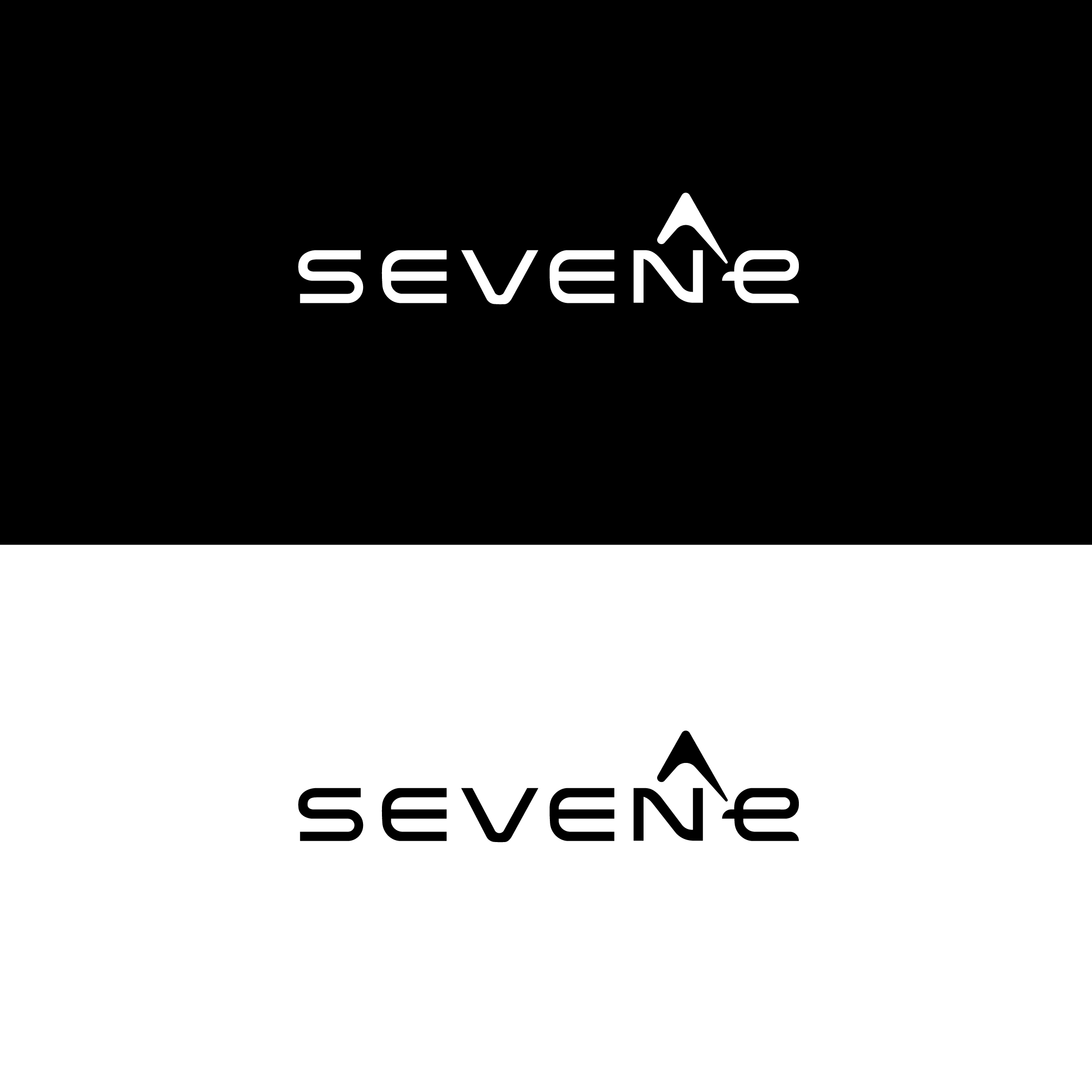
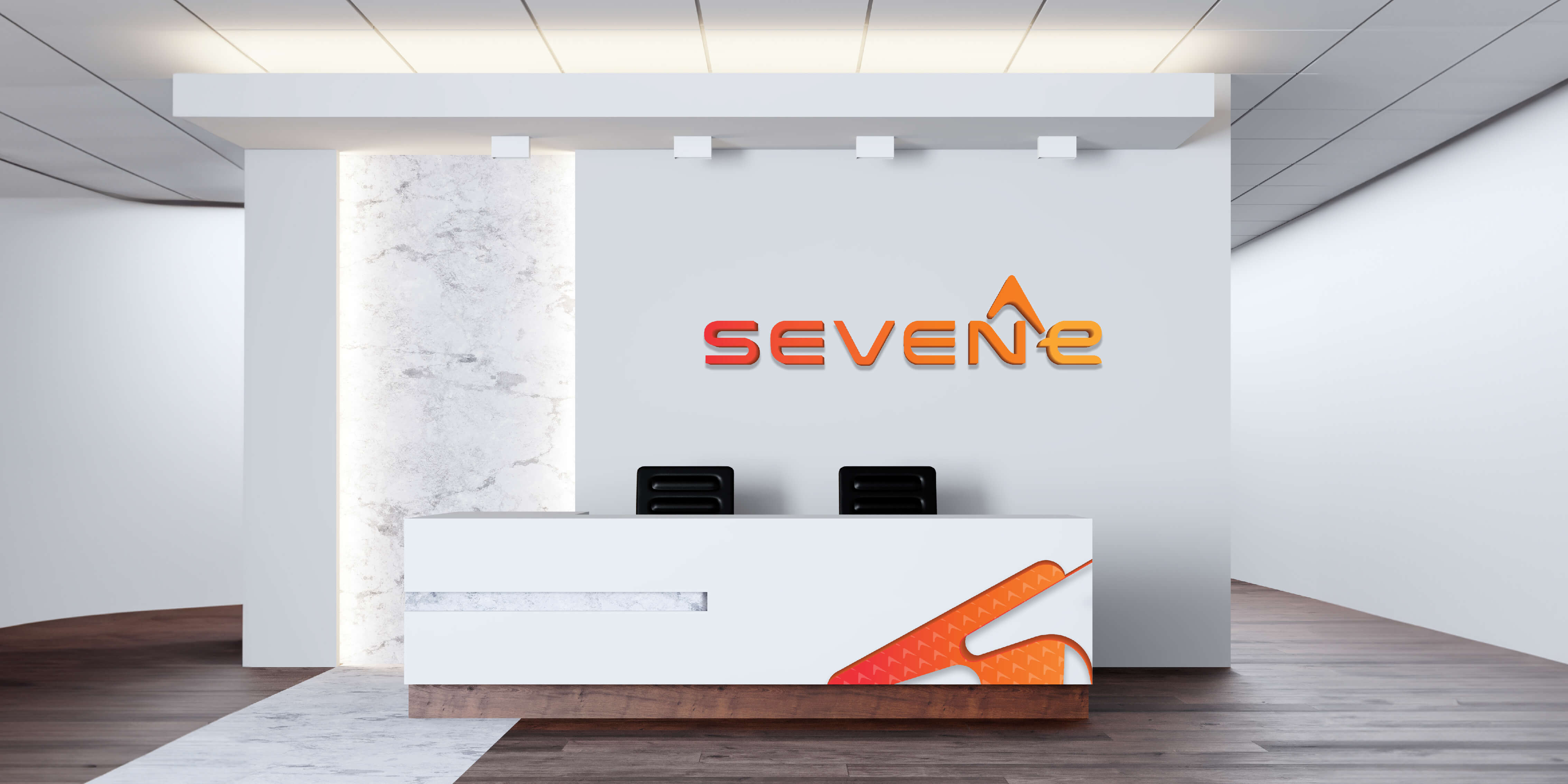
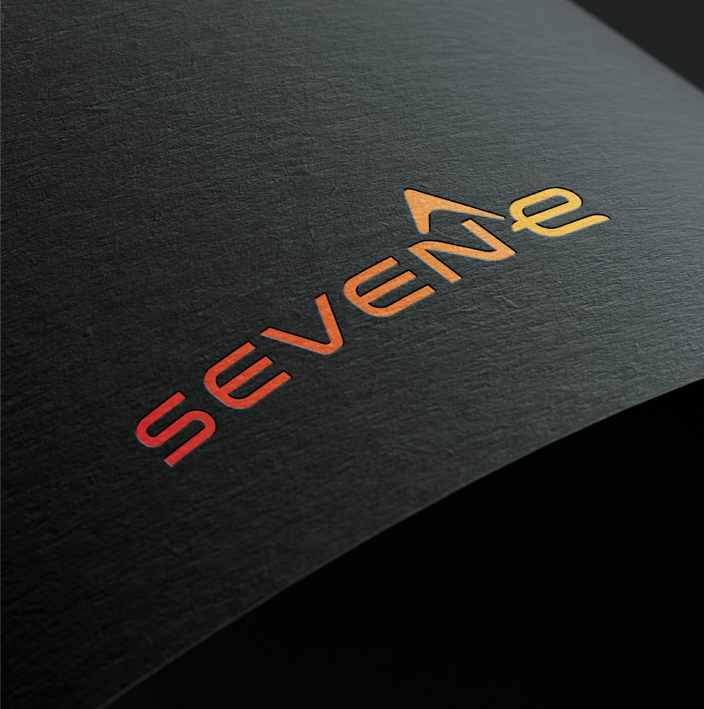
The SevenE logo embodies the essence of shelter, with a minimalist yet impactful design. The numerical representation of “seven” subtly morphs into the shape of a shelter, symbolizing the company’s core business. The logo’s vibrant colours reflect the dynamic nature of the construction industry, while its modern typography adds a touch of sophistication.
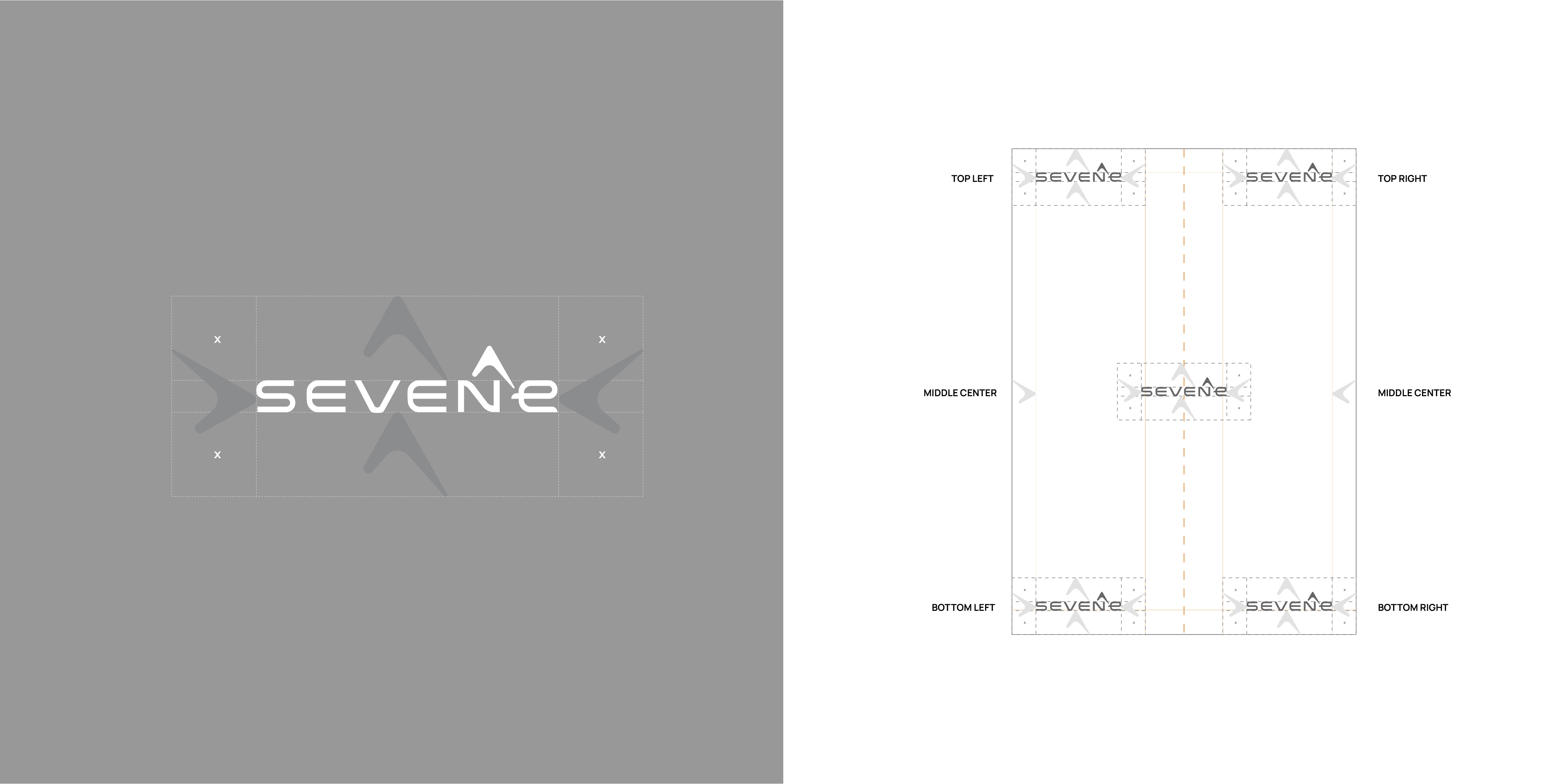
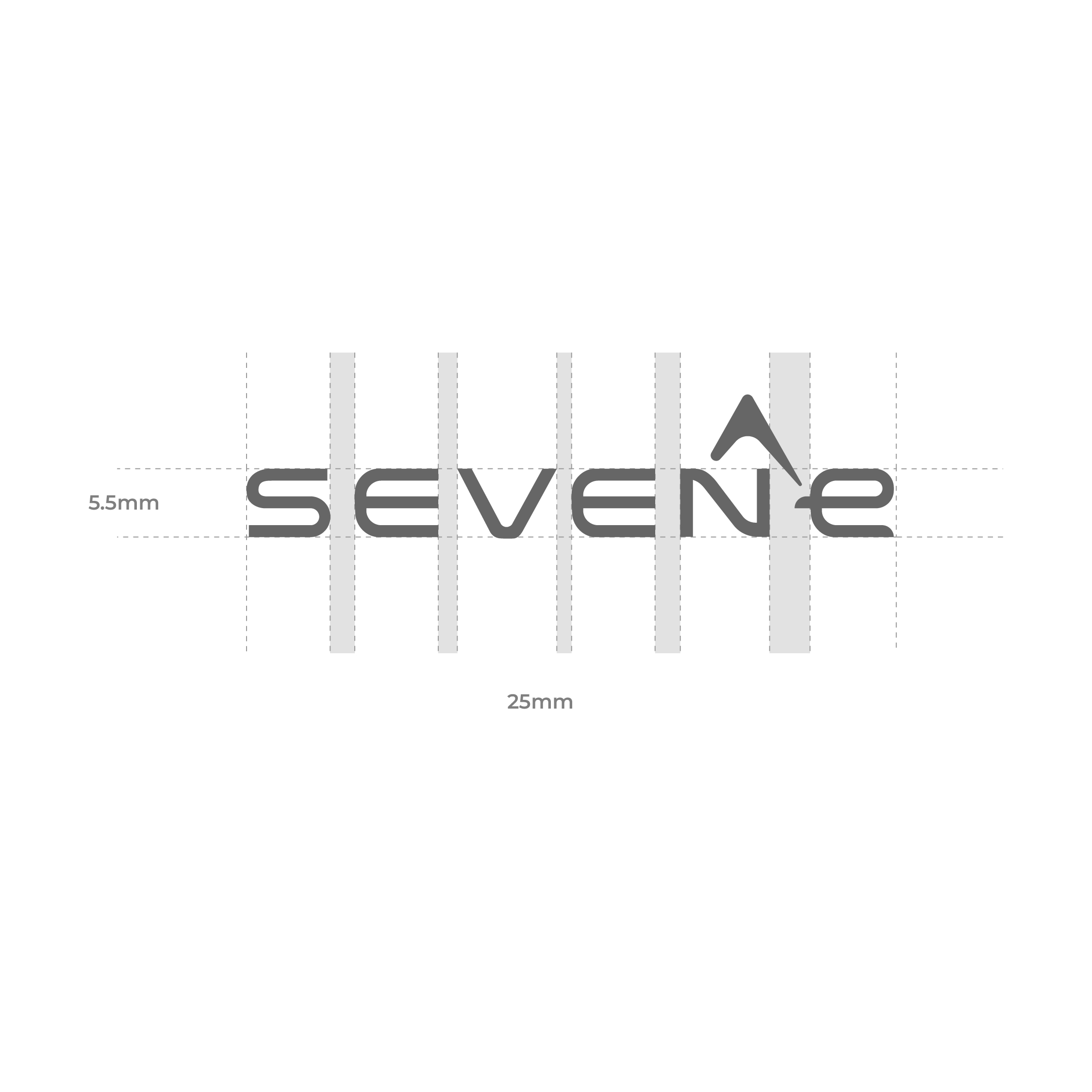
The SevenE logo is designed to be versatile, allowing for various lockups and positioning options across different mediums. Whether displayed alone or alongside the company name, the logo maintains its visual integrity and impact, ensuring consistent brand recognition.
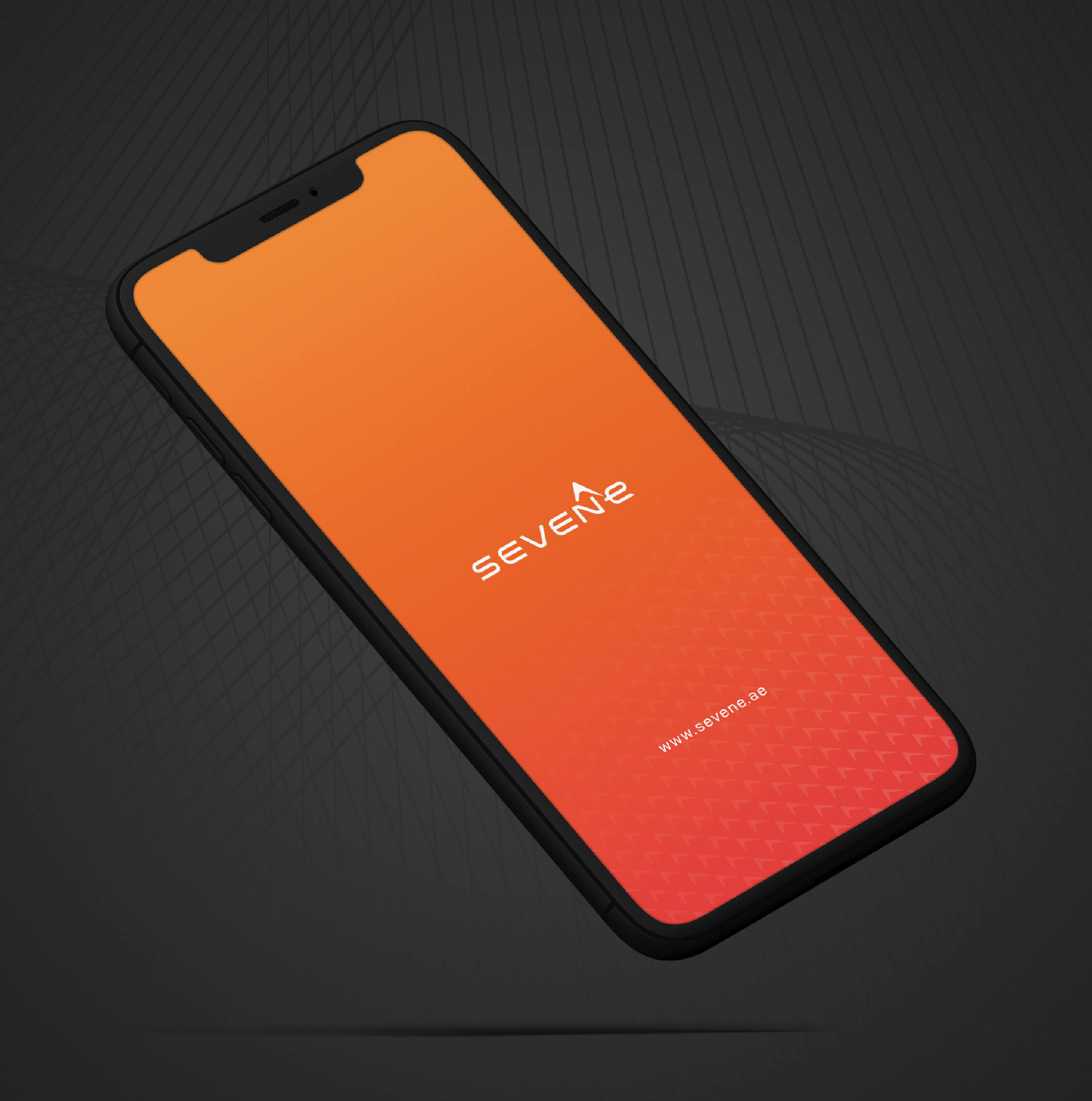
The color palette for SevenE is carefully curated to evoke vibrancy and energy, while also reflecting the company’s Middle Eastern origin: • Fire Red (#EE403D) - 40% • Orange Gradient (#F16522) - 30% • Sandstone Gray (#231f20) - 15% • Pearl White (#f8f3ed) - 15% These bold and vibrant colours not only capture attention but also convey SevenE’s commitment to innovation and excellence in the construction industry.
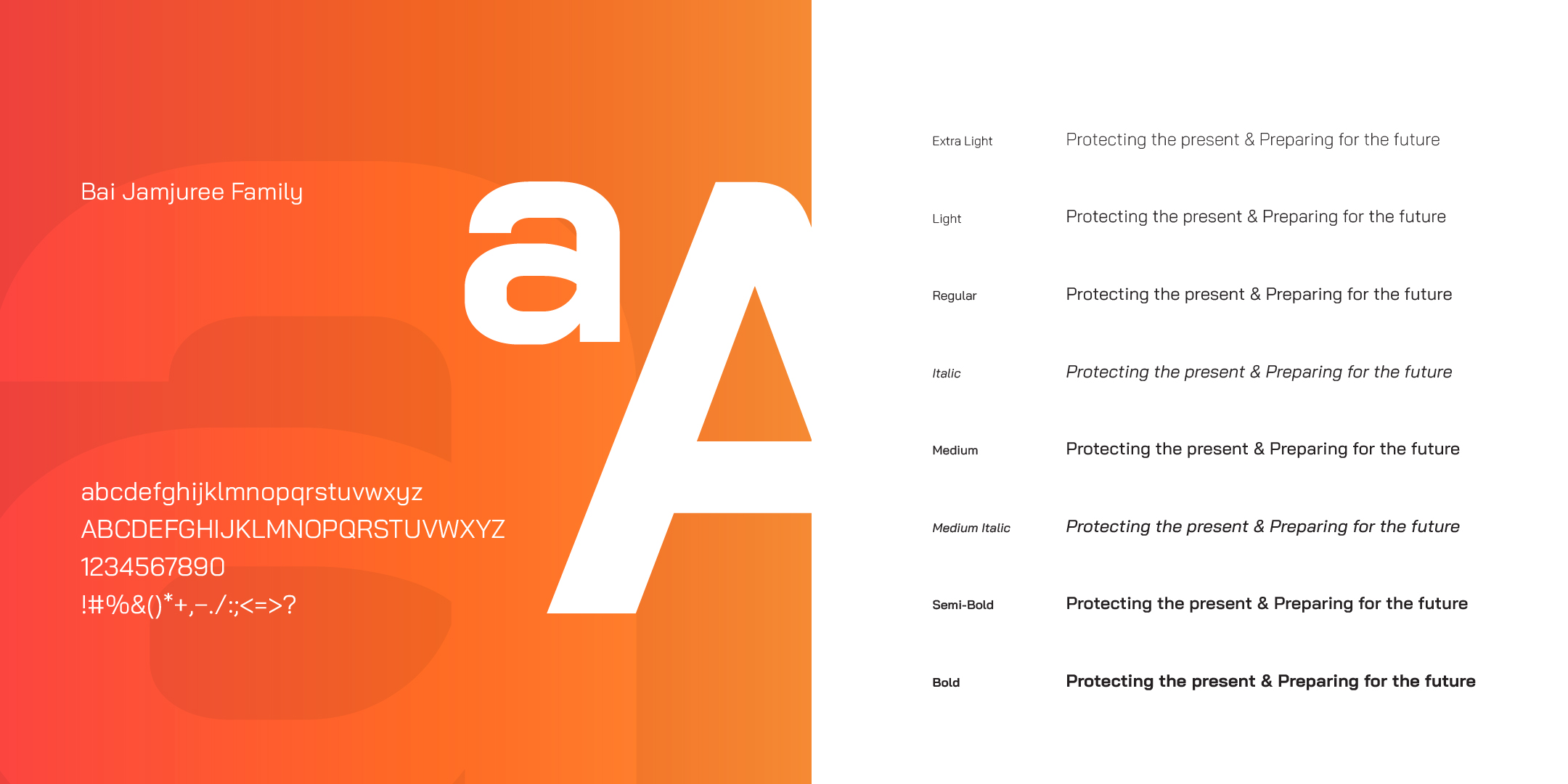
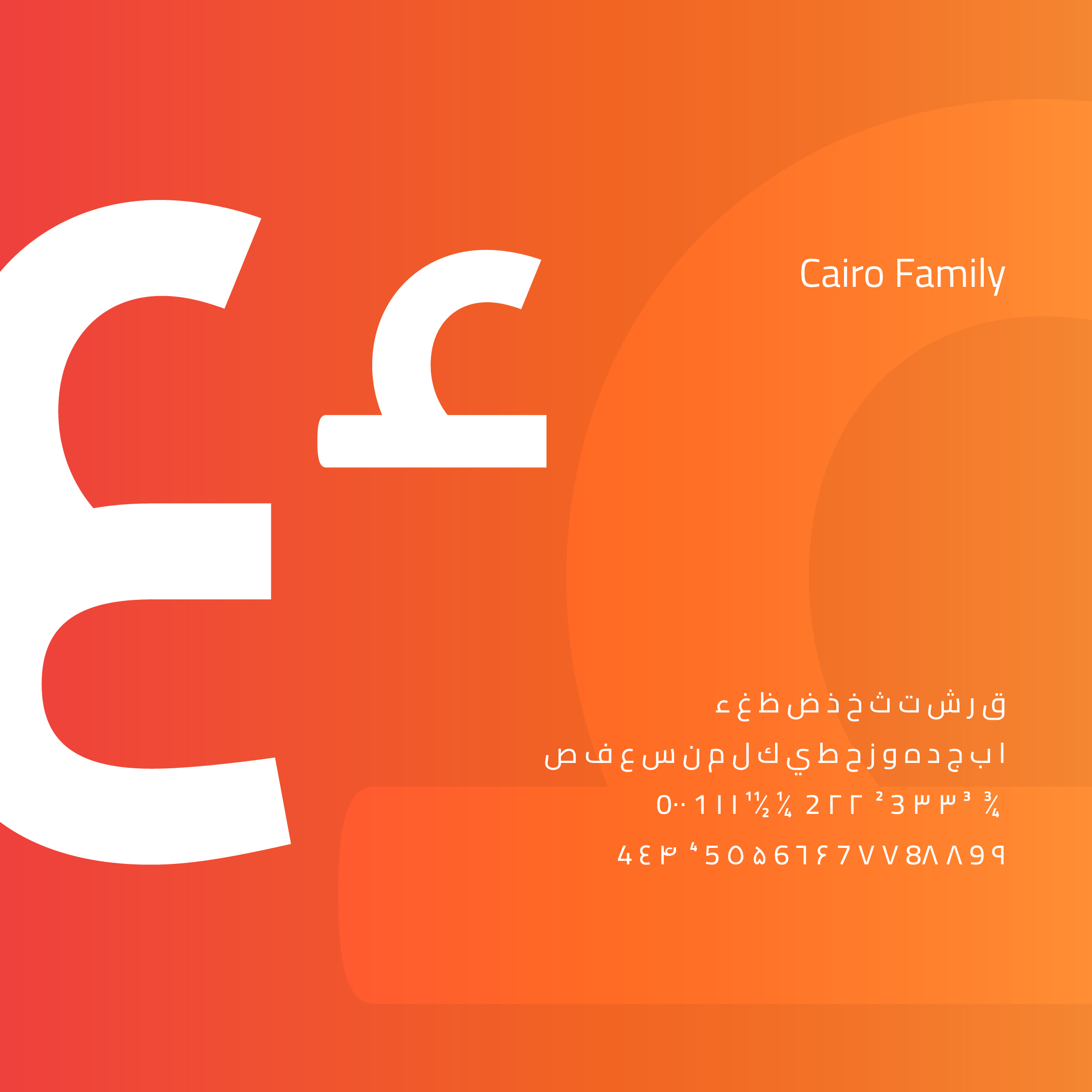
The graphic element of the SevenE brand identity is inspired by the geometric shapes found in traditional Middle Eastern architecture. This motif adds depth and visual interest to marketing materials and reinforces the company’s regional heritage. Typography • Primary Typeface – English: Bai Jamjuree font has been selected as the primary typeface of the SevenE collaterals for its simplicity, legibility, and variety of weights. • Secondary Typeface – English: Manrope is the secondary font, used in presentations, emails, letters, and some applications. • Primary Typeface – Arabic: Cairo Arabic is chosen as the primary Arabic font to cater to the needs and preferences of the Middle Eastern audience.
SevenE’s visual identity is a harmonious blend of modernity and tradition, reflecting the company’s commitment to innovation while honouring its Middle Eastern roots. Through cohesive branding elements, including the logo, colour palette, typography, and graphic motifs, SevenE presents a unified and compelling brand image that resonates with its target audience.
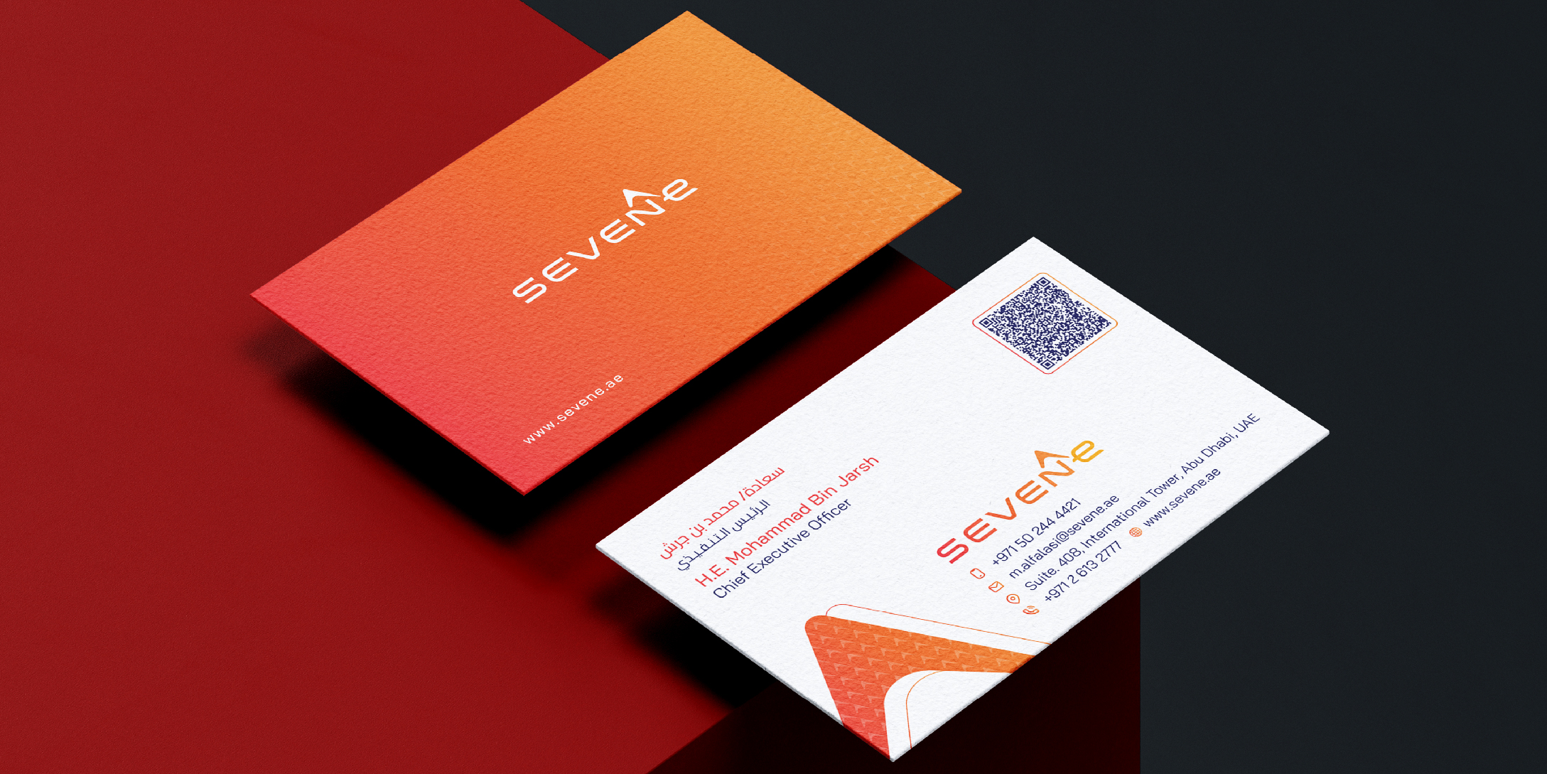
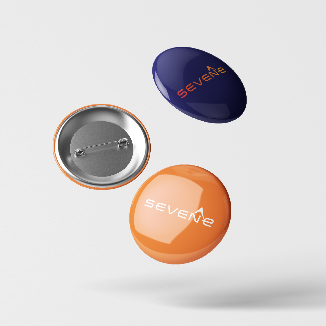
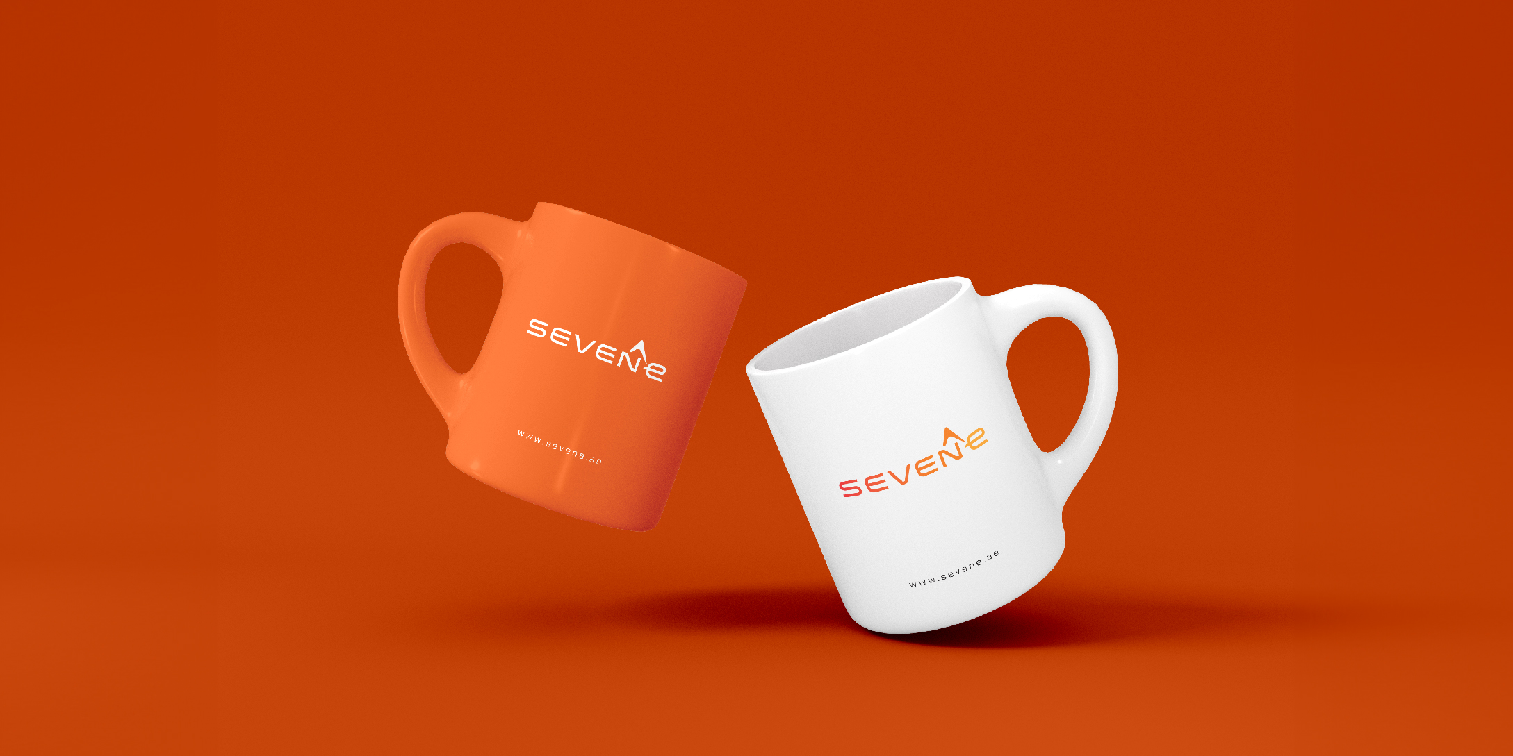
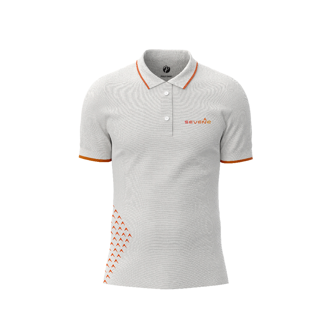
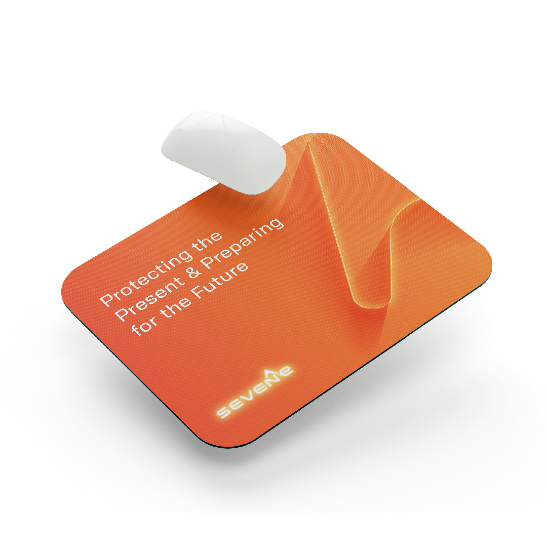
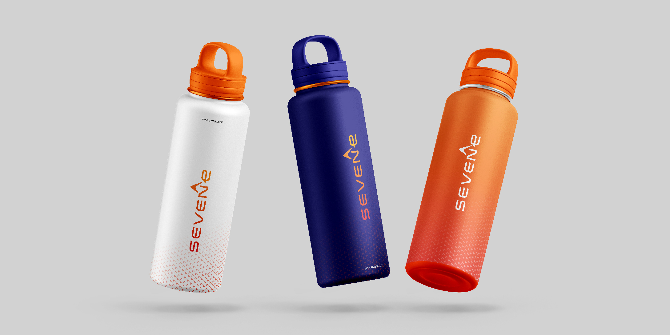
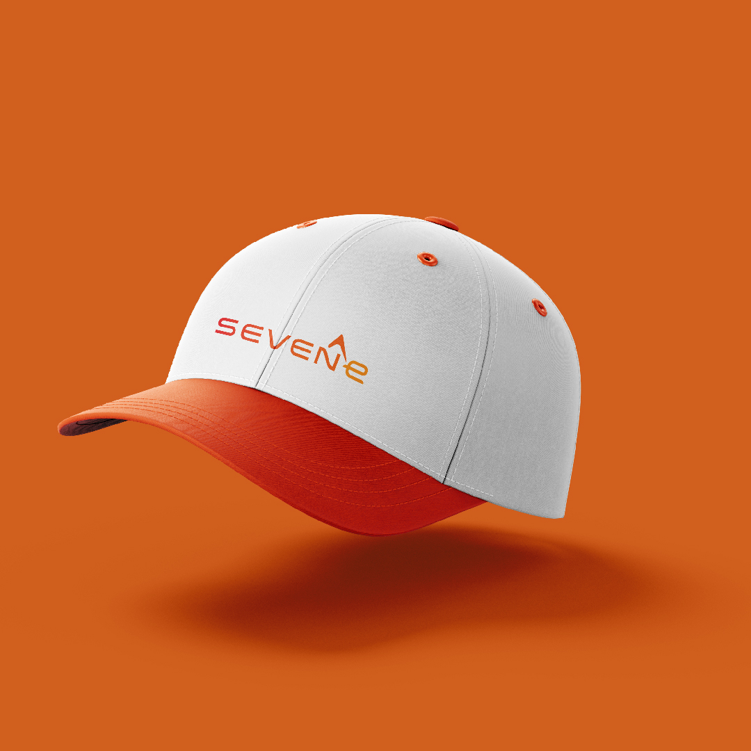
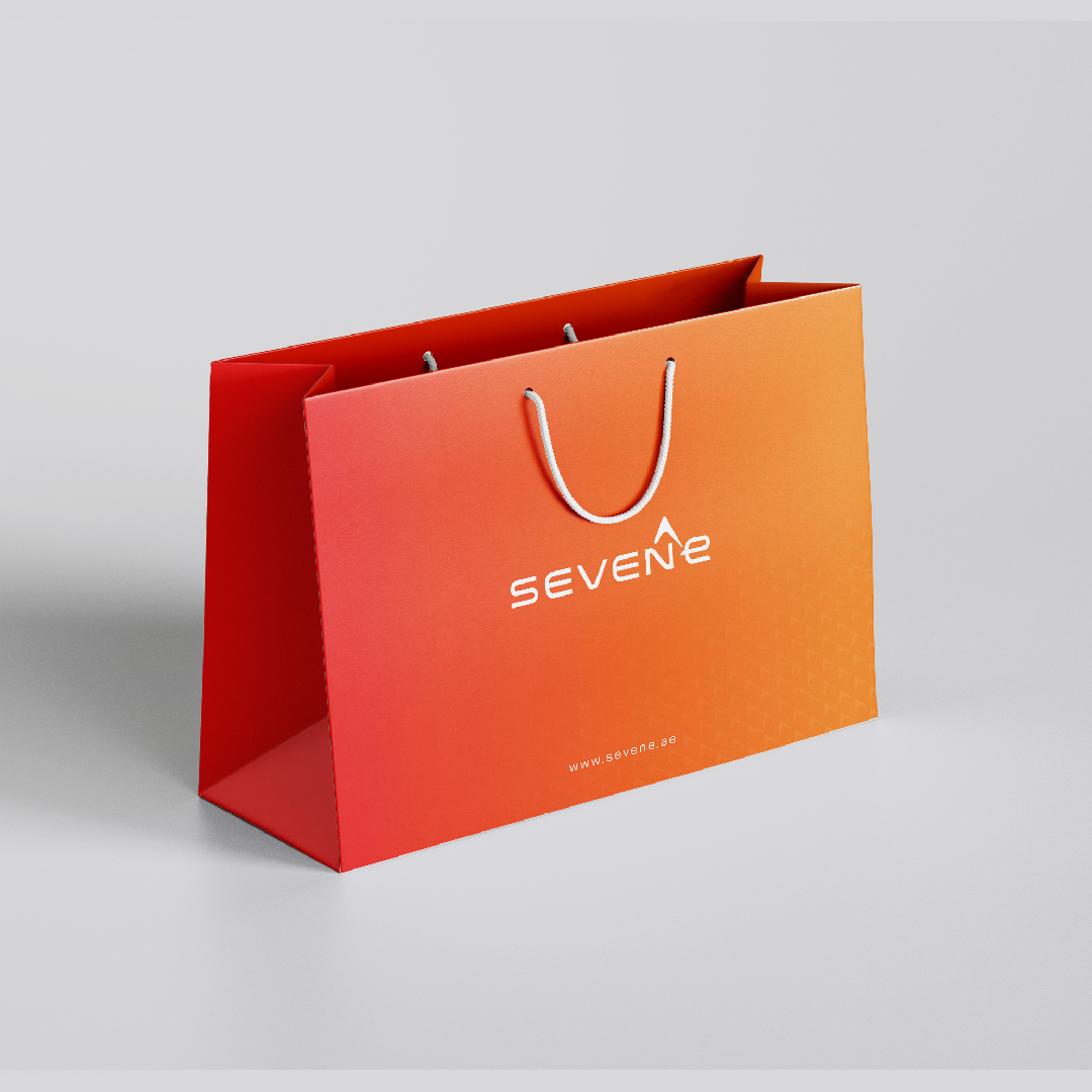
SevenE’s corporate brand collaterals, including office stationery, digital and print materials, and customized gifts, embody the brand’s values of quality, professionalism, and innovation. Each piece is meticulously designed to reflect the company’s identity and leave a lasting impression on clients and stakeholders.
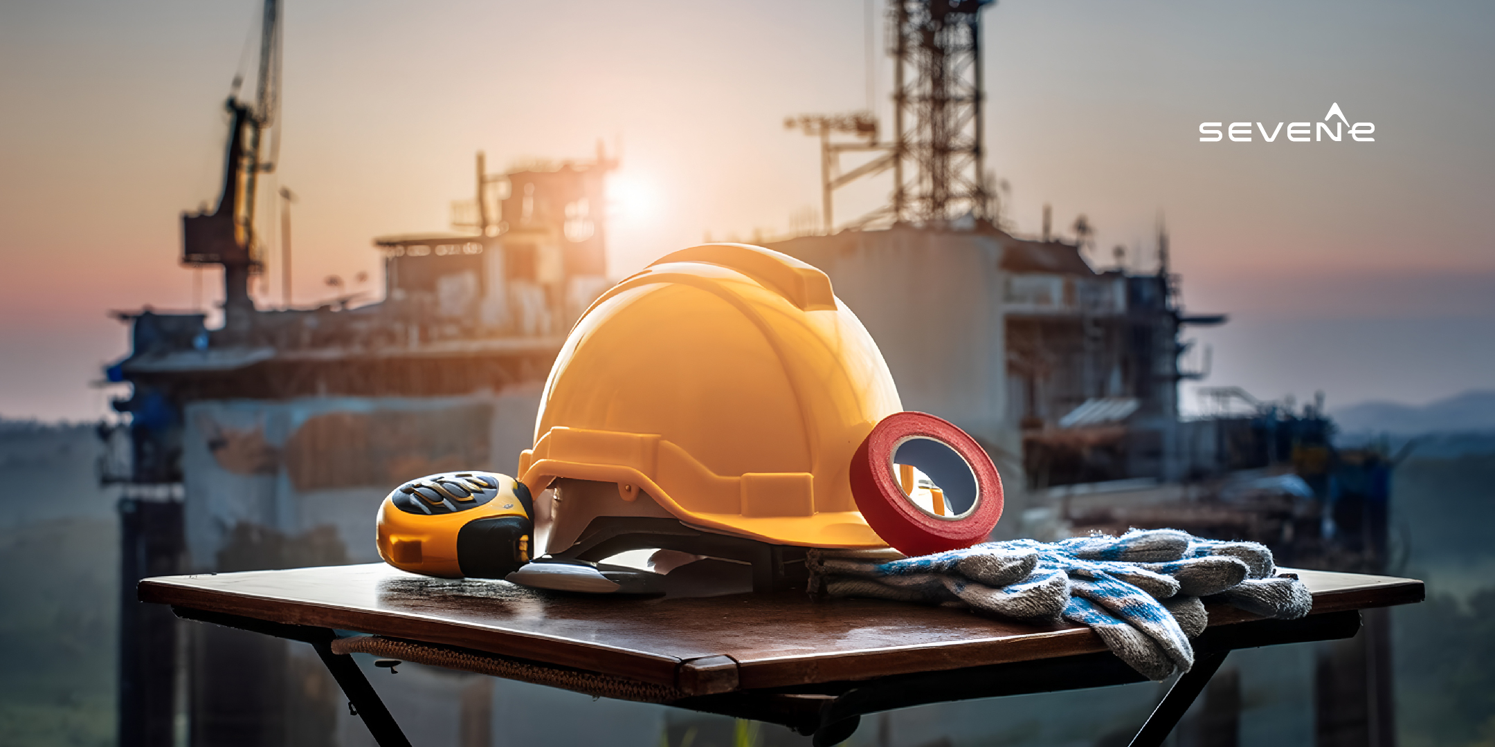
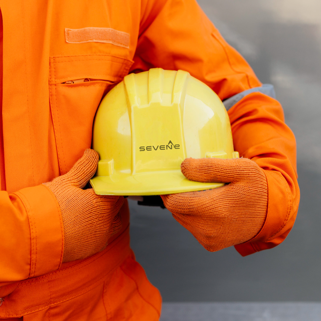
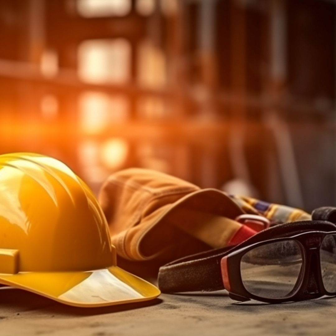
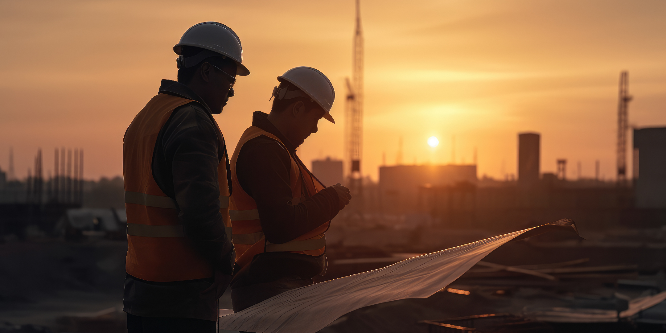
The photography emphasizes safety and protection, reflecting the core values of SevenE. Images should convey professionalism and preparedness, with a focus on construction sites, positive interactions, and day and night shots. Conclusion - The successful completion of SevenE’s branding and visual identity development project marks a significant milestone in the company’s journey towards establishing itself as a leading construction firm in Dubai and beyond. With a cohesive brand identity that reflects its values and heritage, SevenE is well-positioned to thrive in the competitive construction industry landscape.