To develop a new logo for the Packaged drinking water company which competes with the industry leaders in UAE, the logo should stand out in the market and have to be unique and different from their competitors.
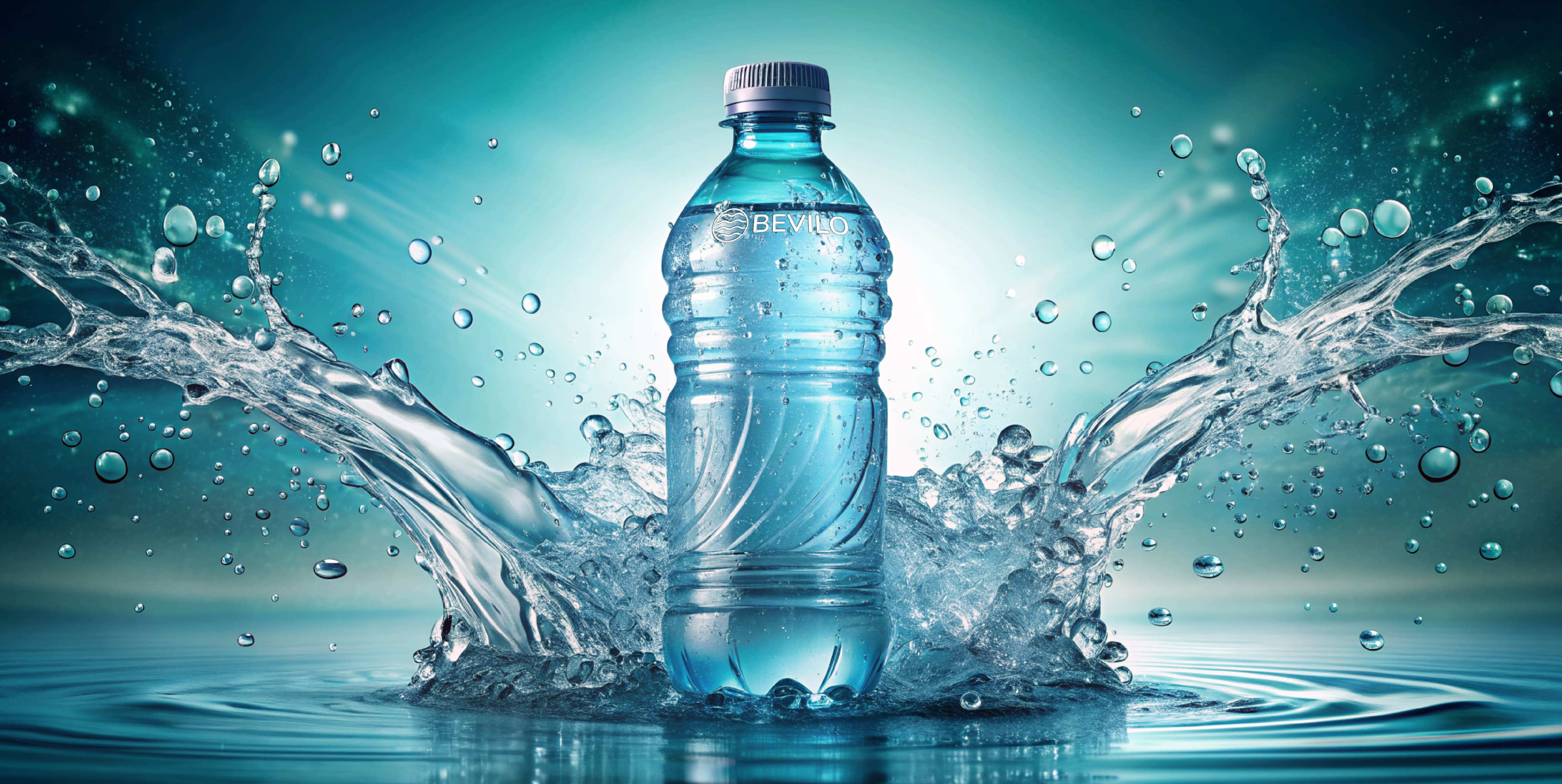
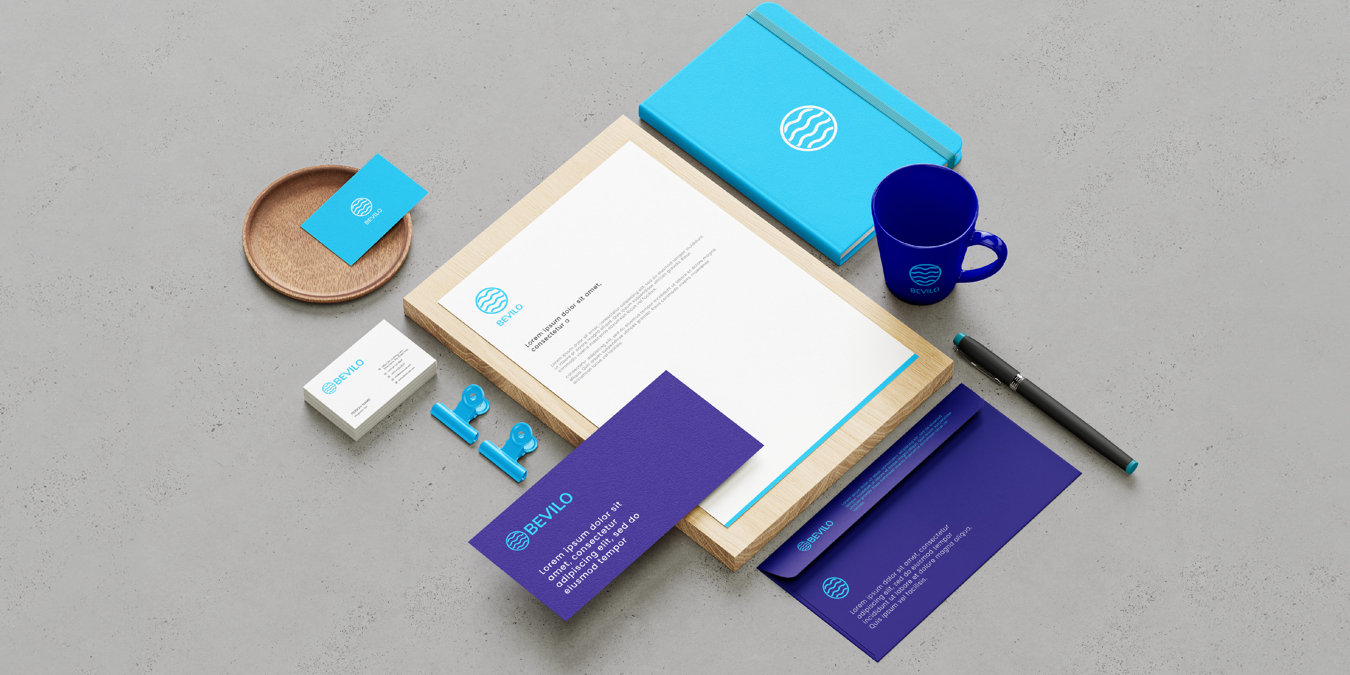
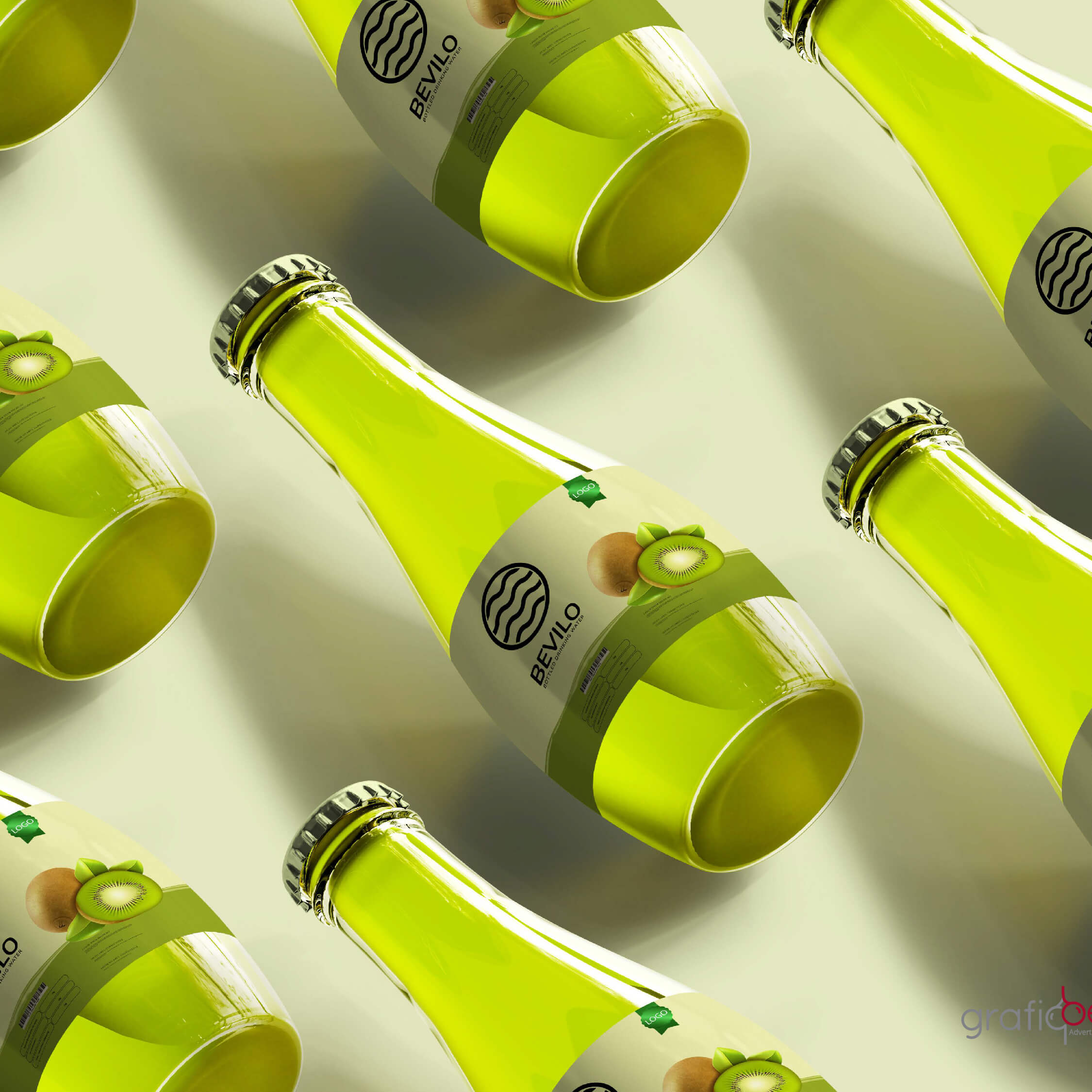
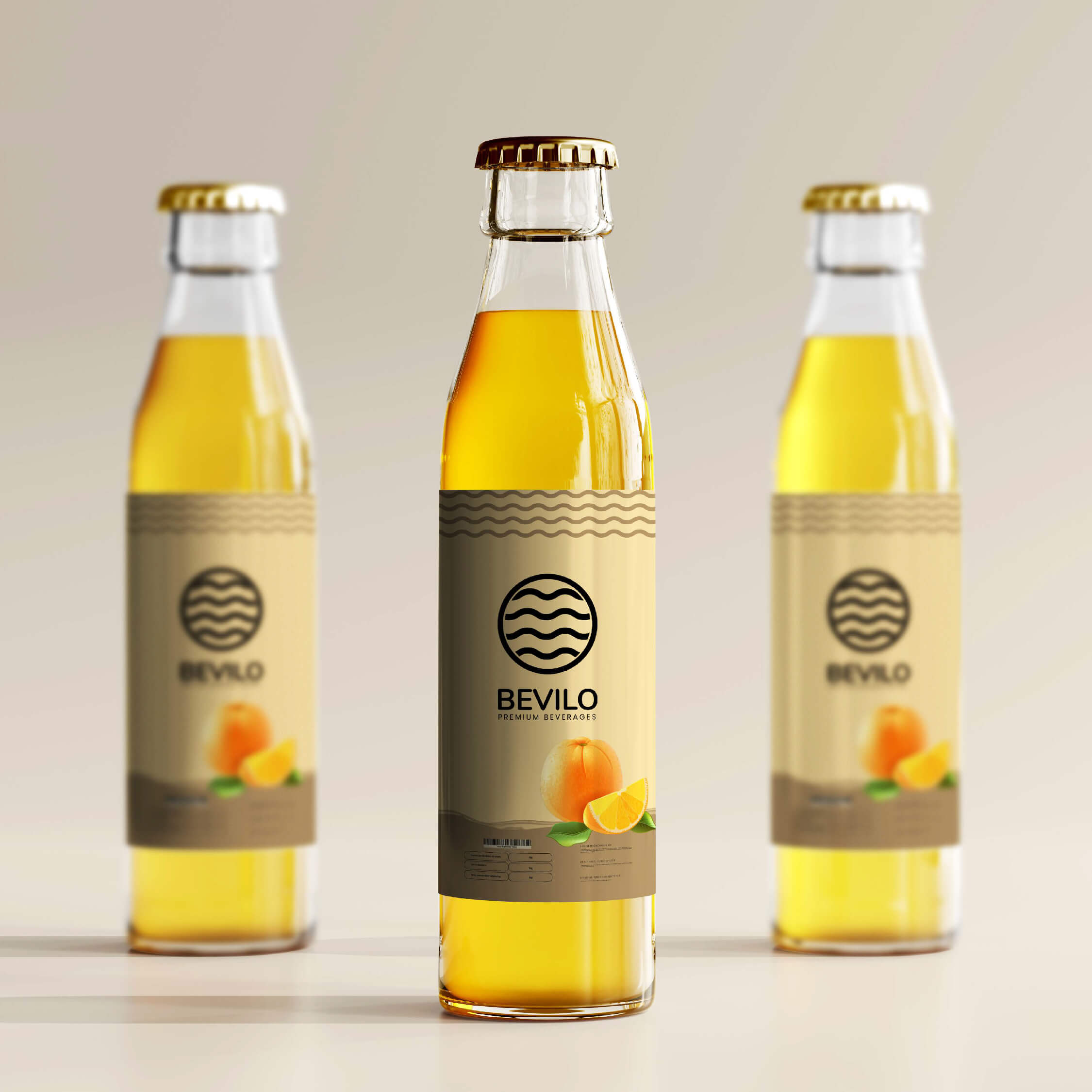
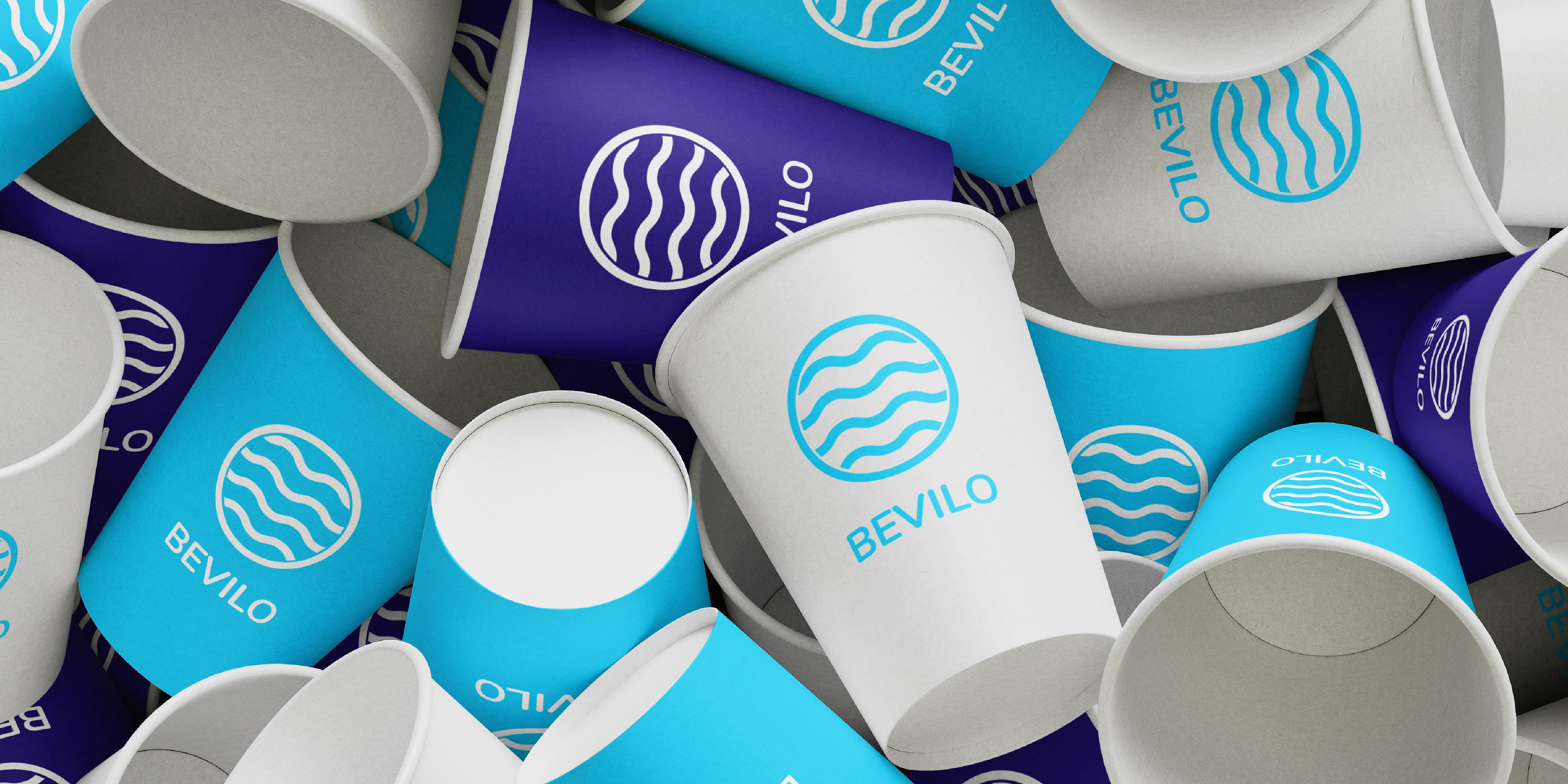
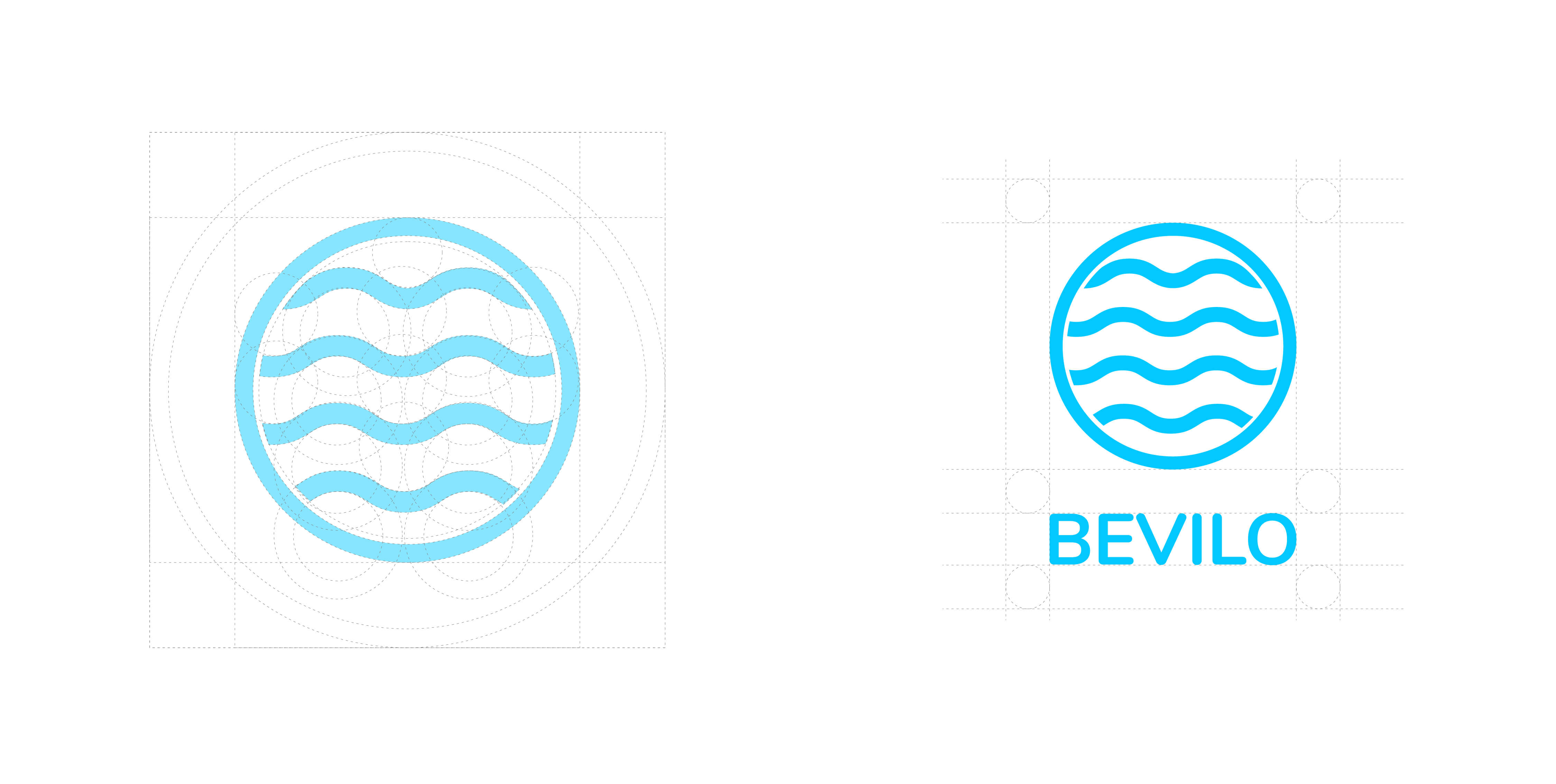
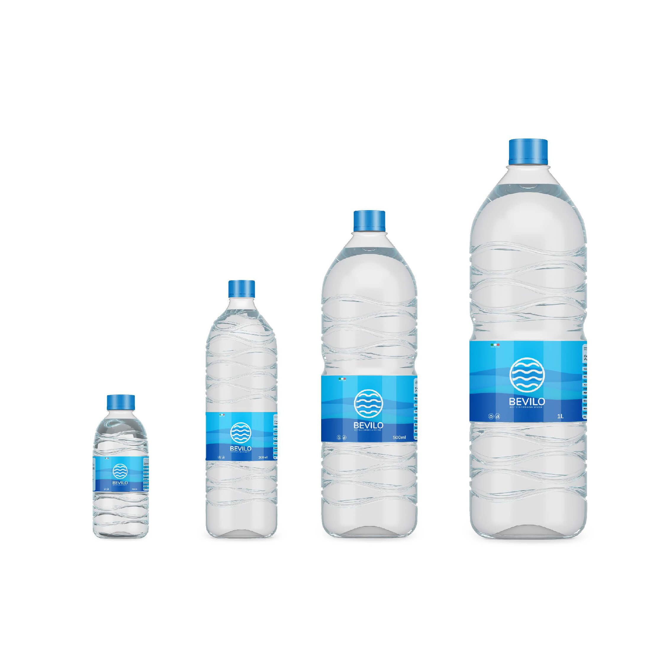
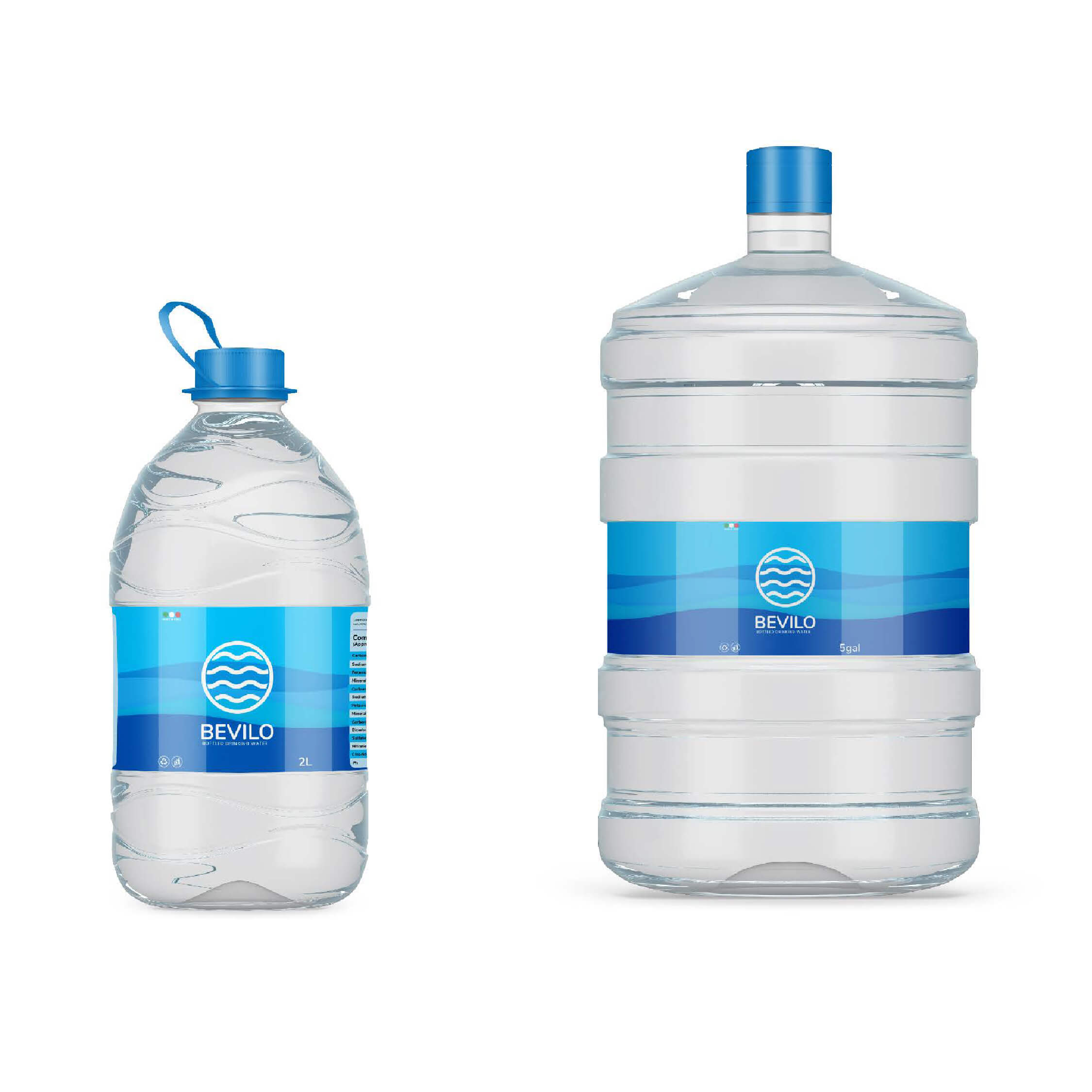
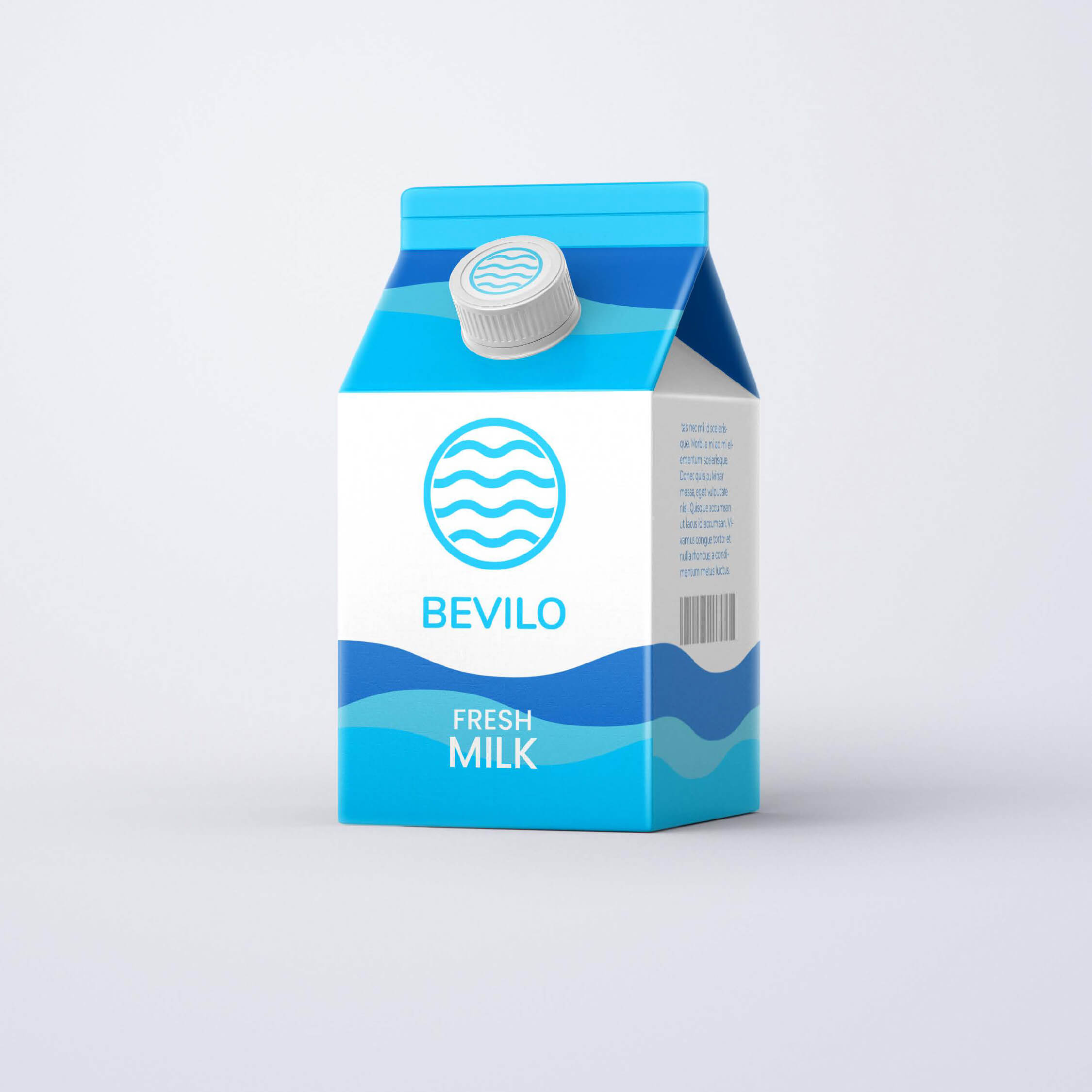
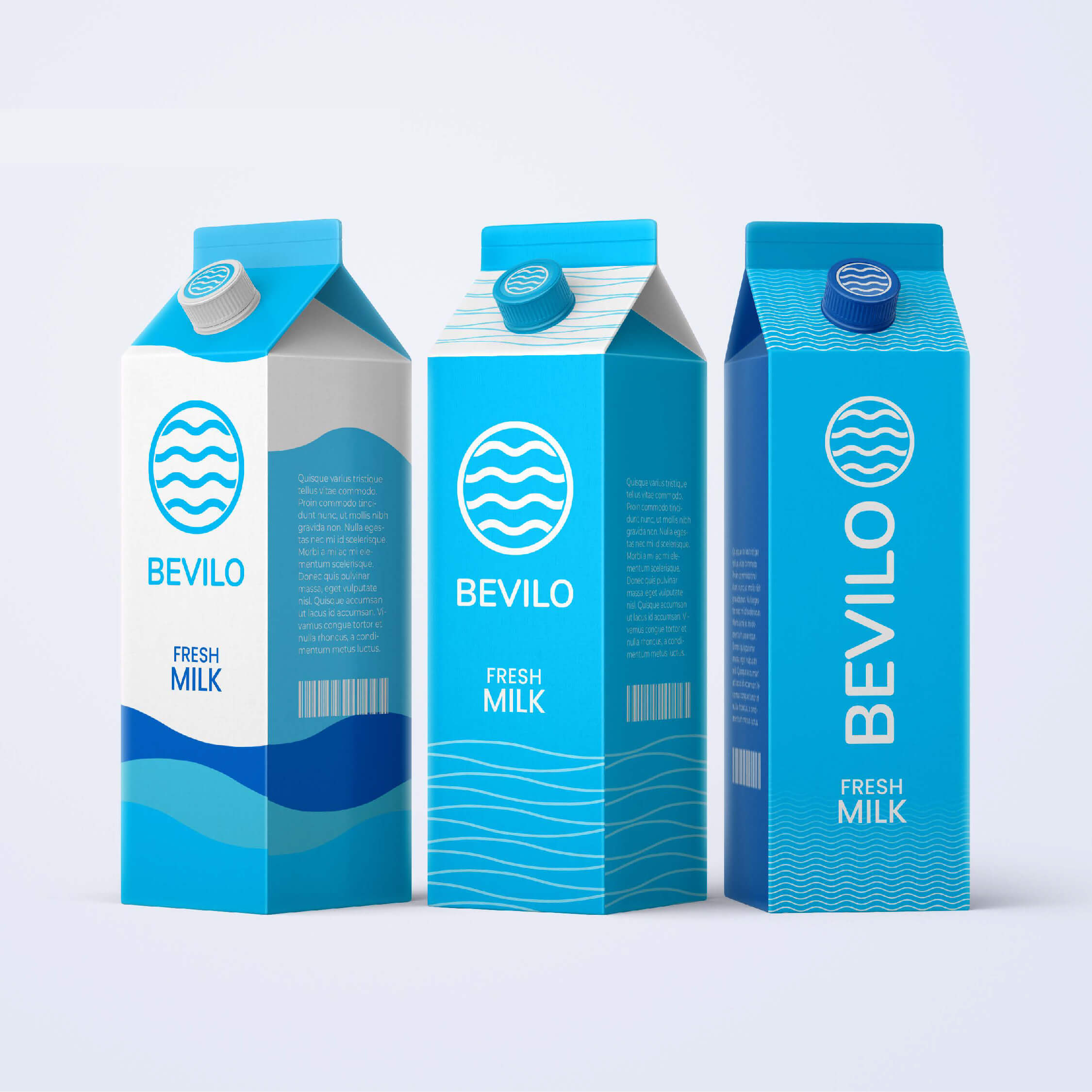
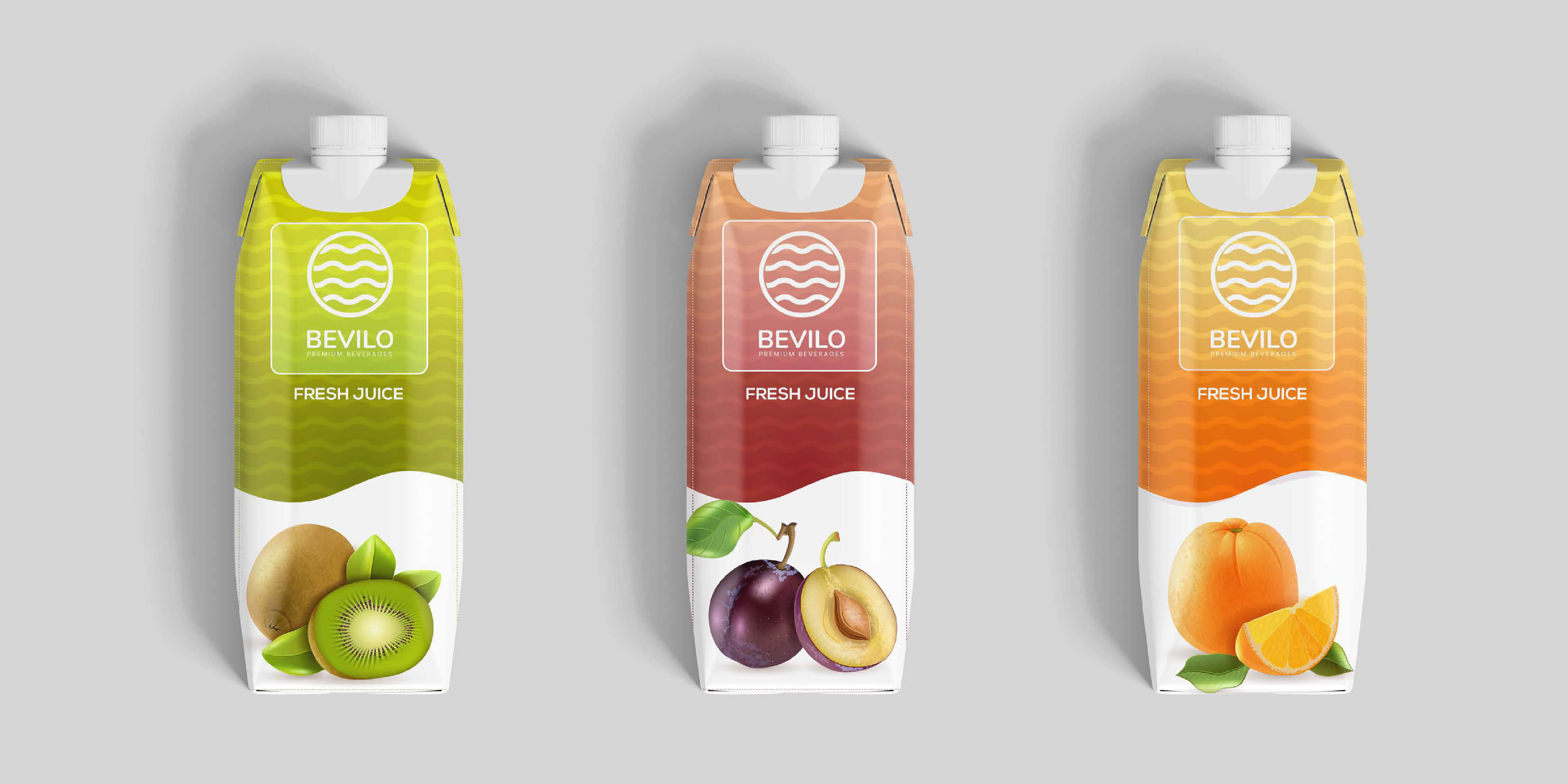
Description: The Bevilo logo embodies the brand’s commitment to delivering the purest drinking water sourced from the pristine and natural springs of Italy. It symbolizes the flow of cool and refreshing water, reflecting Bevilo’s dedication to providing high-quality, natural hydration. Additionally, the disk of the sun in the logo represents Bevilo’s connection with nature and the vitality it brings. Purpose: The logo serves as the visual representation of Bevilo’s brand identity, communicating its core values of purity, freshness, and environmental consciousness to consumers Impact: By evoking images of pure spring water and the warmth of the sun, the logo creates a strong emotional connection with consumers, instilling trust and confidence in Bevilo’s products.
Description: Bevilo offers two logo arrangements: vertical and horizontal. The vertical logo is preferred for most applications due to its versatility and readability. Clear space around the logo must always be respected to ensure visibility and impact. Purpose: Consistent logo lockups and positioning maintain brand integrity and recognition across various platforms and media channels. Impact: By adhering to clear space guidelines and using appropriate logo lockups, Bevilo ensures that its brand identity remains consistent and recognizable, enhancing brand recall and consumer trust.
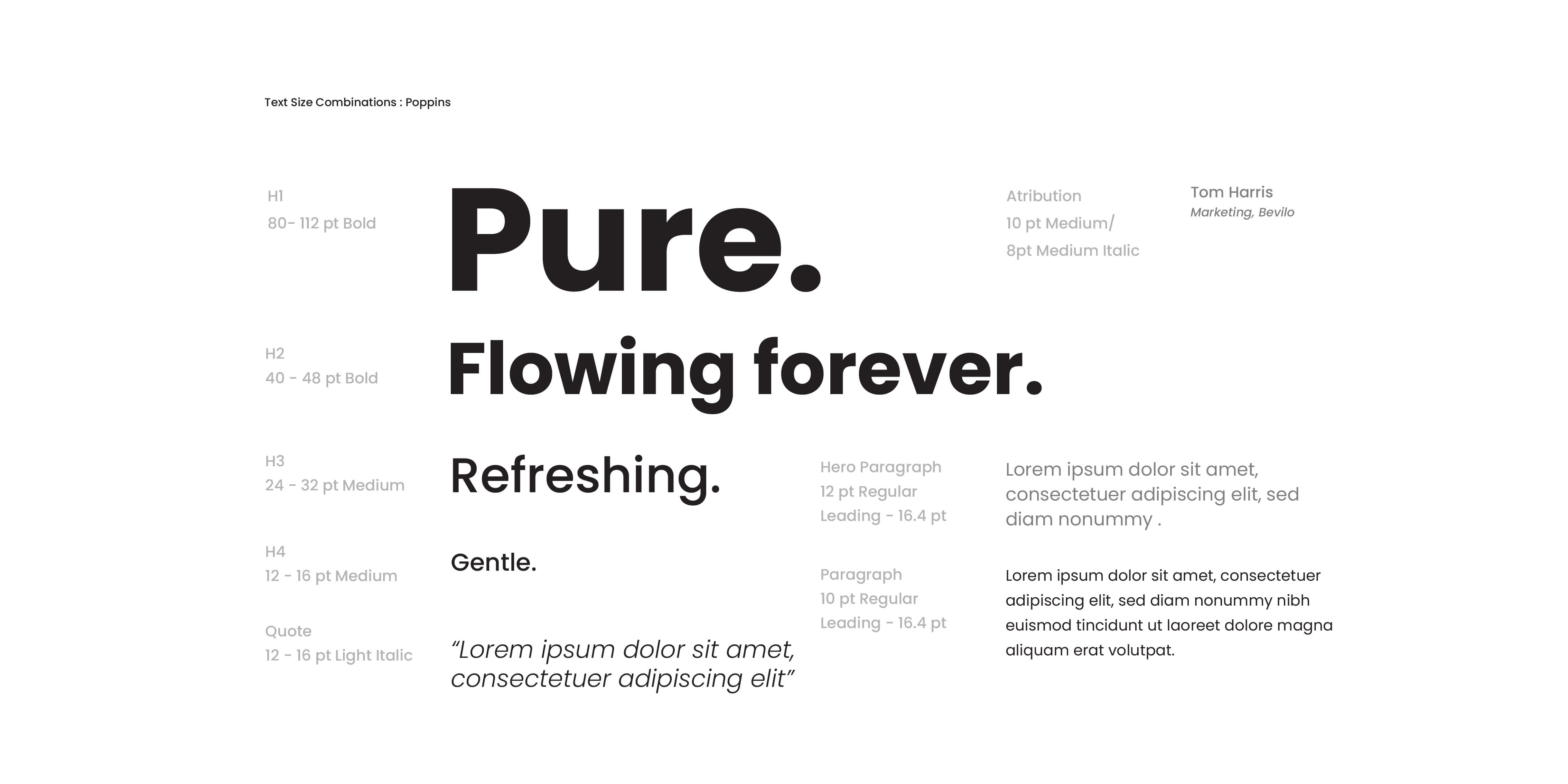
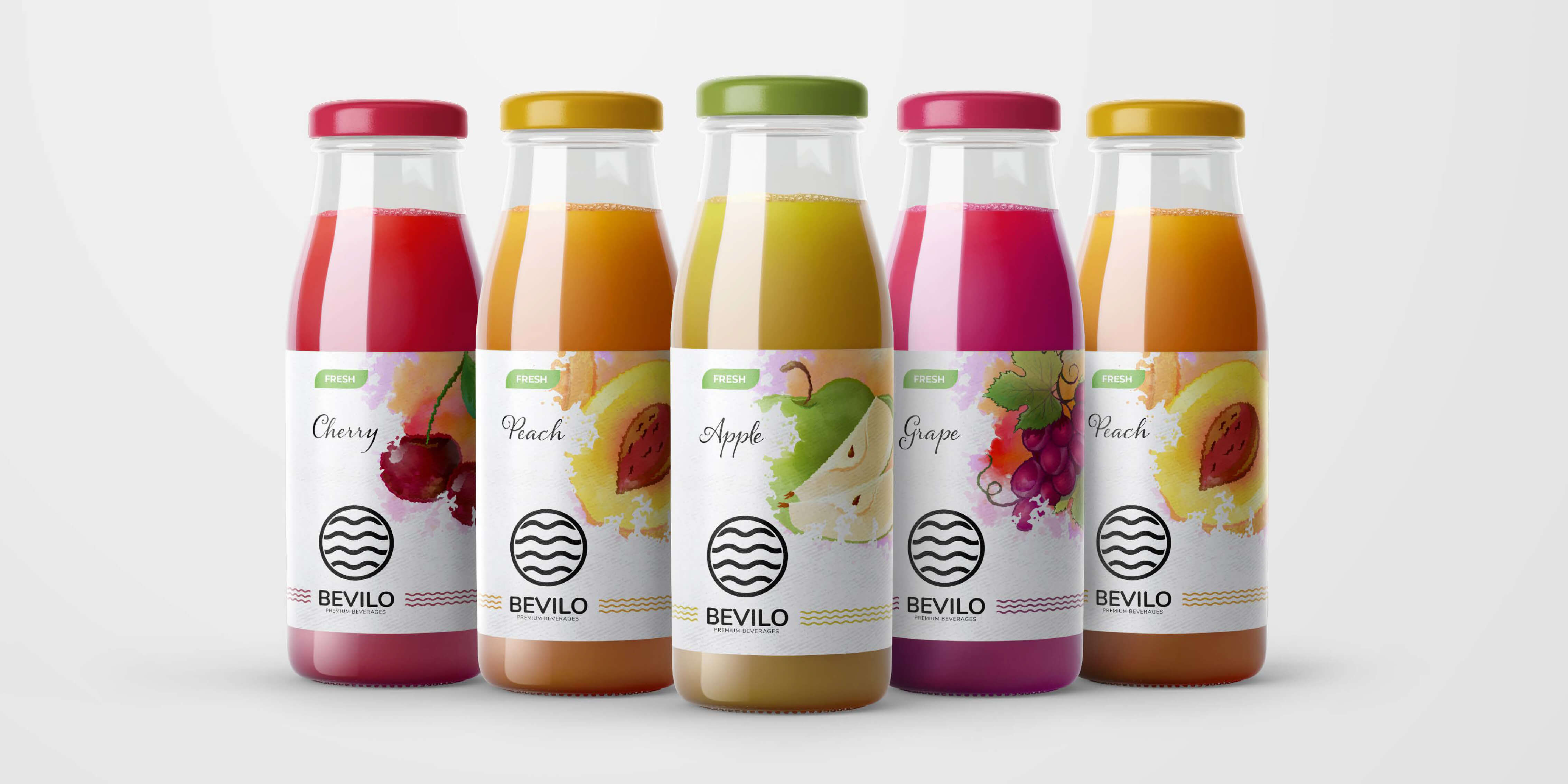
Description: Bevilo’s colour palette consists of blue, black, and white. These colours are chosen to convey a sense of purity, sophistication, and freshness that aligns with the brand’s image. Purpose: The colour palette reinforces Bevilo’s brand identity and helps create a cohesive visual language across all brand materials and touchpoints. Impact: By consistently using the designated colours, Bevilo strengthens brand recognition and differentiation in the competitive market of packaged drinking water.
Description: Bevilo employs the Poppins typeface as its primary font, conveying a modern, friendly, and versatile tone. The Arabic typeface, GE SS Two, ensures bilingual communication, while Arial serves as a fallback typeface for consistency. Purpose: Typography plays a crucial role in conveying Bevilo’s brand voice and personality across communication channels. Impact: By using consistent typography, Bevilo maintains brand coherence and professionalism, enhancing readability and brand recall among its diverse audience.
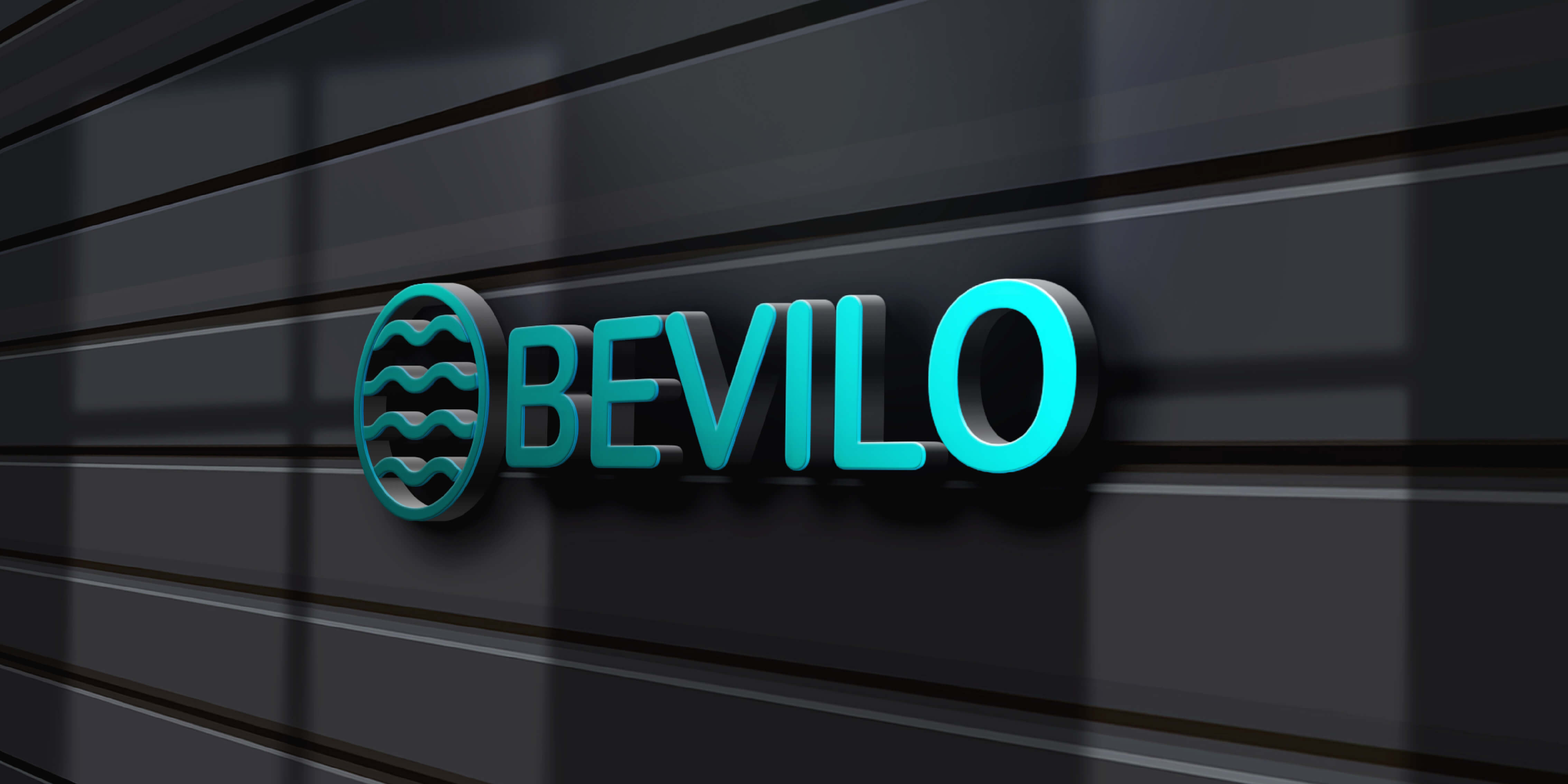
Description: Bevilo emphasizes the consistent and prominent placement of its logo on social media posts, ensuring brand visibility and recognition. The primary colours of blue and white are strategically chosen to symbolize the flow of water and maintain brand consistency. Purpose: Brand expression on social media reinforces Bevilo’s brand identity and engages with its target audience effectively. Impact: By aligning social media content with brand guidelines, Bevilo strengthens its online presence and fosters meaningful connections with consumers, driving brand loyalty and advocacy
Conclusion - Bevilo’s branding project has effectively communicated its commitment to purity and freshness. The logo, with its symbolic representation of natural water and sun, is versatile and memorable. Clear guidelines for logo usage, colour palette, and typography ensure consistency across platforms. By prioritizing logo placement on social media and using blue and white colours to symbolize water, Bevilo’s visual identity resonates with consumers. Overall, Bevilo’s branding efforts establish trust and differentiation in the competitive beverage market