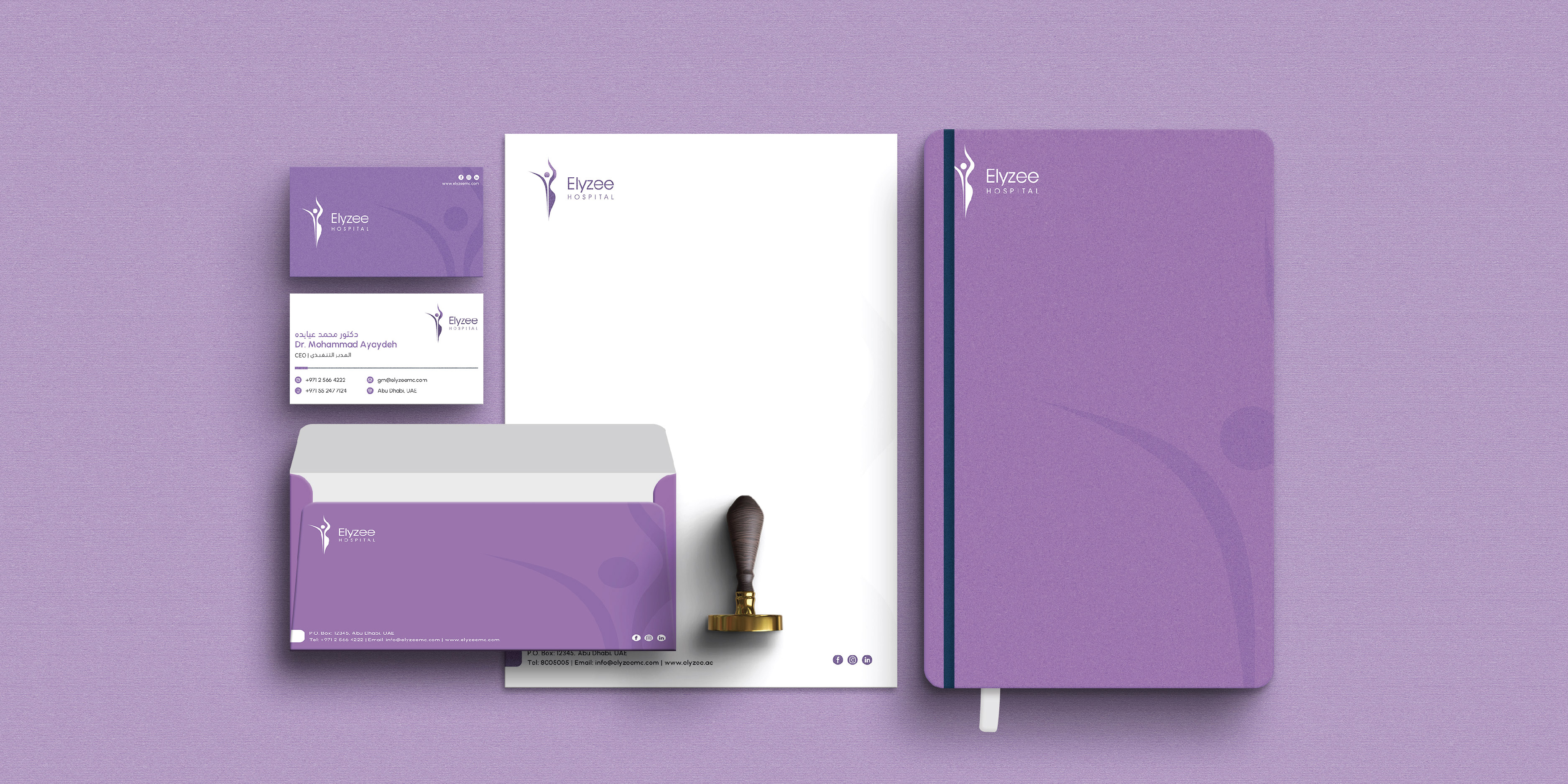
To develop an identity for the brand using the existing Logo which covers all the marketing materials, brand stationaries, and a guideline for the usage of all these items.

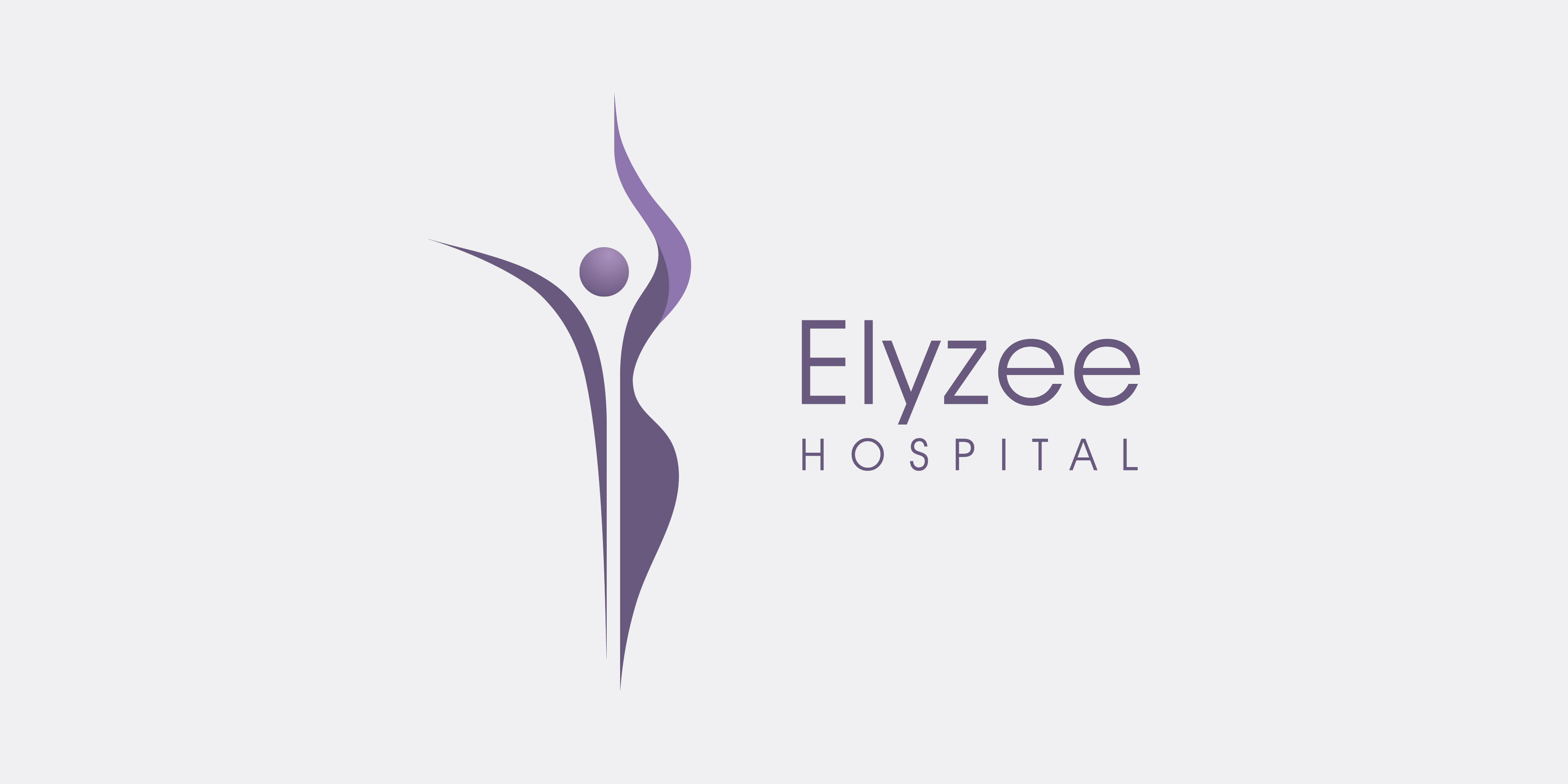
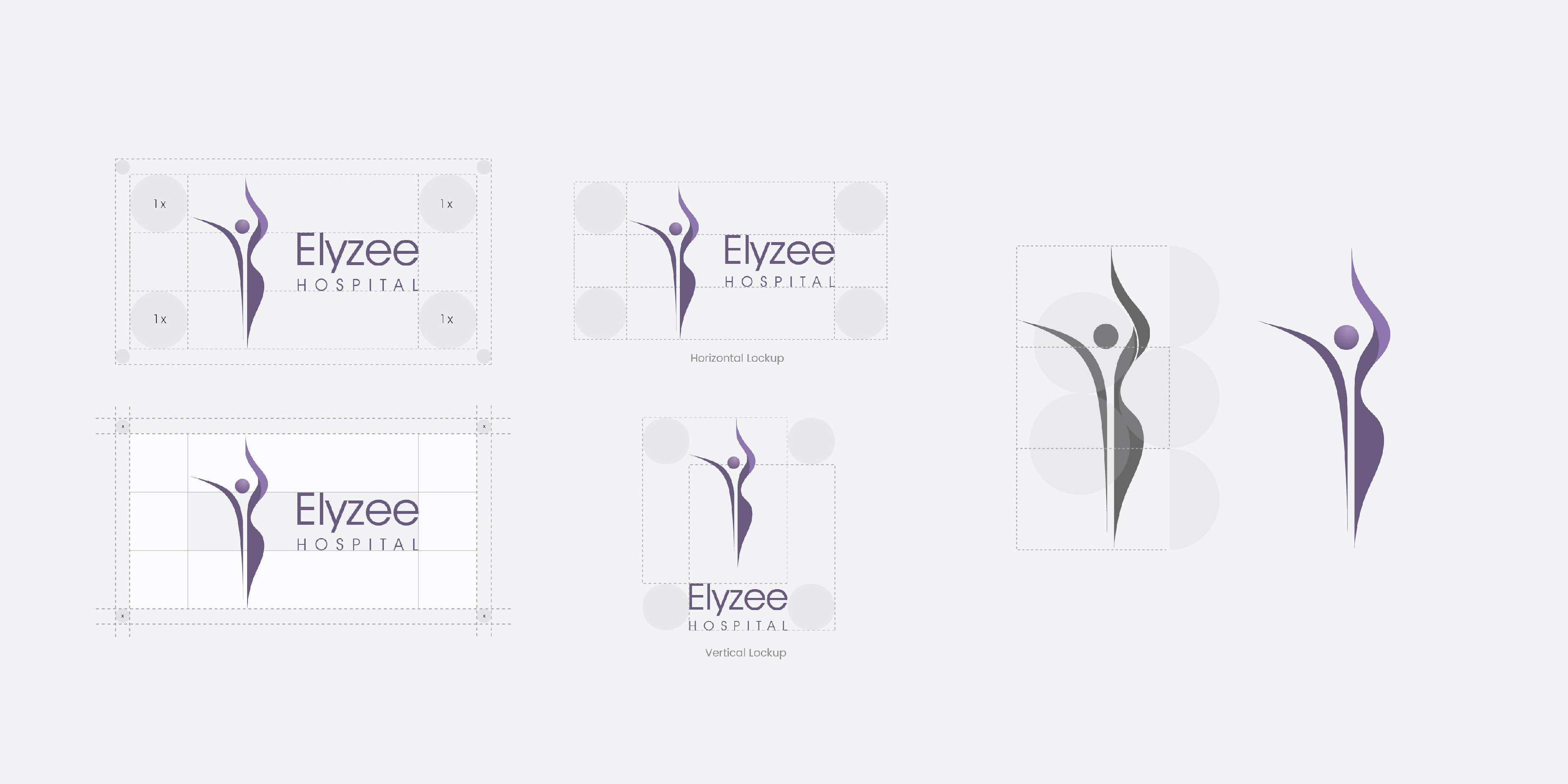
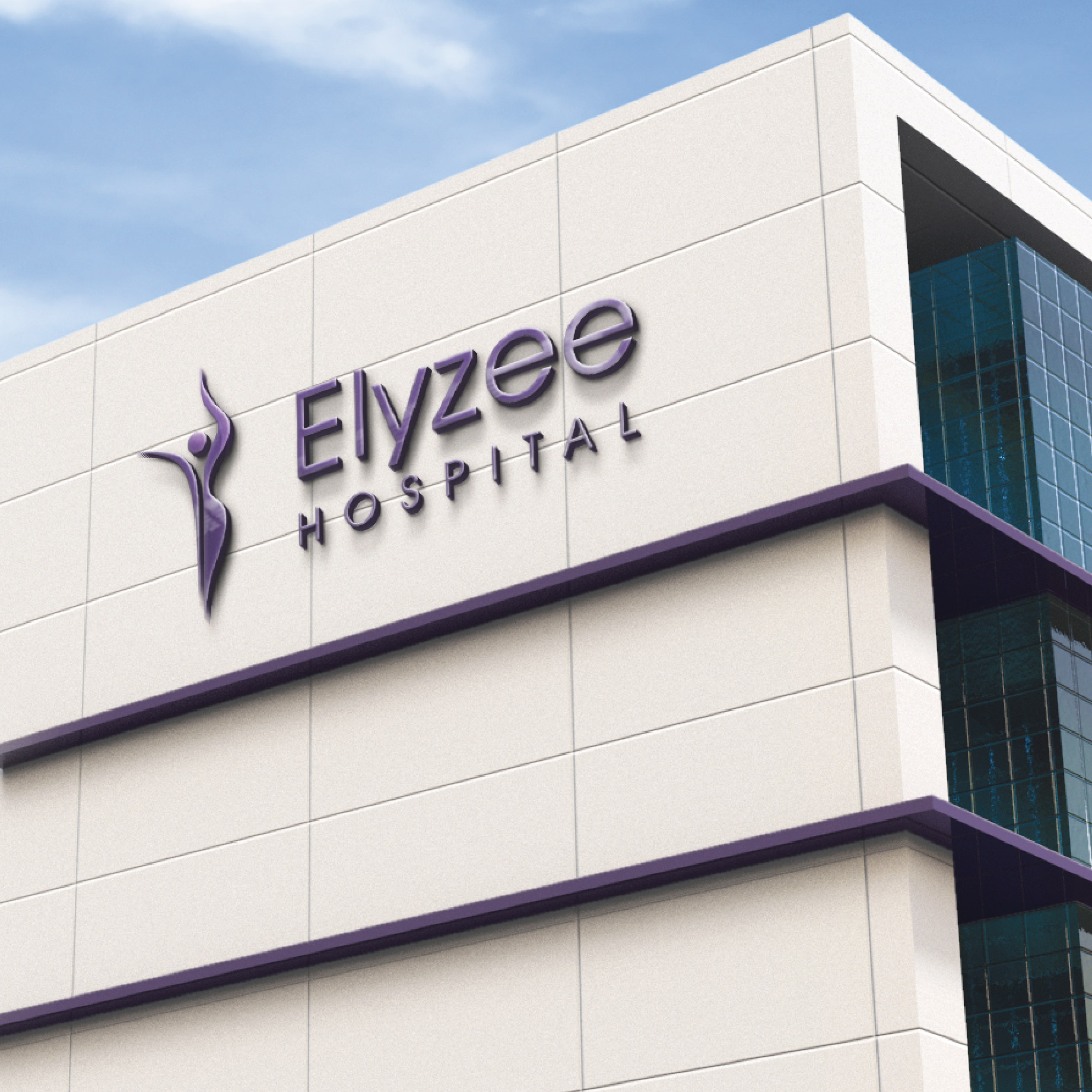
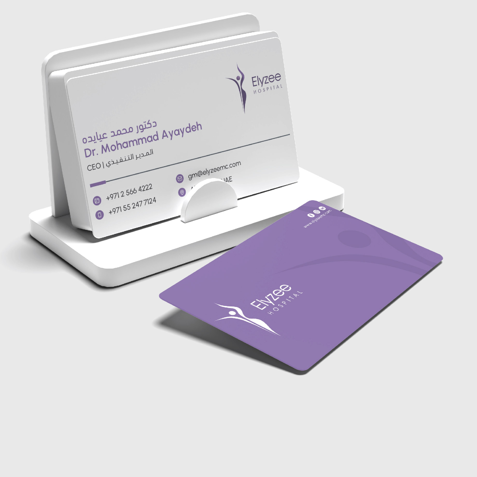
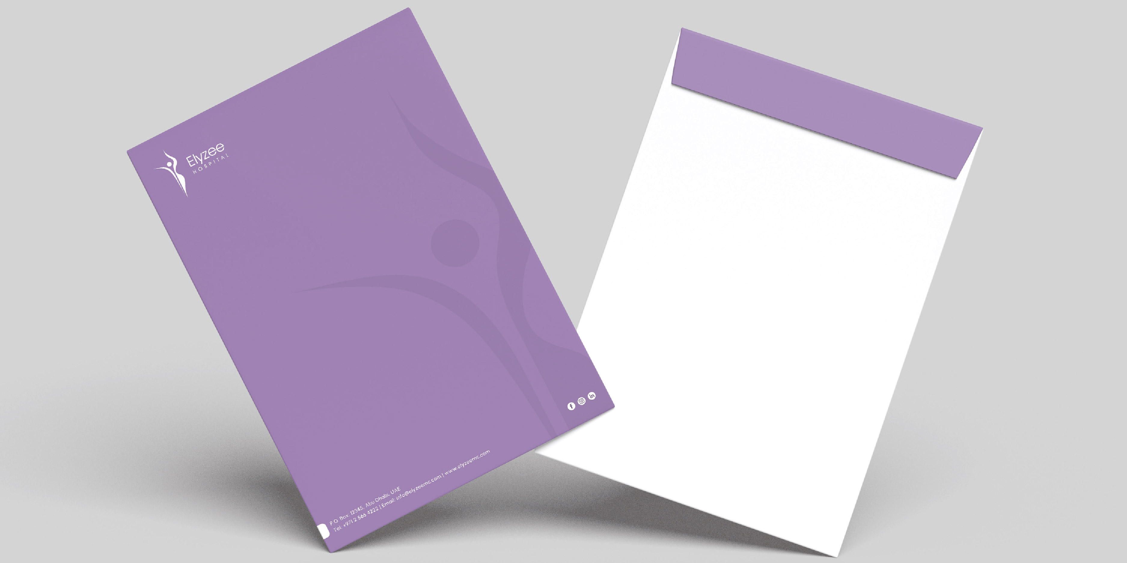
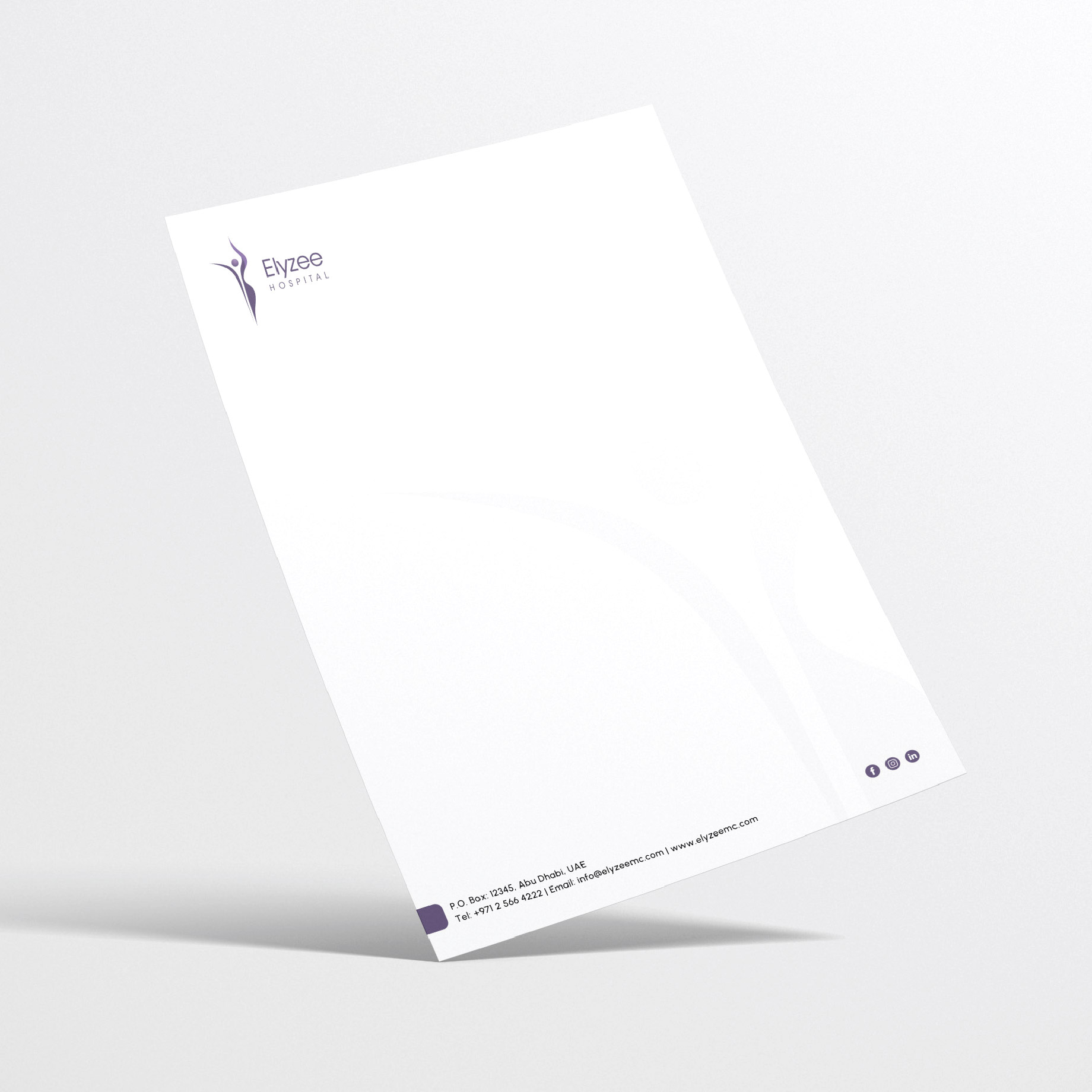
The Elyzee Hospital logo comprises two elements: the icon and the wordmark. The logo should always be used together with both elements and should not be modified, distorted, or redrawn. The icon symbolizes healthy human existence and is proportioned with three equal circles, ensuring consistency and recognizability across all applications.
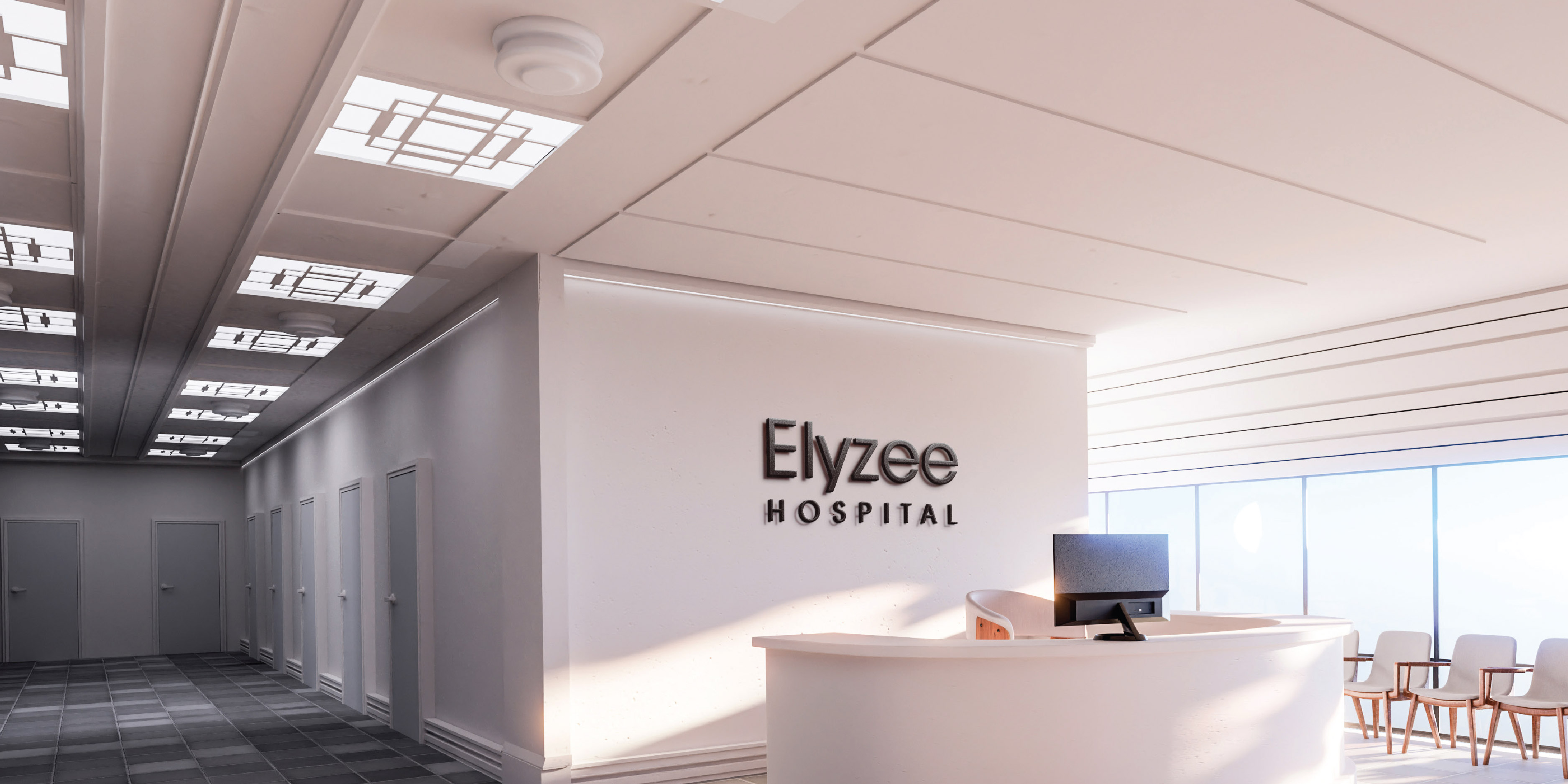
An exclusion zone surrounding the logo ensures its visibility and impact by keeping it free from any text or graphic elements. The logo should be surrounded by clear space to maximize attention and recognition. Variations in logo lockups are designed to accommodate different placement occasions and reduce the risk of congested areas in horizontal and vertical orientations.
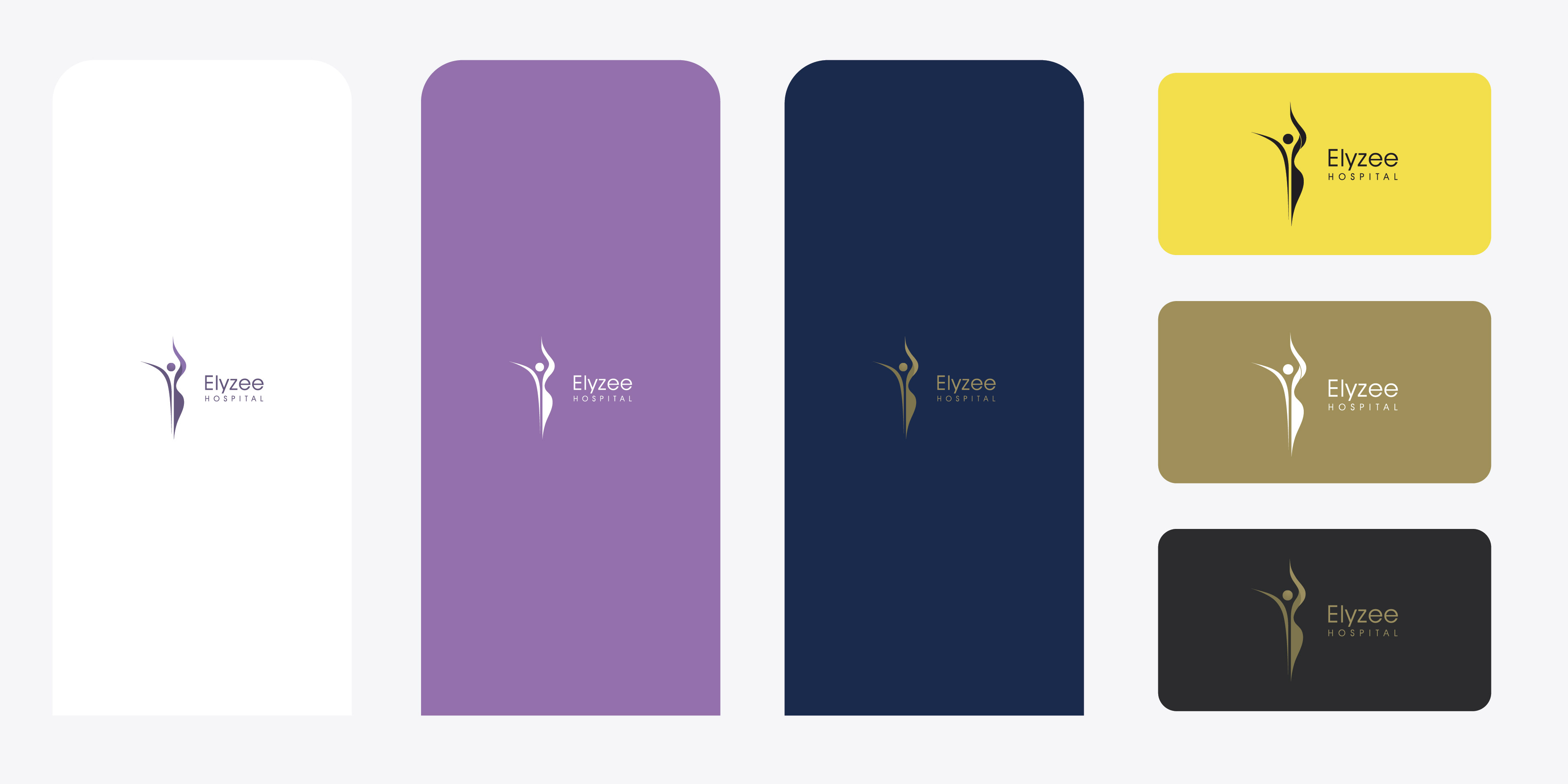
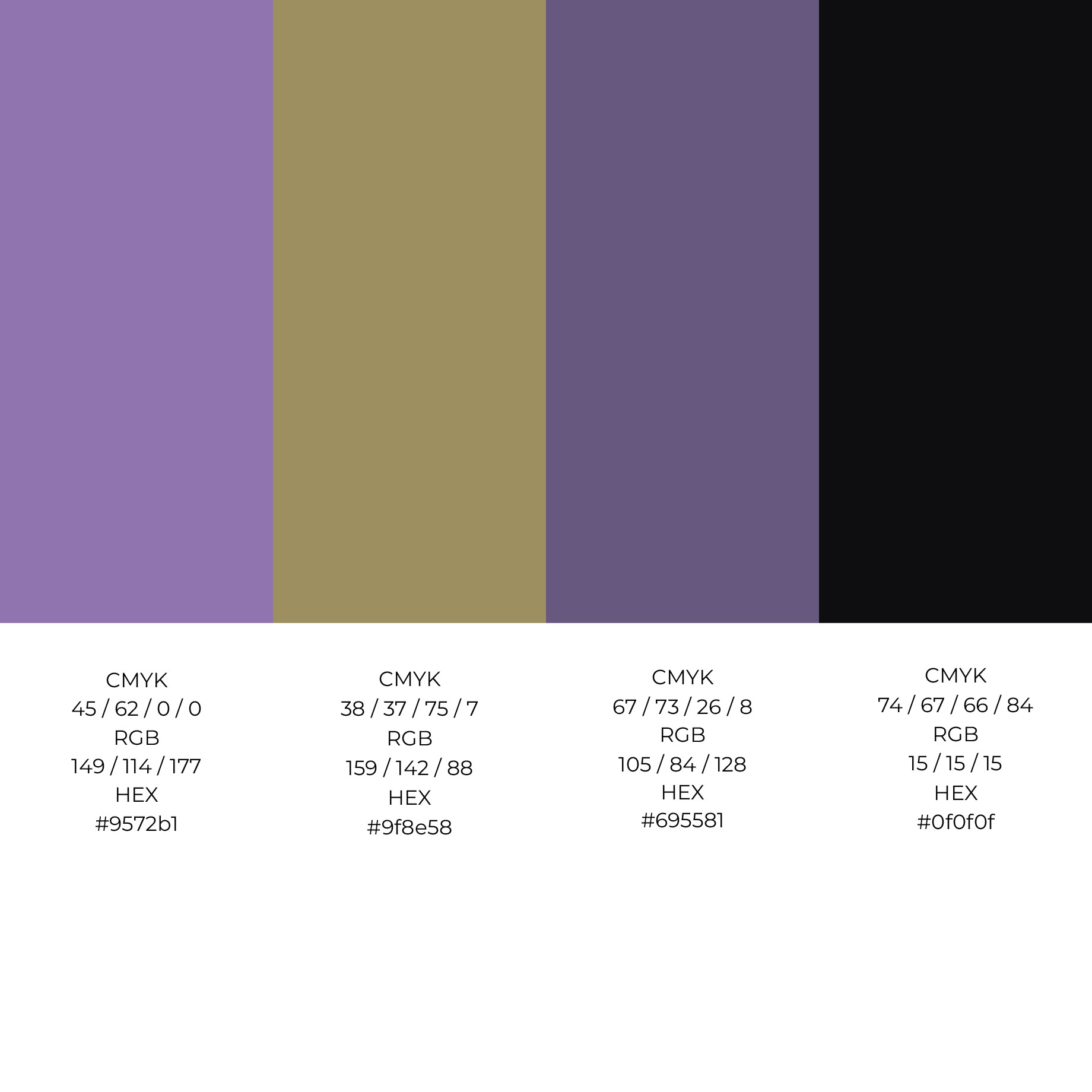
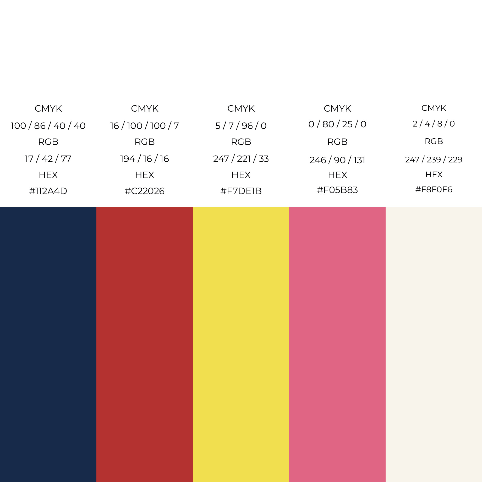
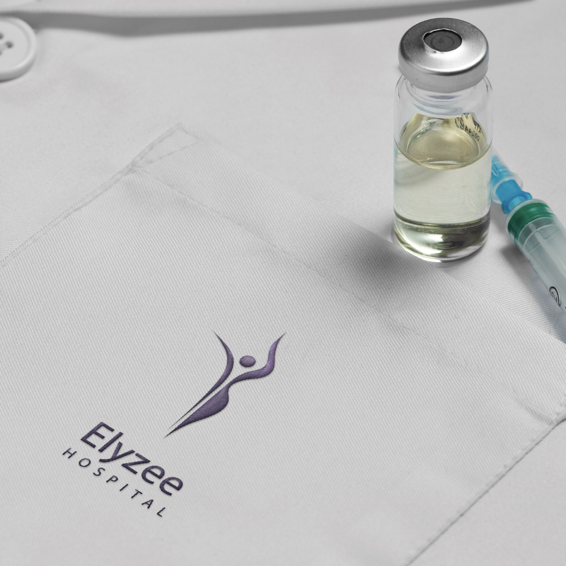
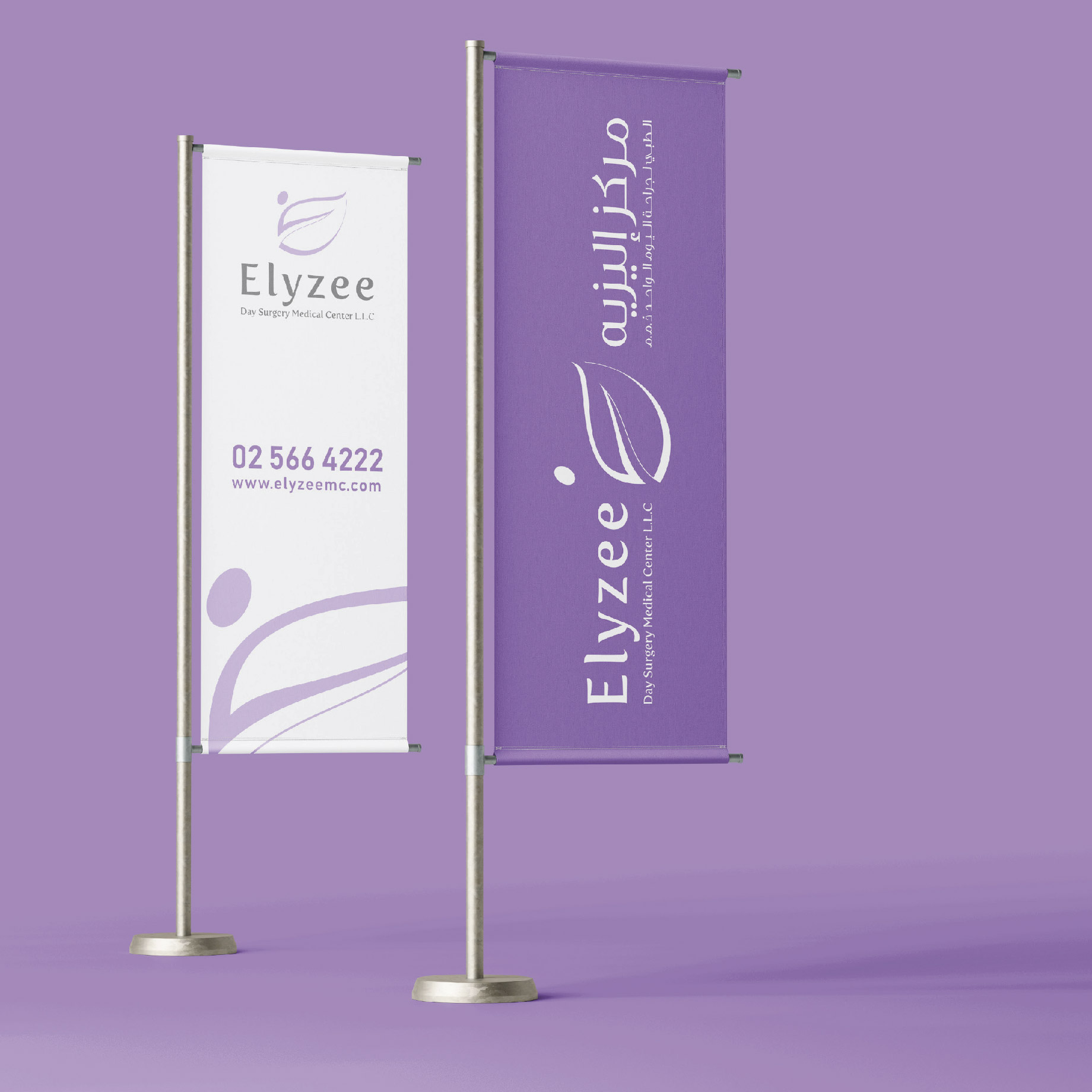
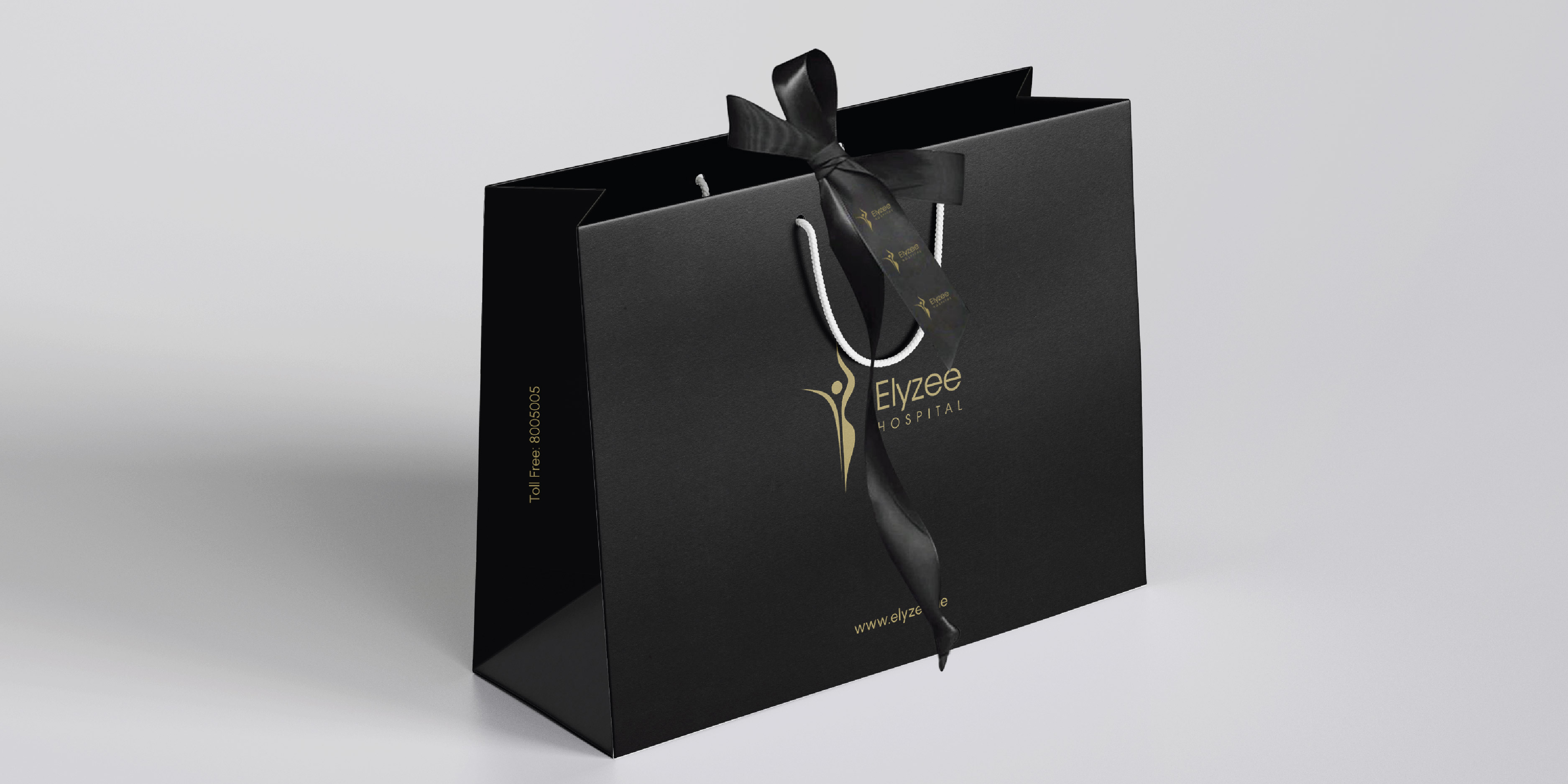
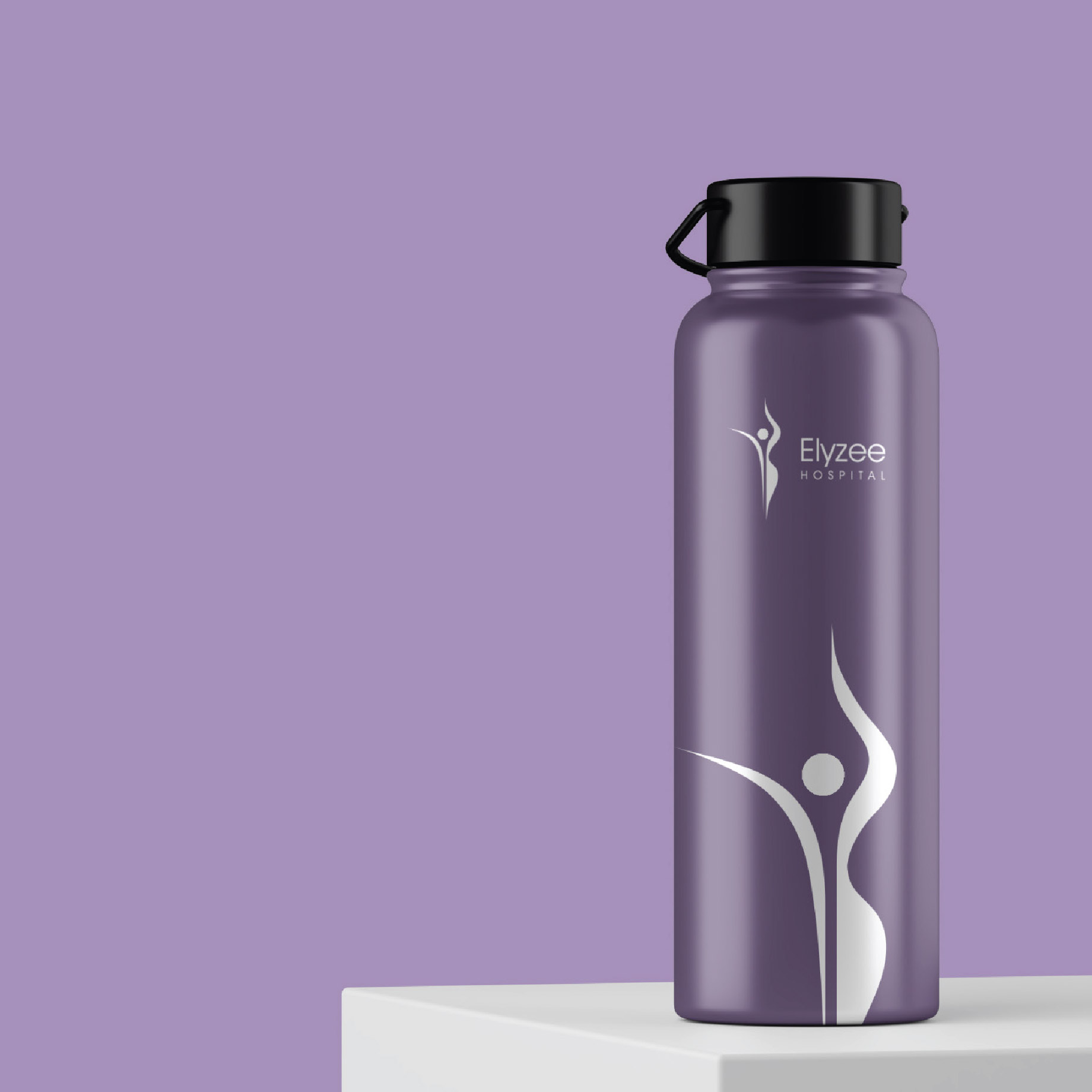
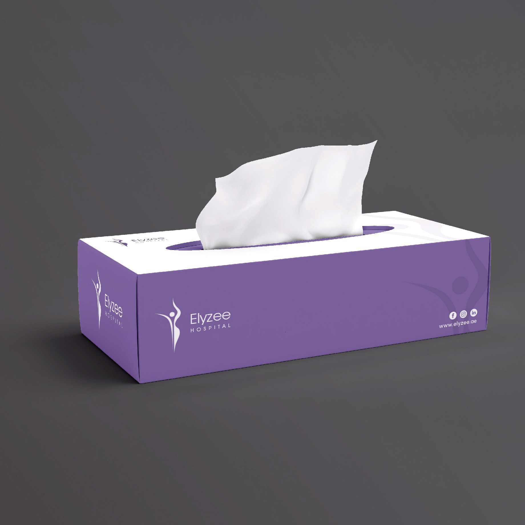
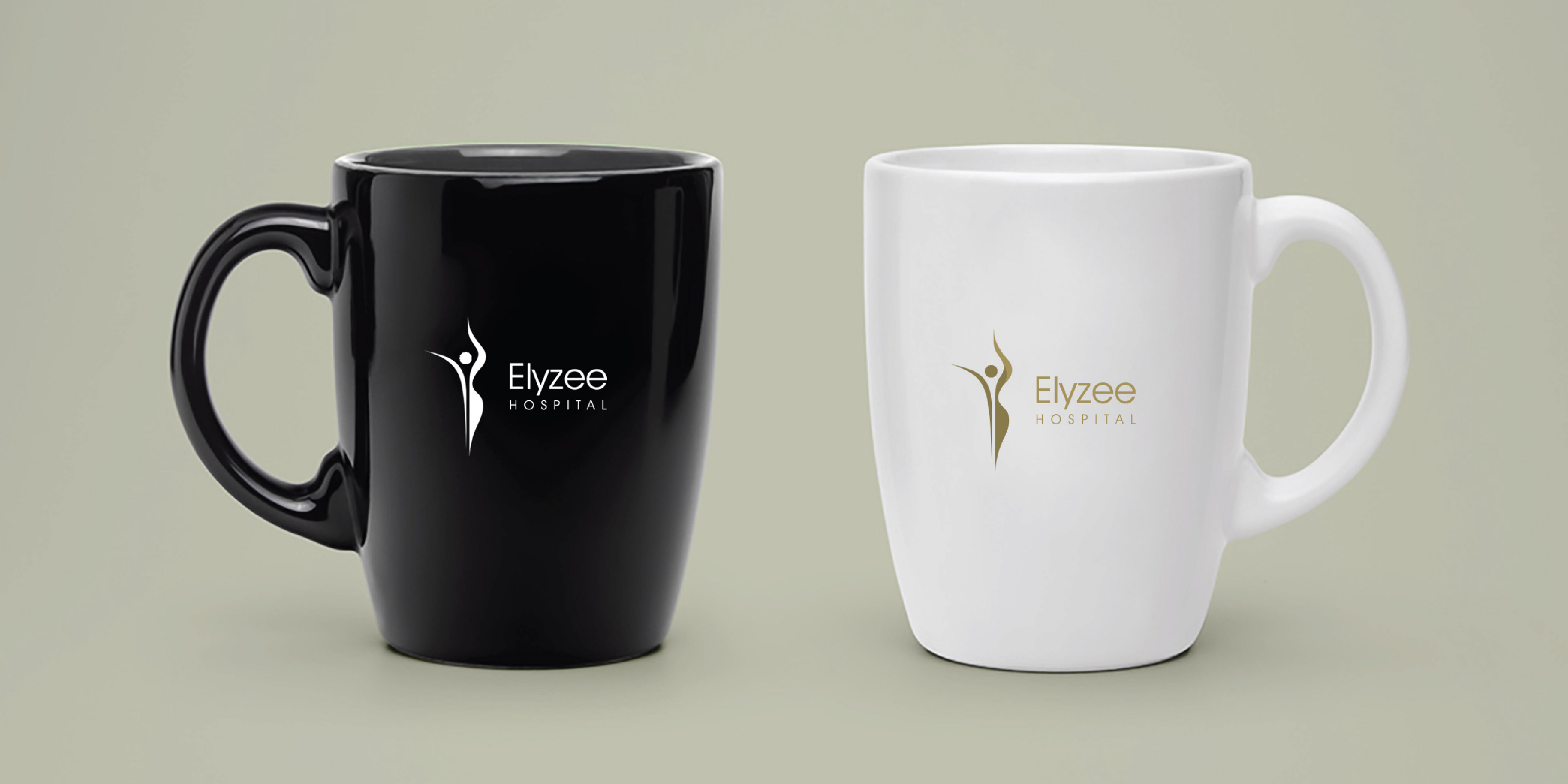
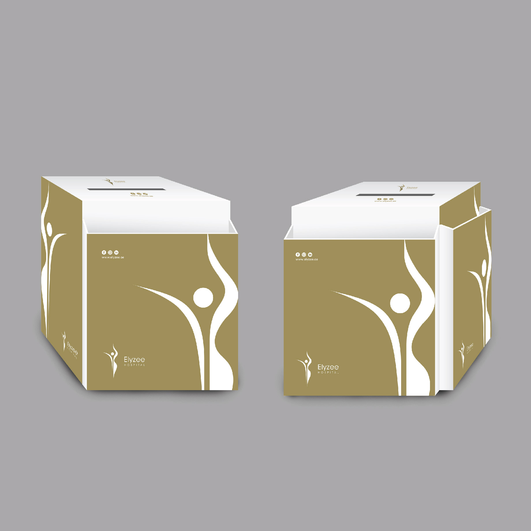
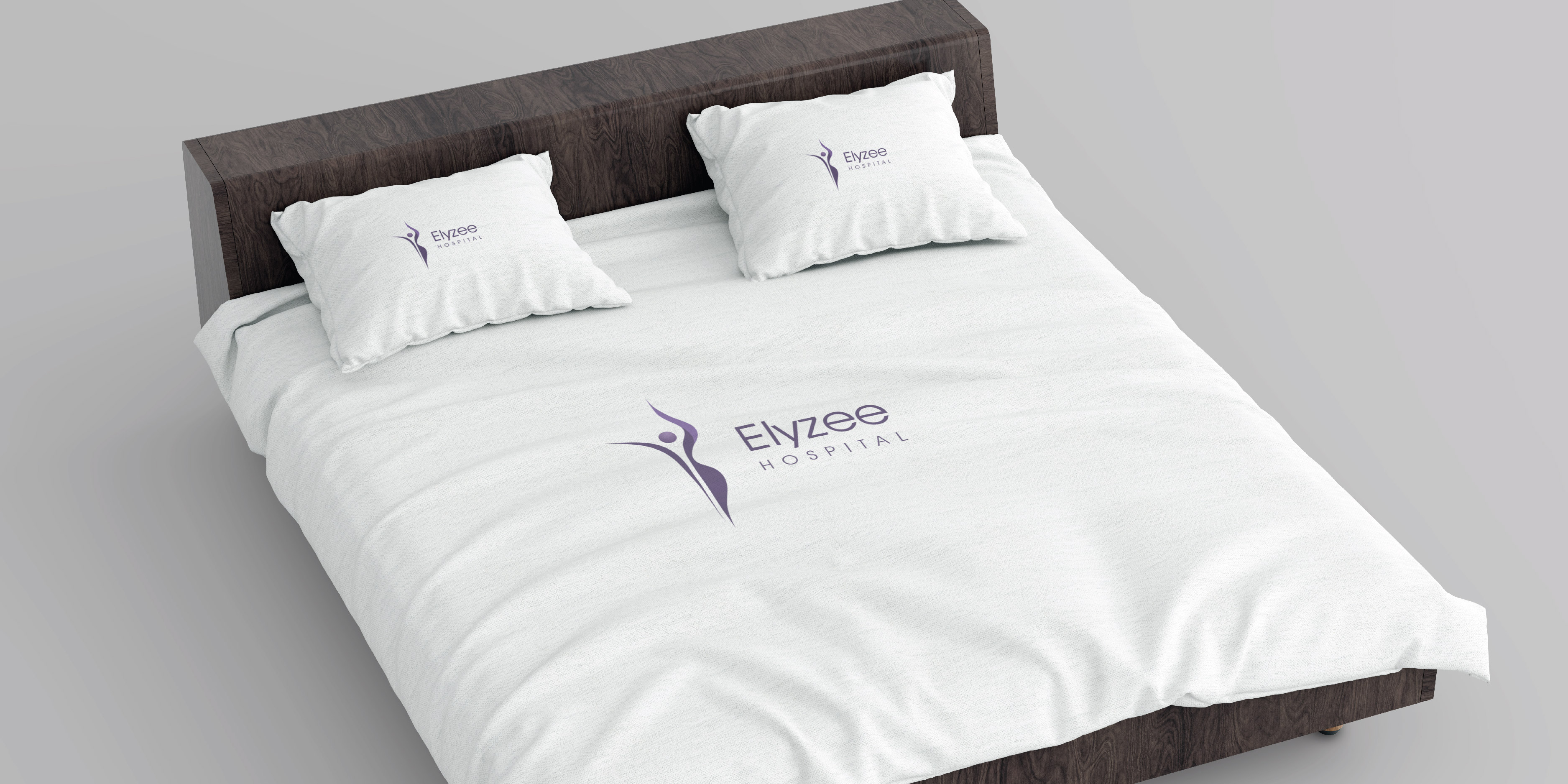
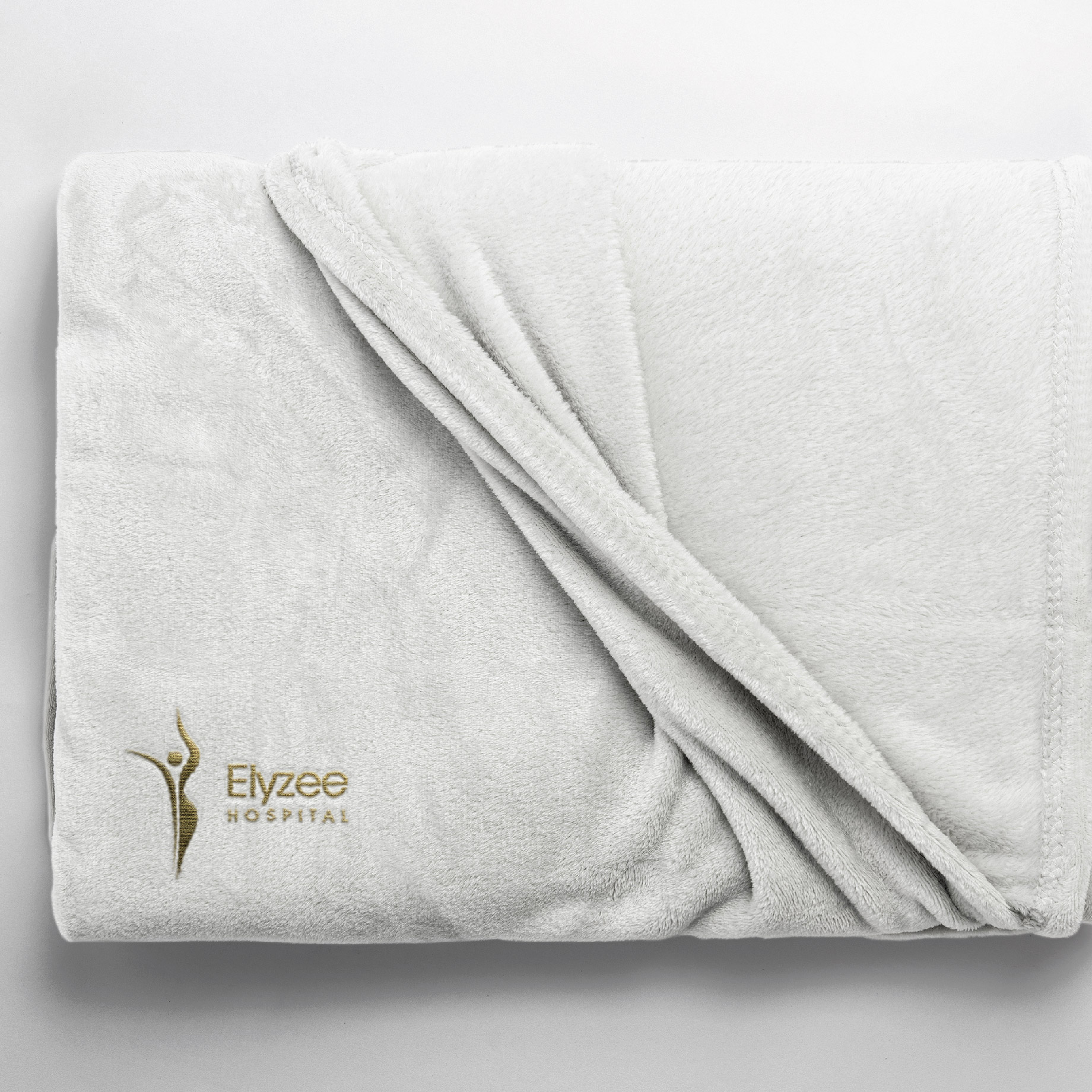
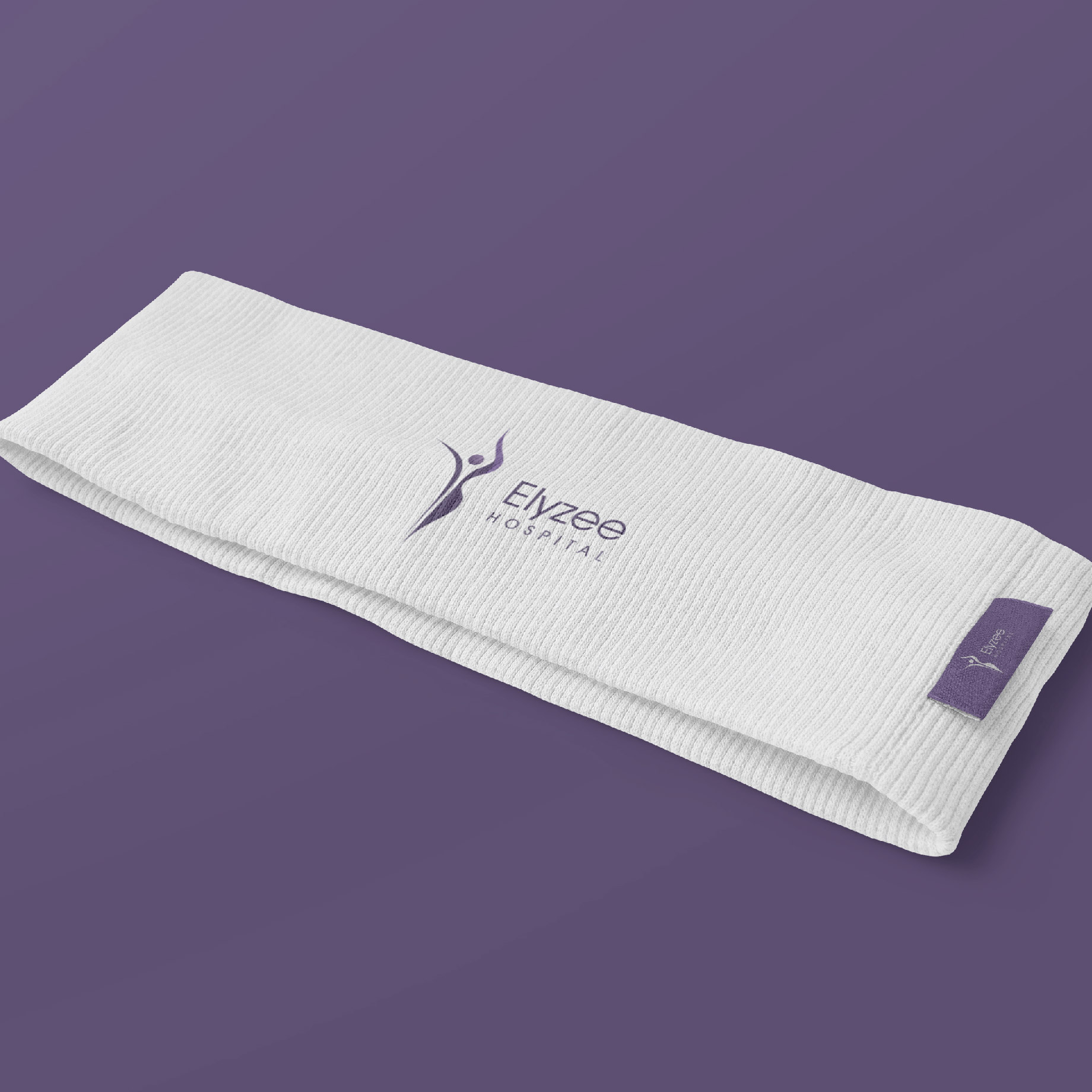
Elyzee Hospital›s primary colour palette includes purple and gold colour schemes, representing the premium brand in the health market. These colours are incorporated into the logo to create a distinctive and ownable look. Secondary colours complement the primary palette and are used for backgrounds, textures, and product photography.
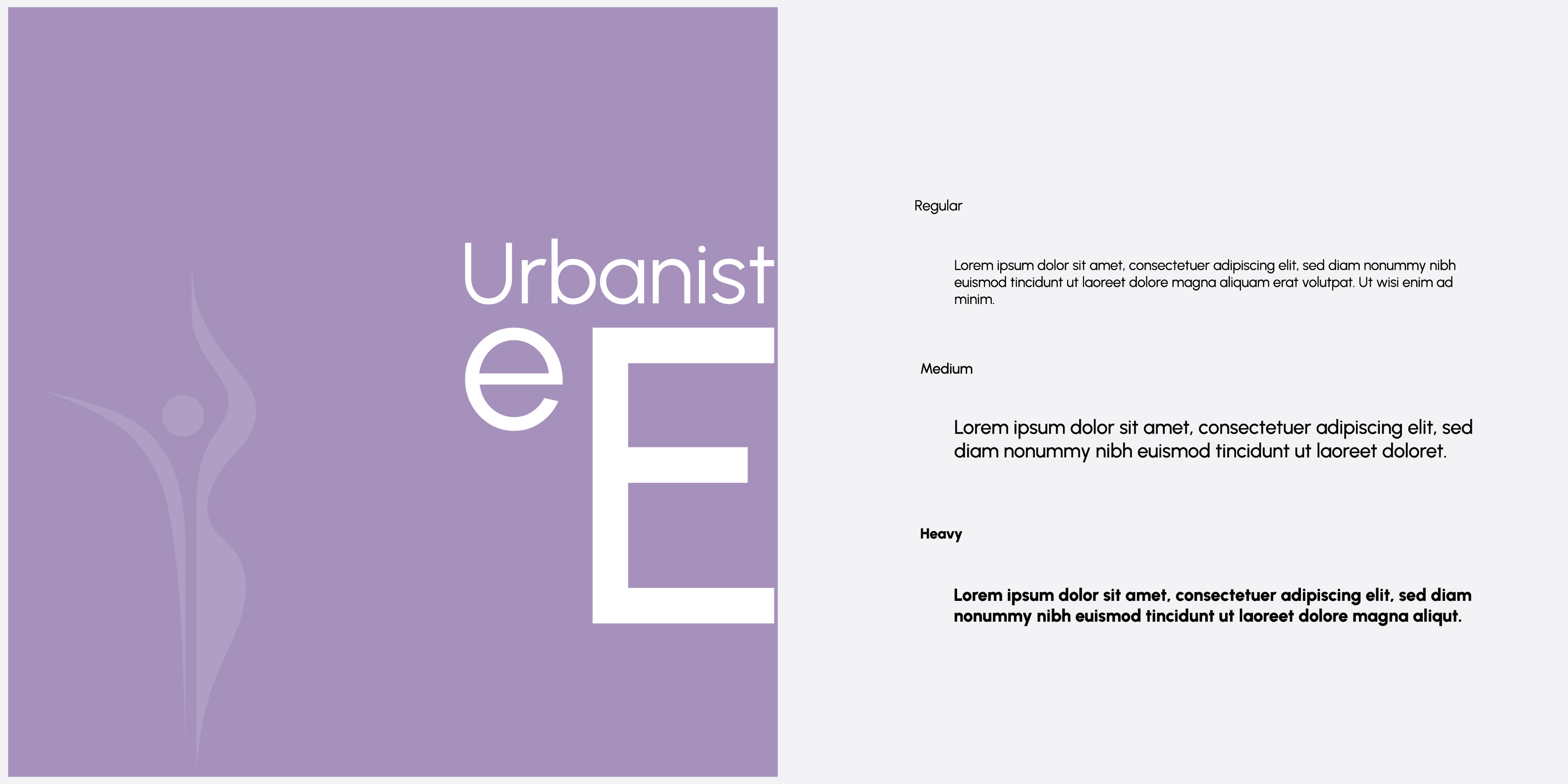
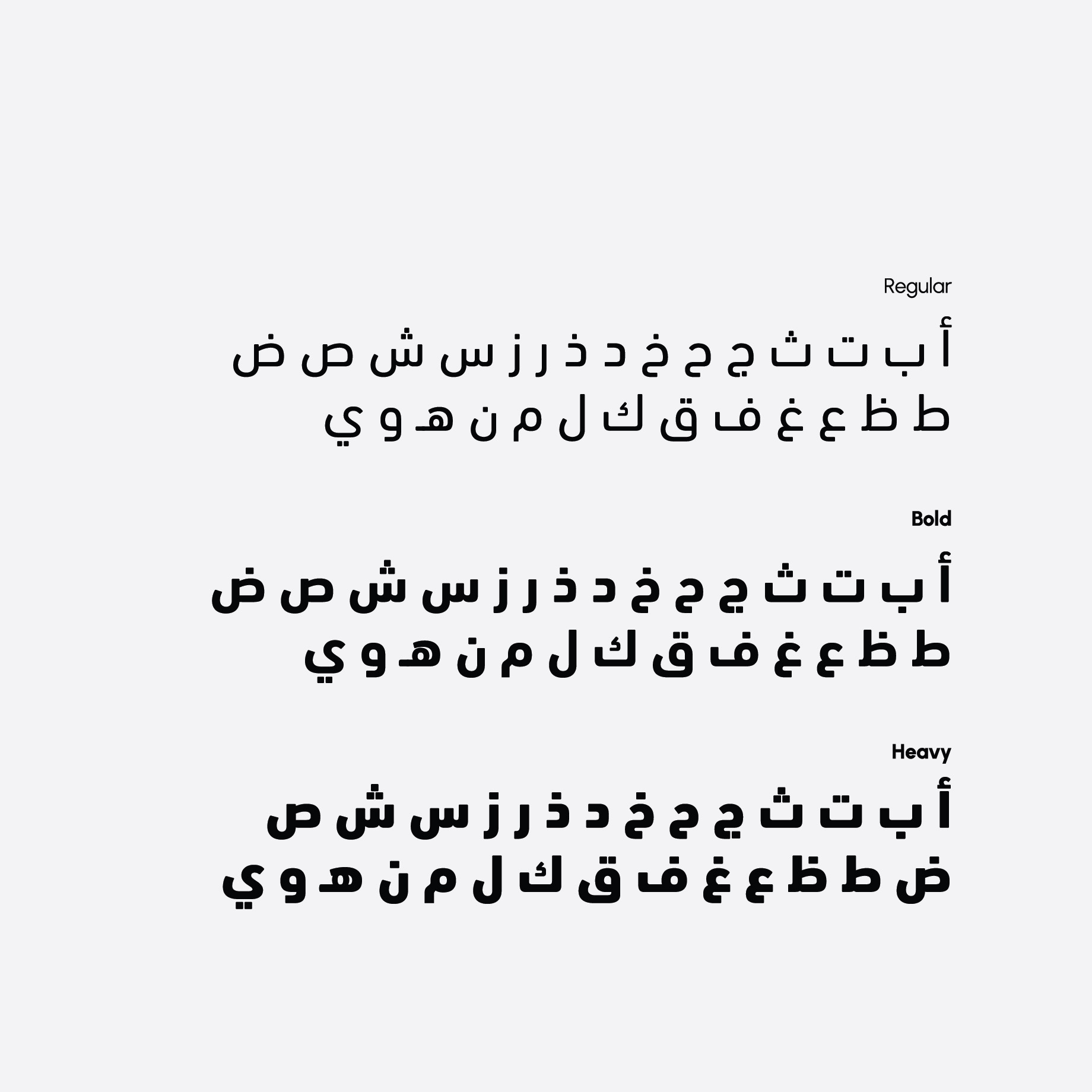
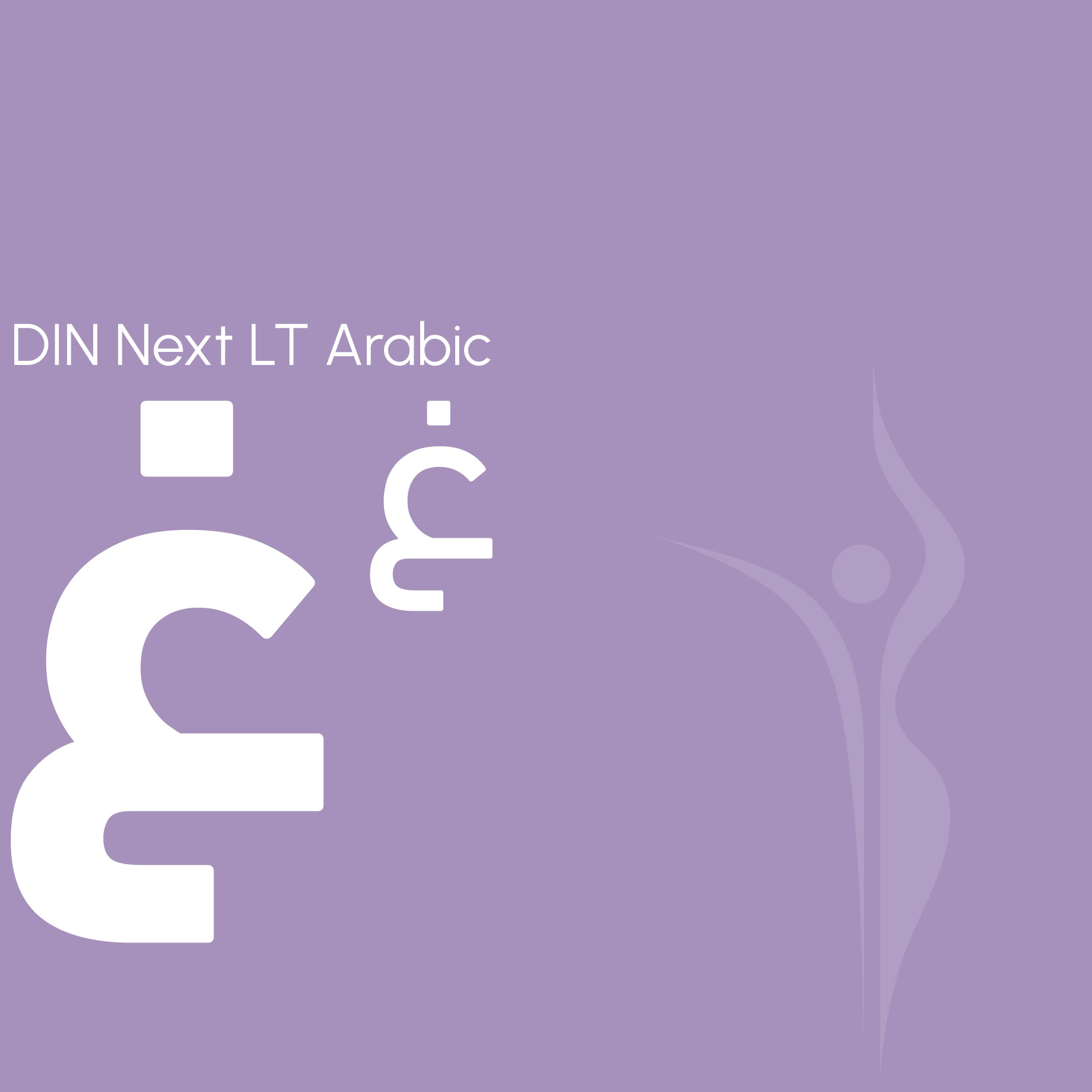
Urbanist is chosen as the primary English typeface for its modern, friendly, versatile, and minimalist design, ensuring high legibility across various applications. DIN Next LT Arabic is selected as the primary Arabic typeface to cater to bilingual communication needs, reflecting Elyzee Hospital›s commitment to inclusivity and accessibility
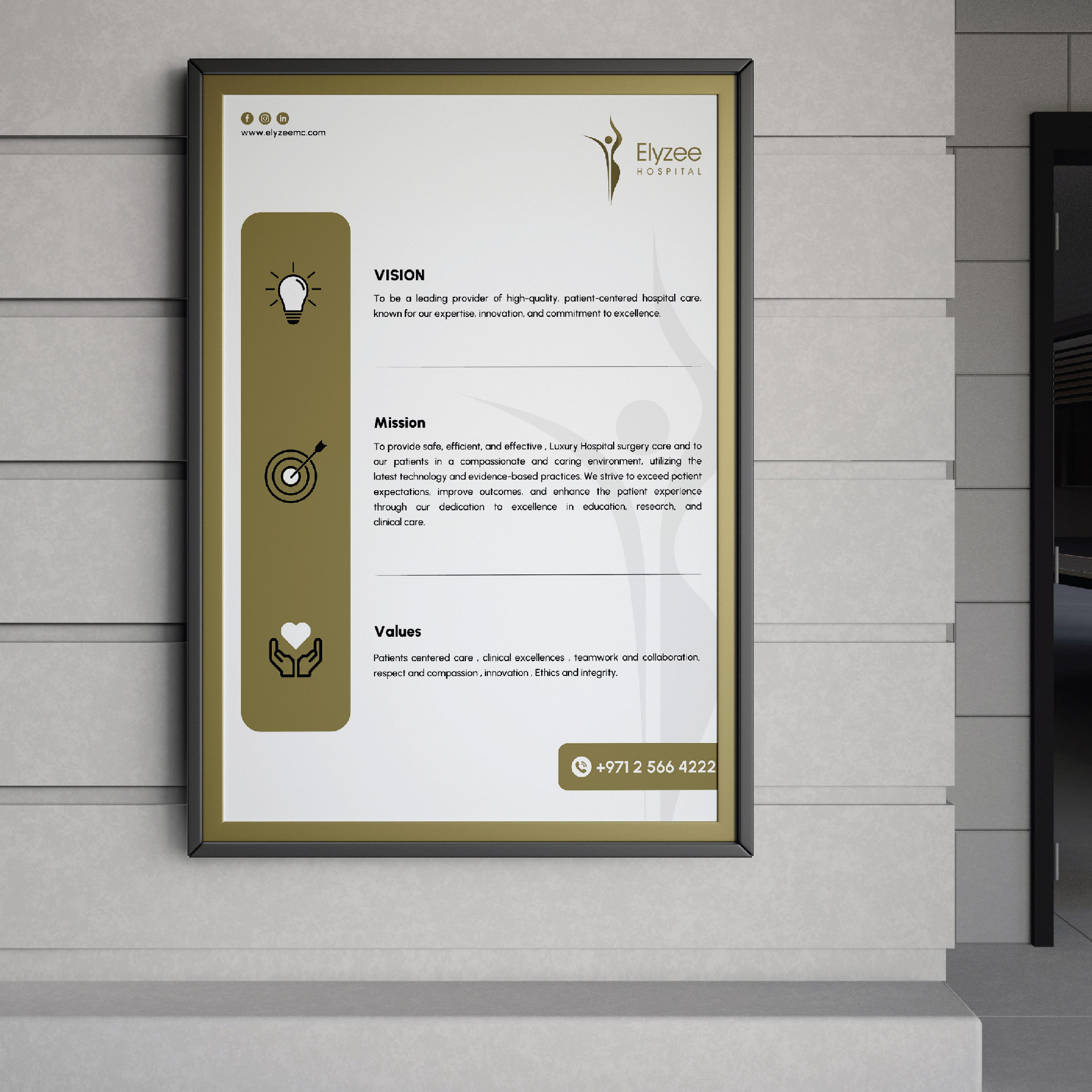
Elyzee Hospital›s brand expression revolves around professionalism, reliability, and premium healthcare services. Through consistent visual elements, messaging, and tone of voice, the brand communicates its dedication to providing exceptional medical care and fostering patient trust and satisfaction.


Elyzee Hospitals visual identity is characterized by its cohesive and recognizable design elements, including the logo, colour palette, typography, and imagery. Whether in digital or print media, Elyzee Hospital maintains consistency in its visual presentation to enhance brand recognition and foster patient loyalty and confidence.

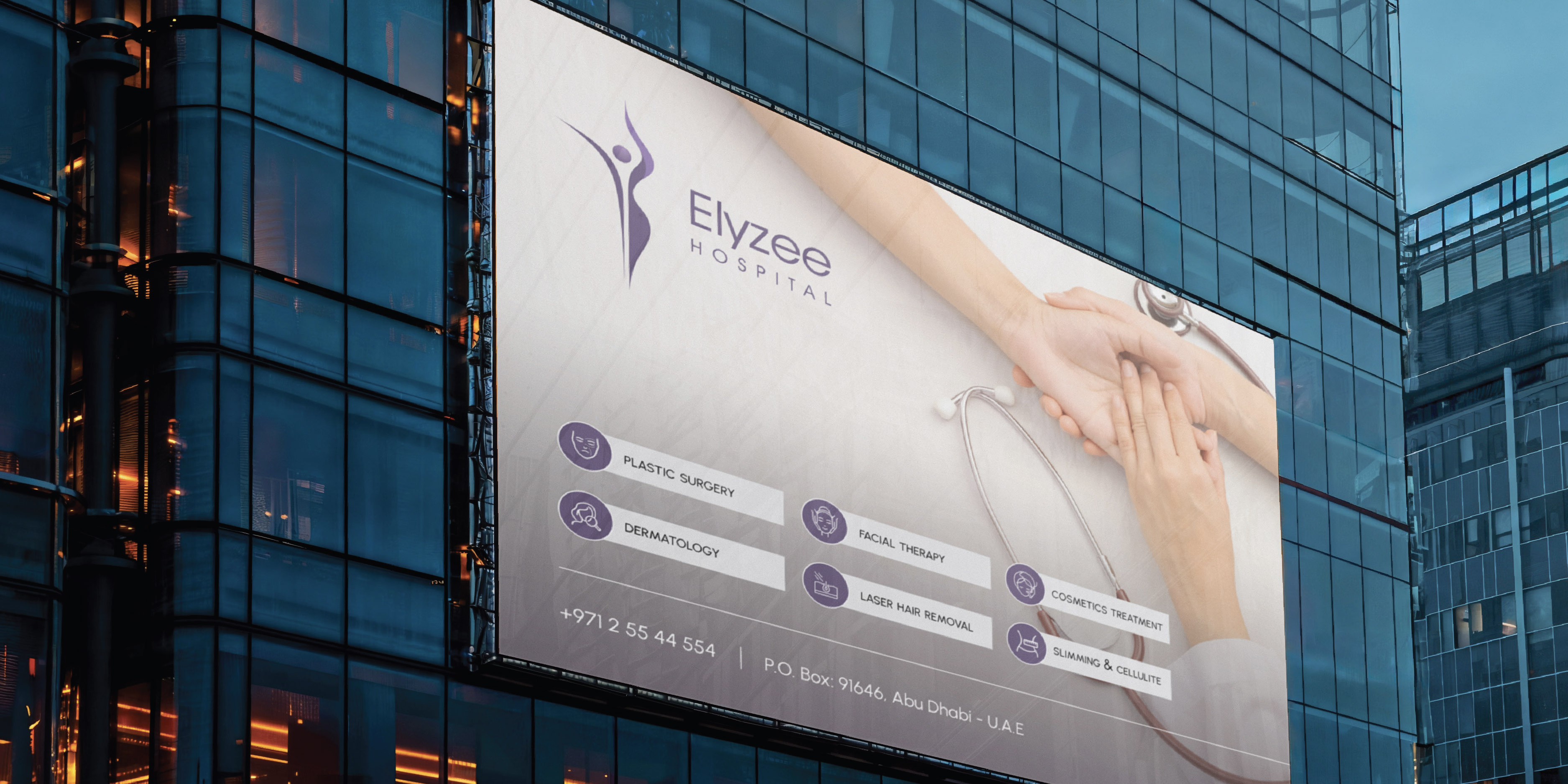
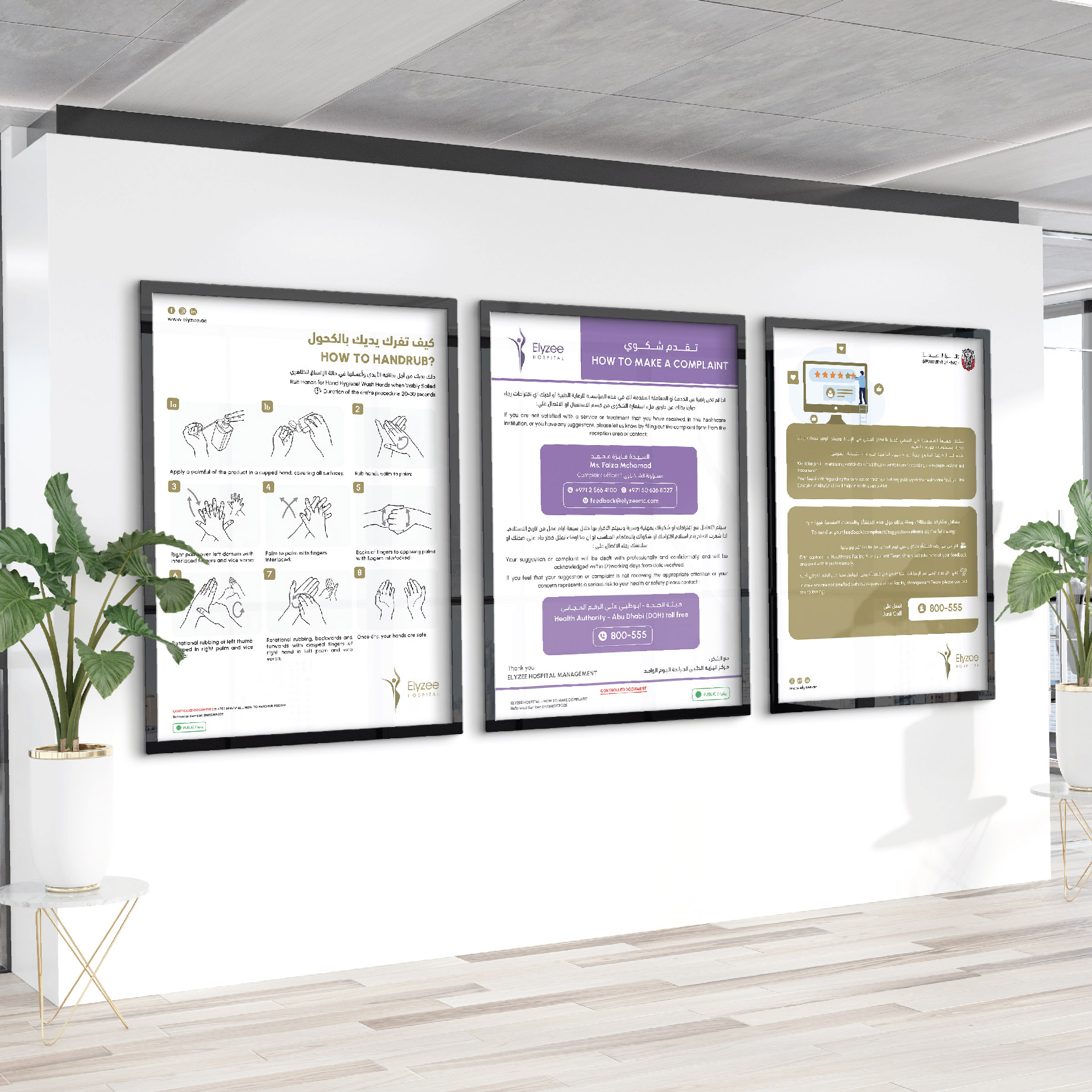


The branding project for Elyzee Hospital has successfully established a cohesive and recognizable brand identity. The logo, typography, and colour palette reflect the hospital›s commitment to professionalism and premium healthcare services. Clear positioning guidelines ensure consistent and impactful logo placement across various platforms. Overall, Elyzee Hospital now stands out as a trusted healthcare provider in Abu Dhabi, UAE, setting it apart from competitors and reinforcing its commitment to excellence