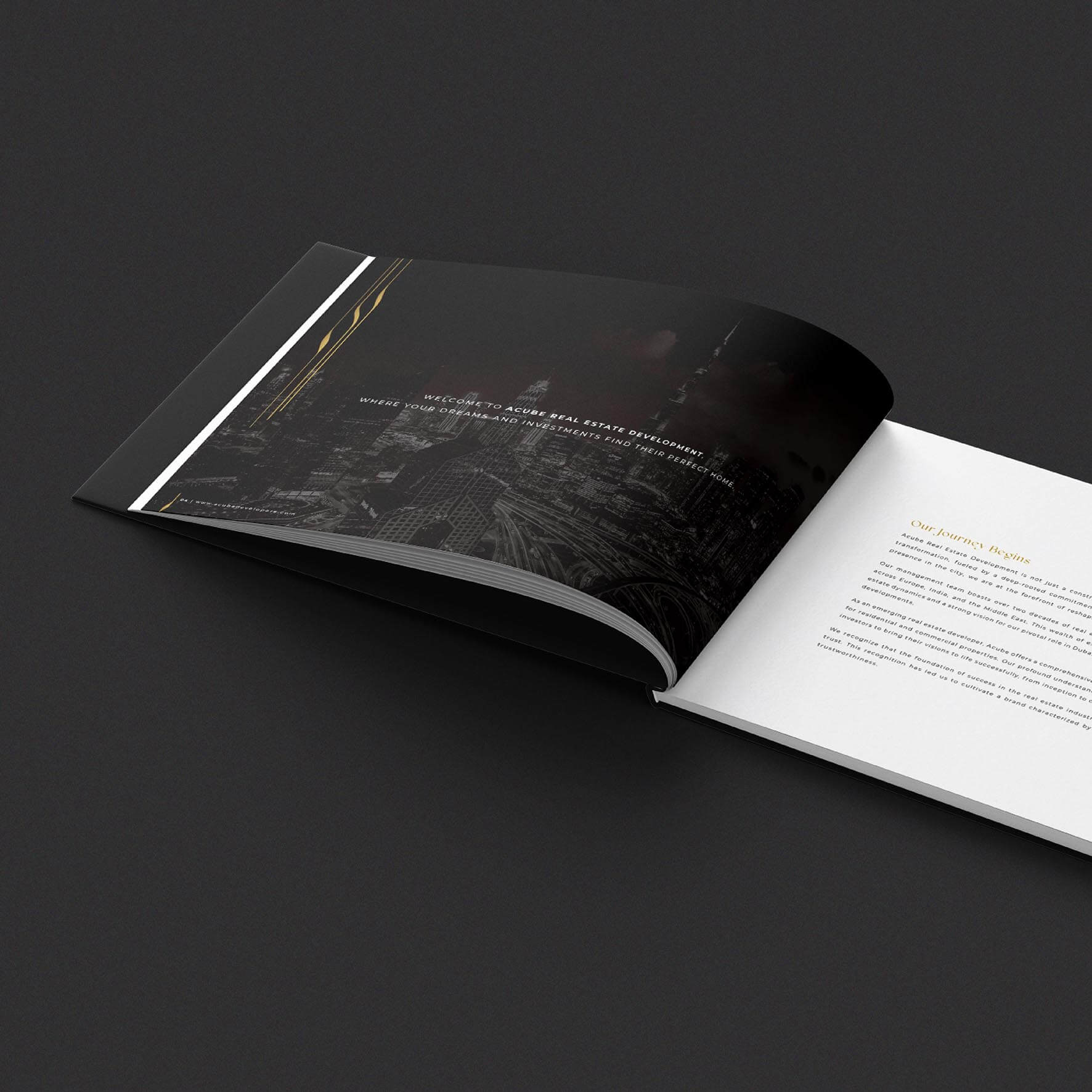
To develop a brand story for their existing Logo - Establish the ACUBE brand, highlighting exemplary practices and tangible advantages. Position ACUBE as a brand synonymous with intellect, innovation, dependability, meticulousness, and foresight – a distinctive offering within the industry. Distinguish the brand with a unique identity that sets it apart from conventional industry competitors. ACUBE should aim to be a company guided by its brand
The ACUBE logo derives its inspiration from the concept of a cube, symbolizing unity, solidity, strength, and reliability. The cube represents the company's six founders, all of whom have names starting with the letter 'A.' The logo's modern typography, combined with the clever integration of the letters 'C' and 'U,' enhances ACUBE's creativity and uniqueness. The design conveys strength, unity, innovation, and individuality in real estate development.
The logo is designed to maintain clarity and impact across various applications and reproduction methods. Minimum size specifications and exclusion zones ensure that the logo remains legible and visually striking in all contexts
Primary Colours - Core Colours: Gold: Symbolizing wealth, success, and knowledge, representing prestige and high status. Black: Signifying power, authority, and modernity, exuding professionalism and seriousness while radiating elegance, substance, and influence. Gradients: Gradients are utilized to elevate the brand's appeal, adding a premium touch to ACUBE's visual identity.
Primary Typeface – English: The Montserrat font family is chosen for its simplicity, legibility, and variety of weights, ensuring a consistent and modern look across ACUBE's collaterals. Secondary Typeface – English: Arial serves as the fallback font, ensuring accessibility for all users across presentations, emails, letters, and various applications. Primary Typeface – Arabic: Avenir Arabic is selected to cater to ACUBE's diverse audience effectively, offering a bilingual version of the brand with its simplicity and readability
ACUBE's visual identity embraces fluidity and dynamism, reflecting the brand's dedication to modernity and high standards in infrastructure development. The design's fluid lines convey a sense of openness and spaciousness, symbolizing freedom and creative potential. It embodies ACUBE's forward-thinking spirit and commitment to excellence, making a powerful statement of sophistication and progressiveness.
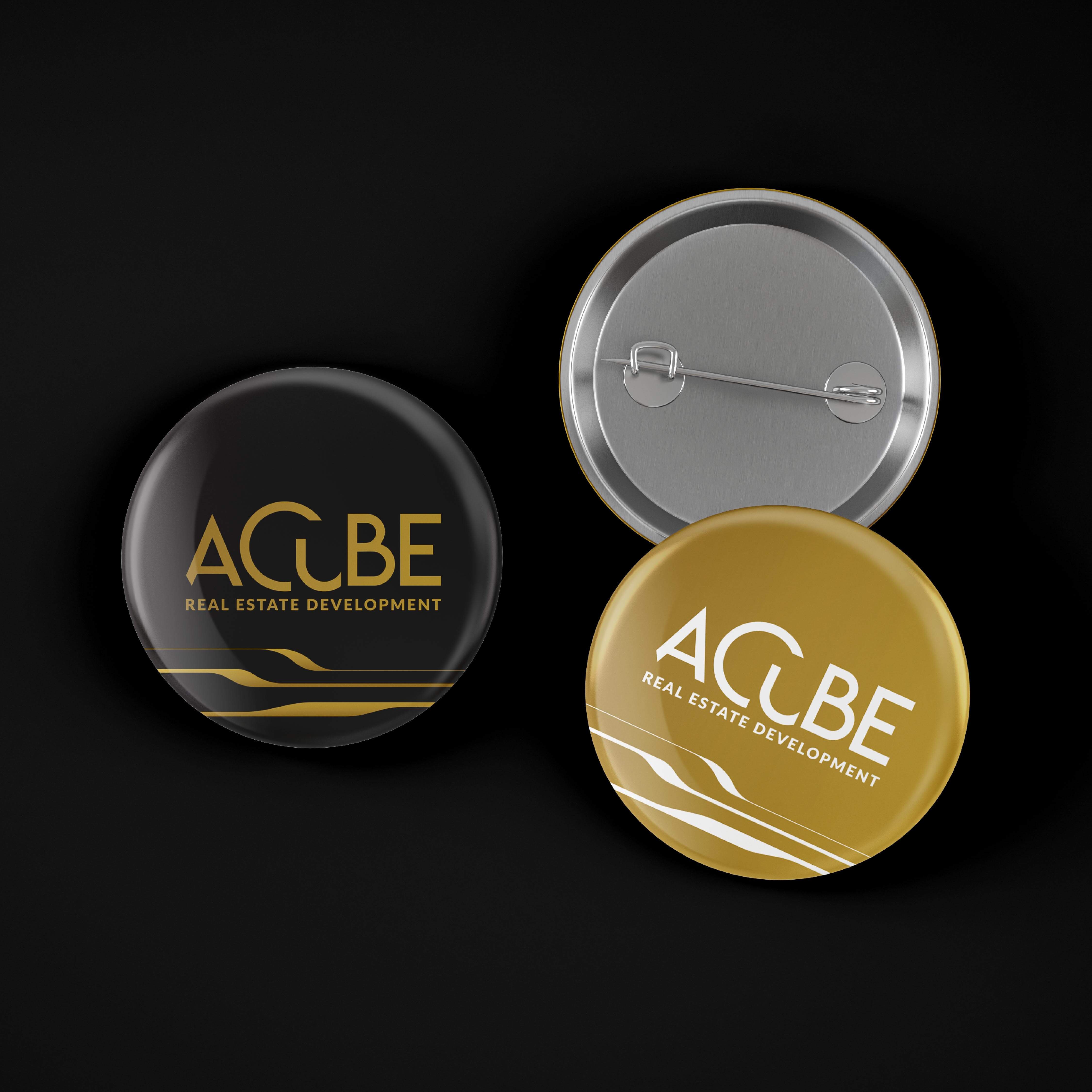
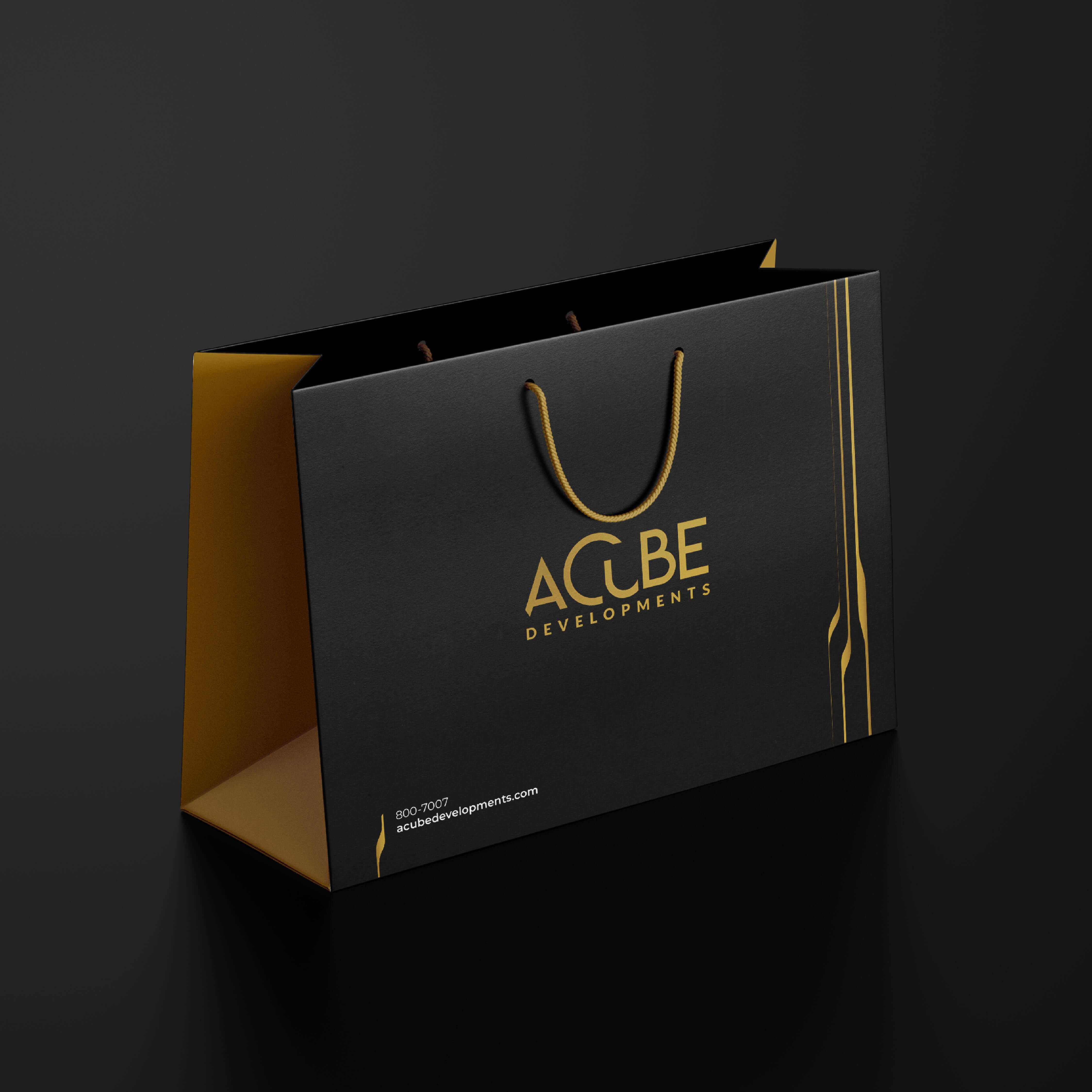
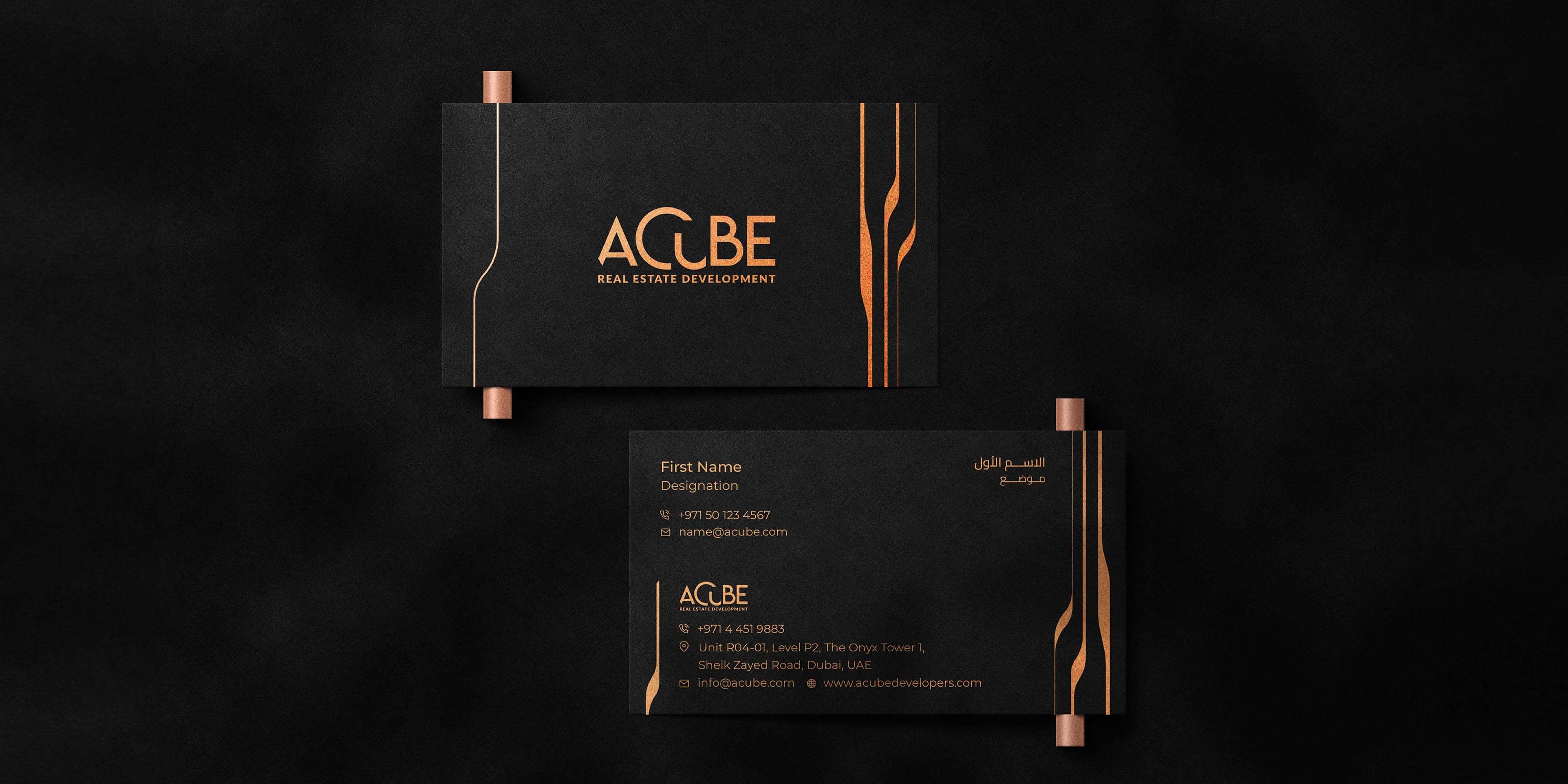
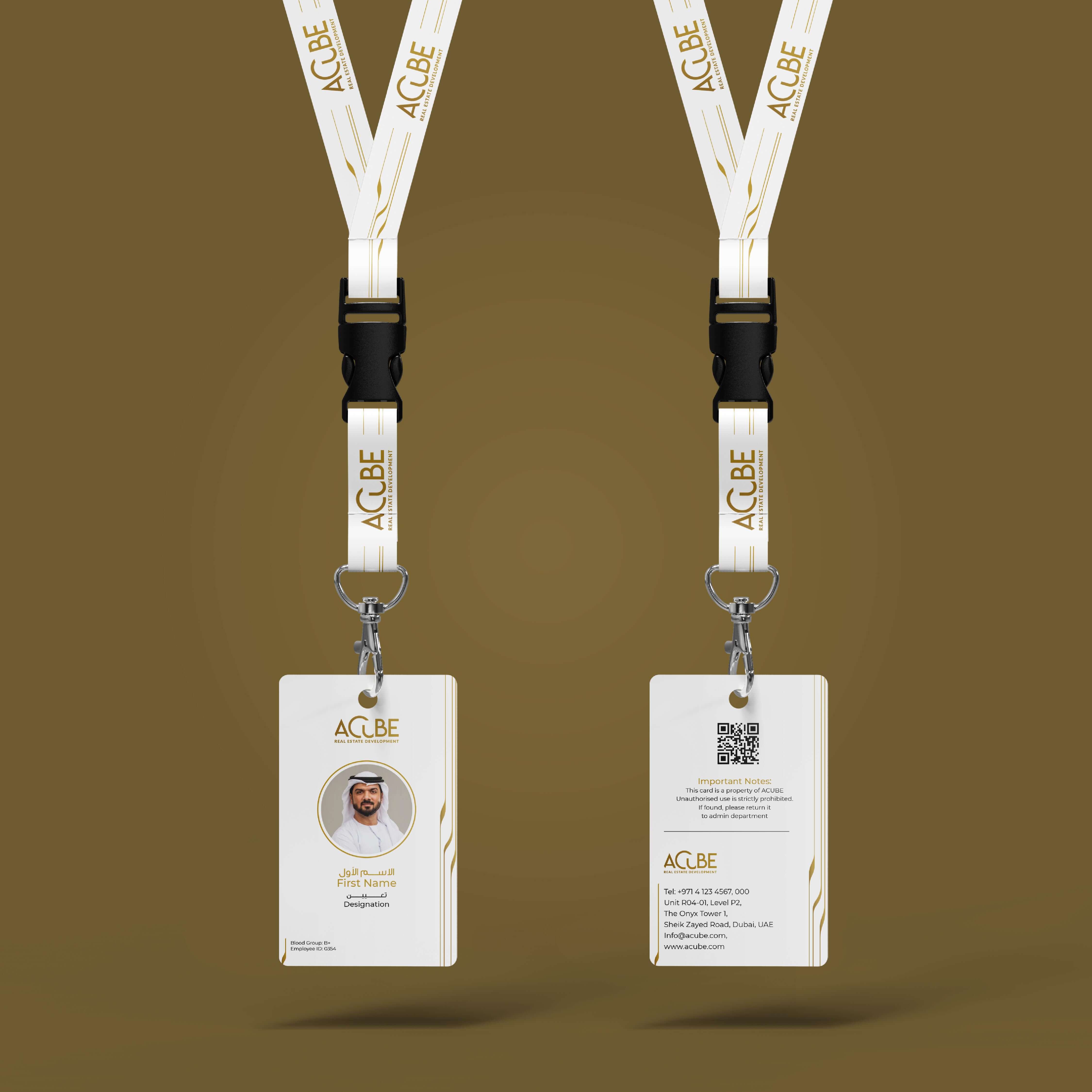
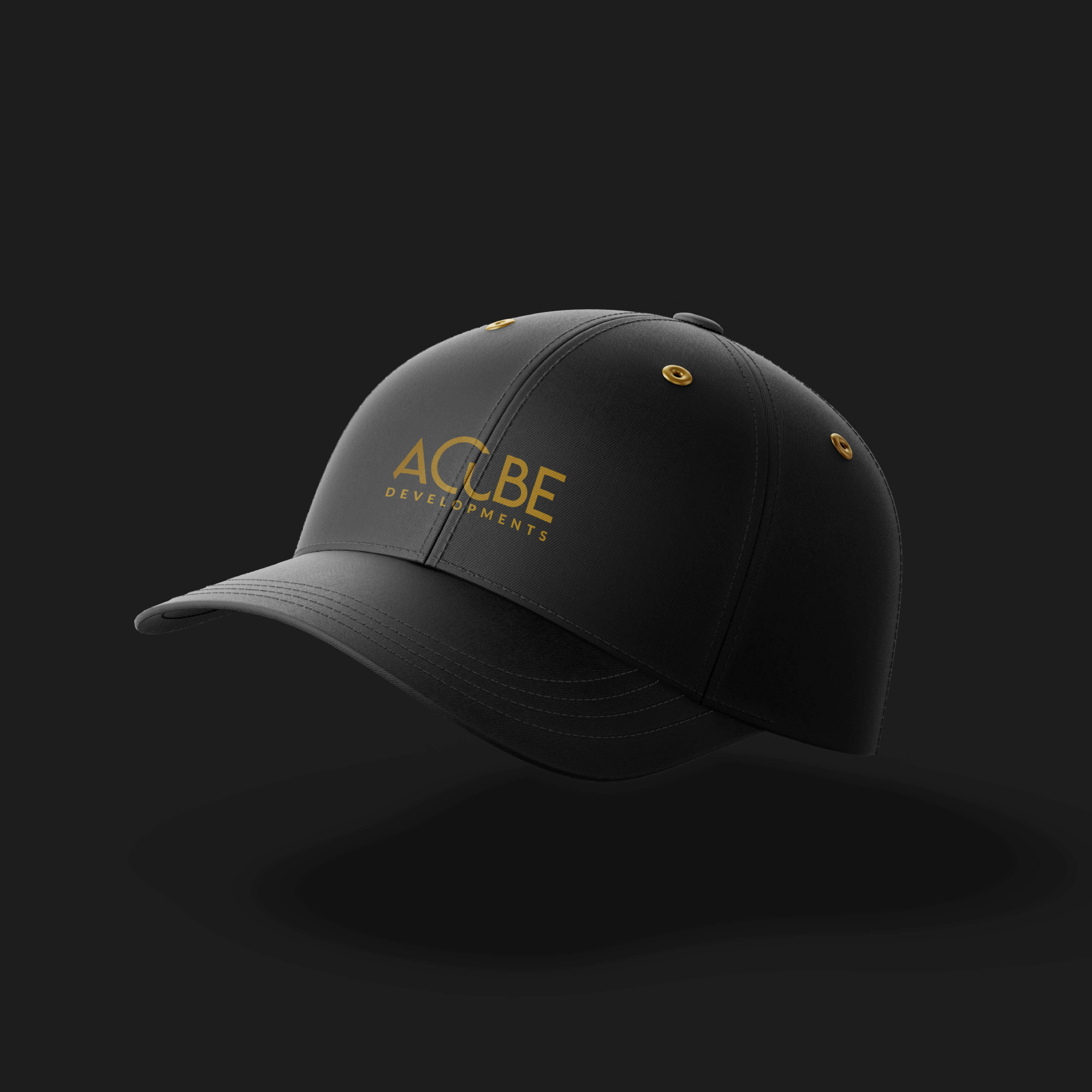
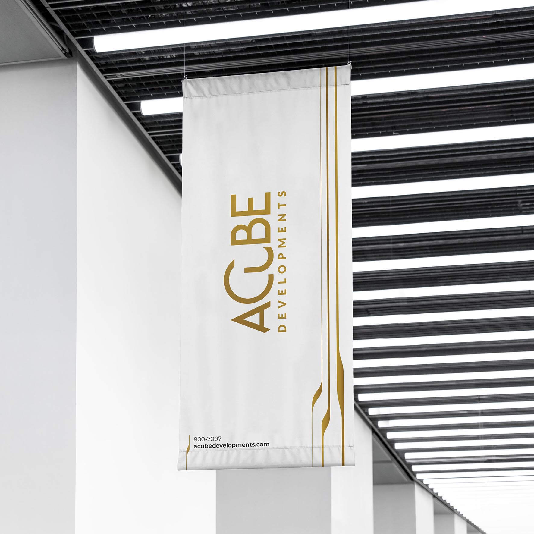
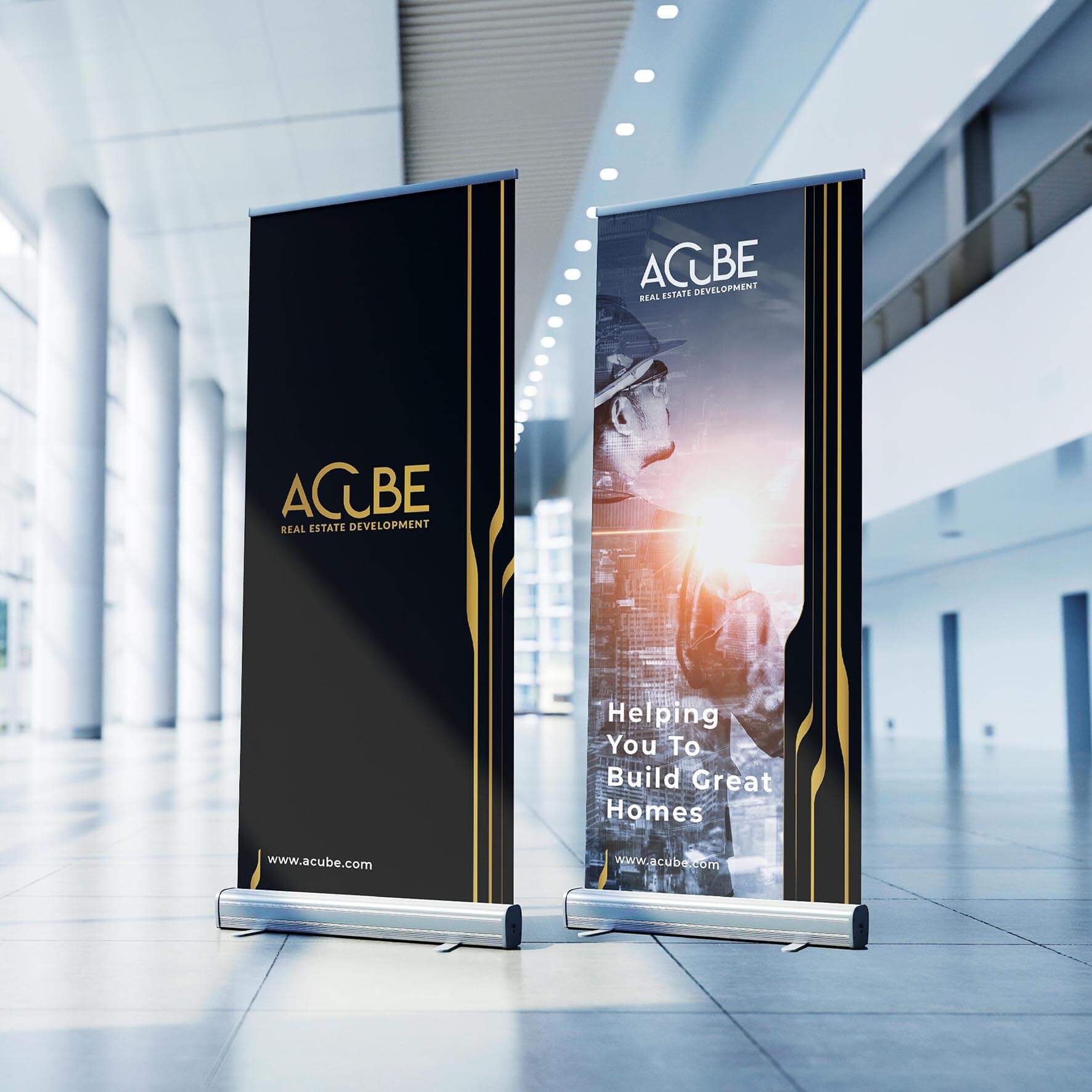
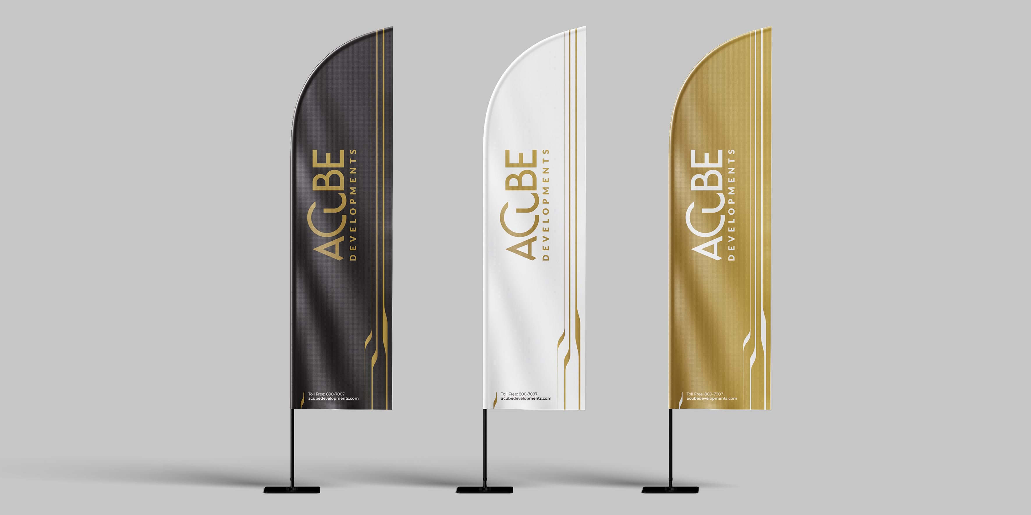
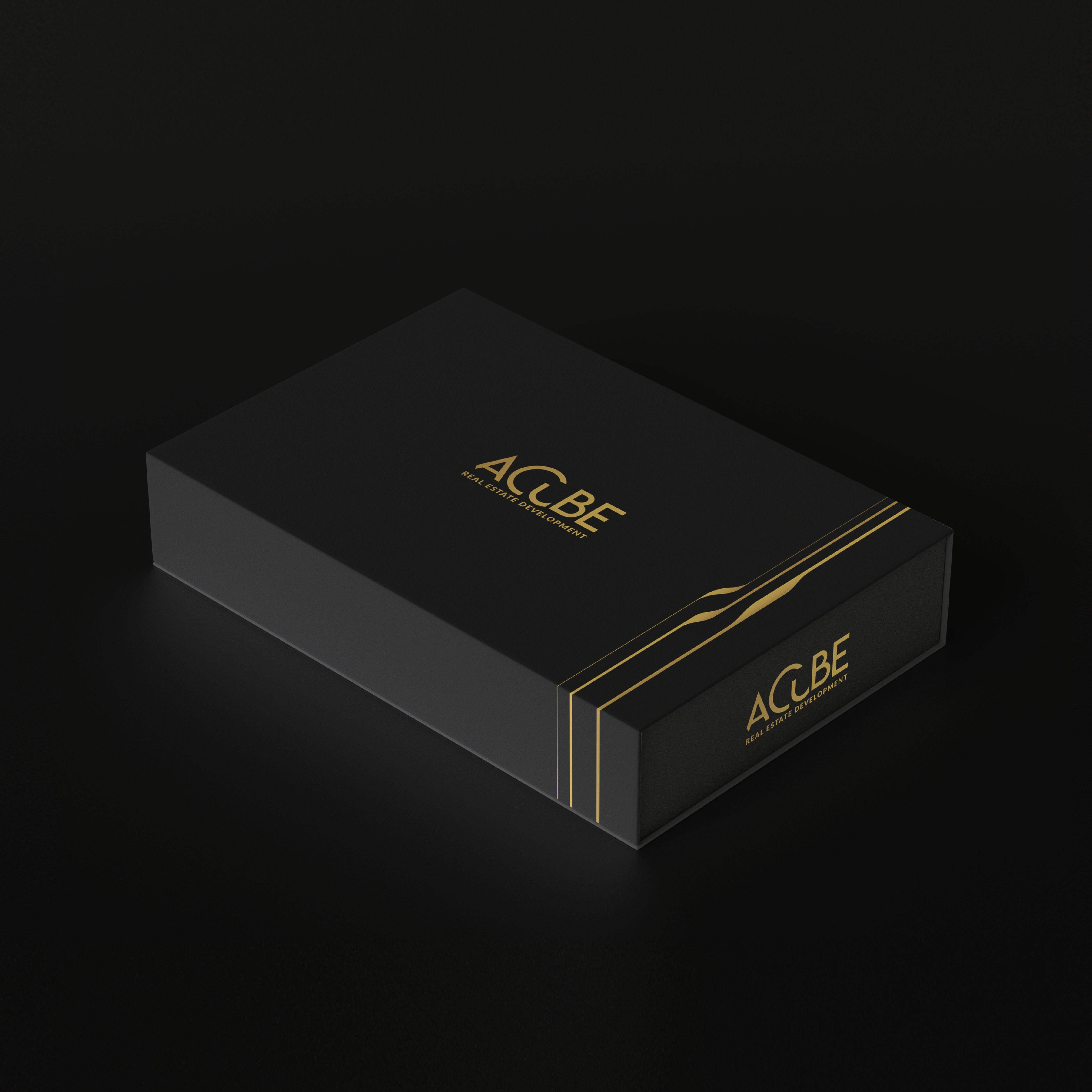
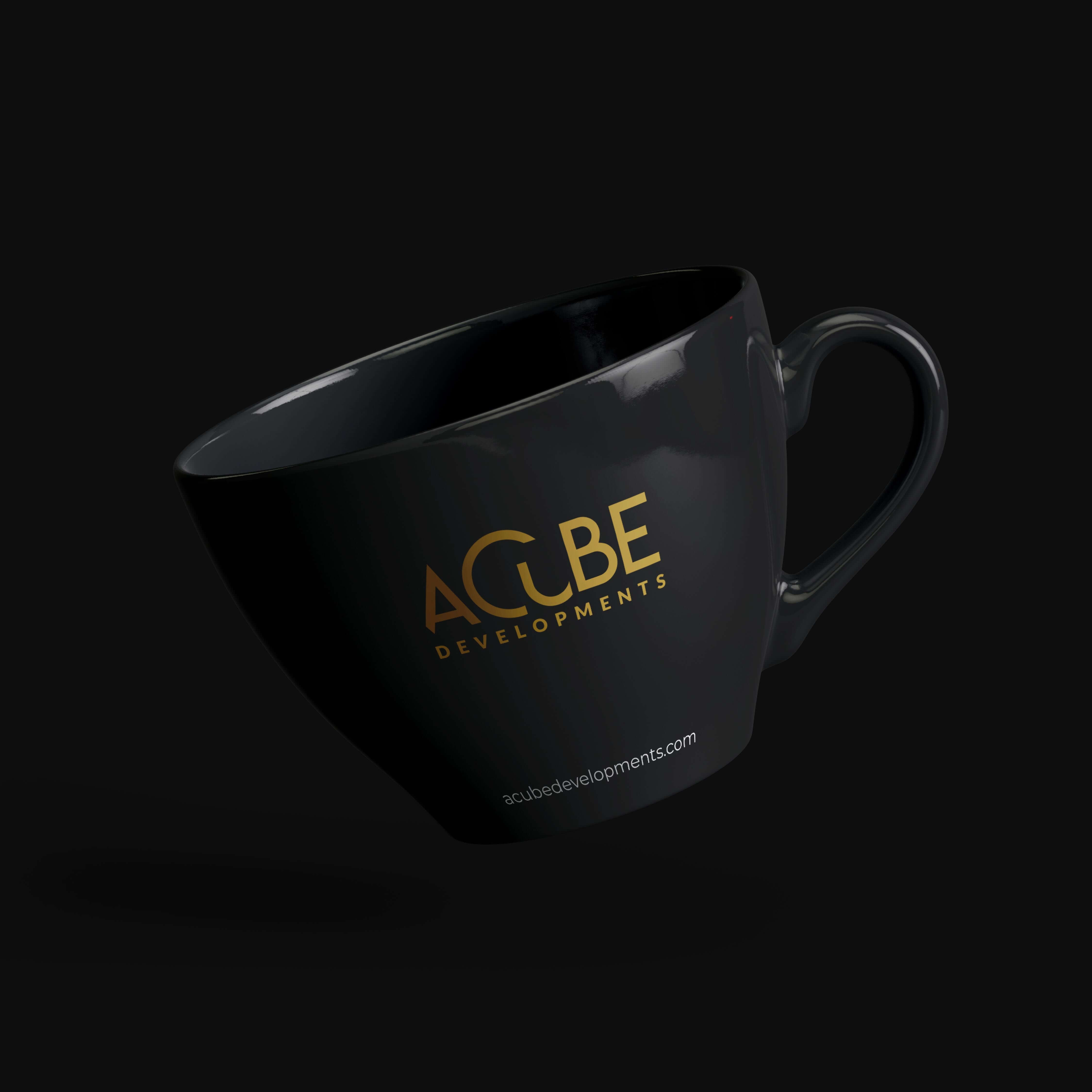
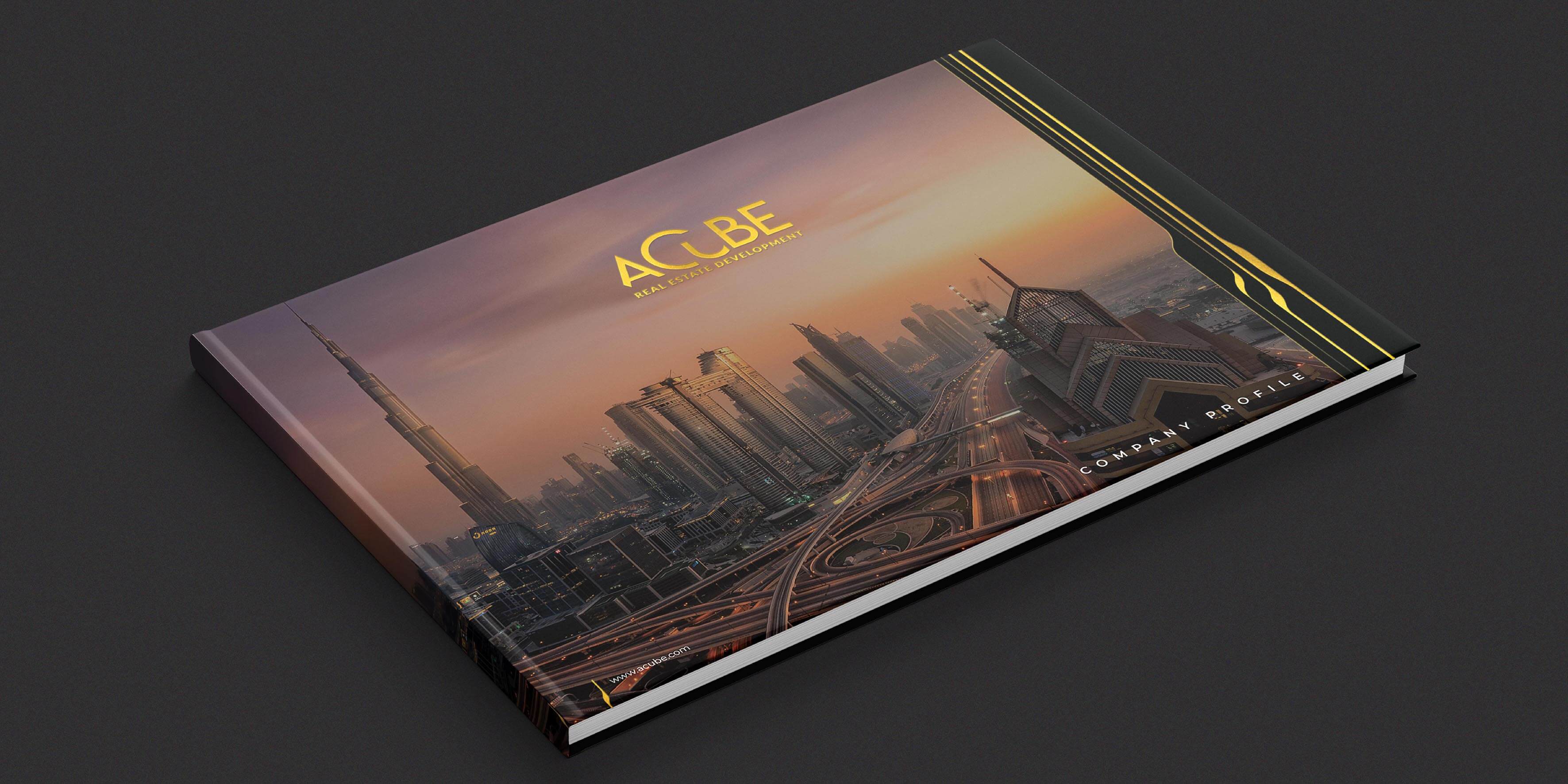
ACUBE's corporate brand collaterals, including office stationery, digital and print materials, and customized gifts, reflect the brand's values of intellect, innovation, dependability, and foresight. Each collateral piece is meticulously designed to maintain ACUBE's brand identity and leave a lasting impression on clients and stakeholders.
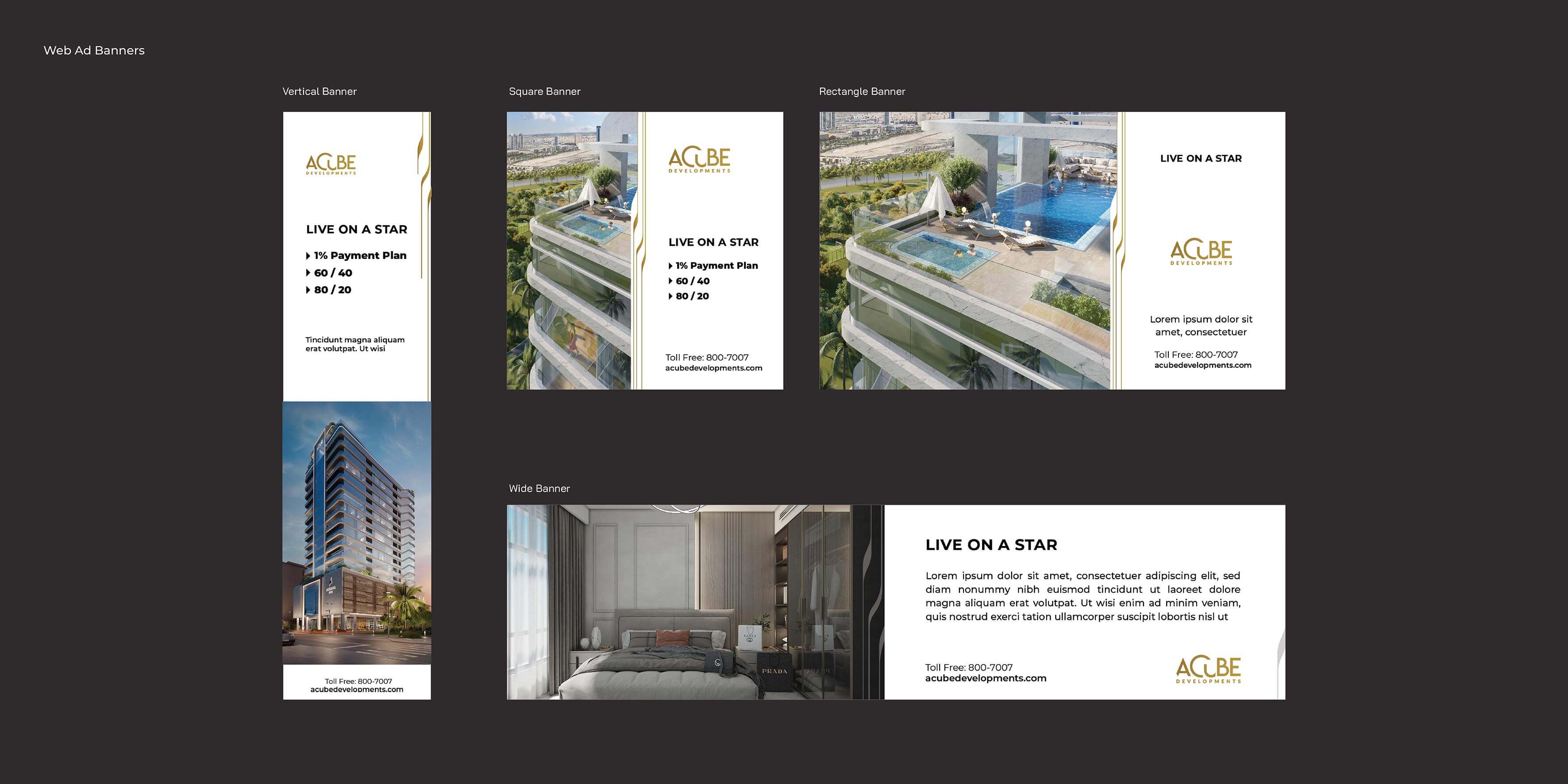
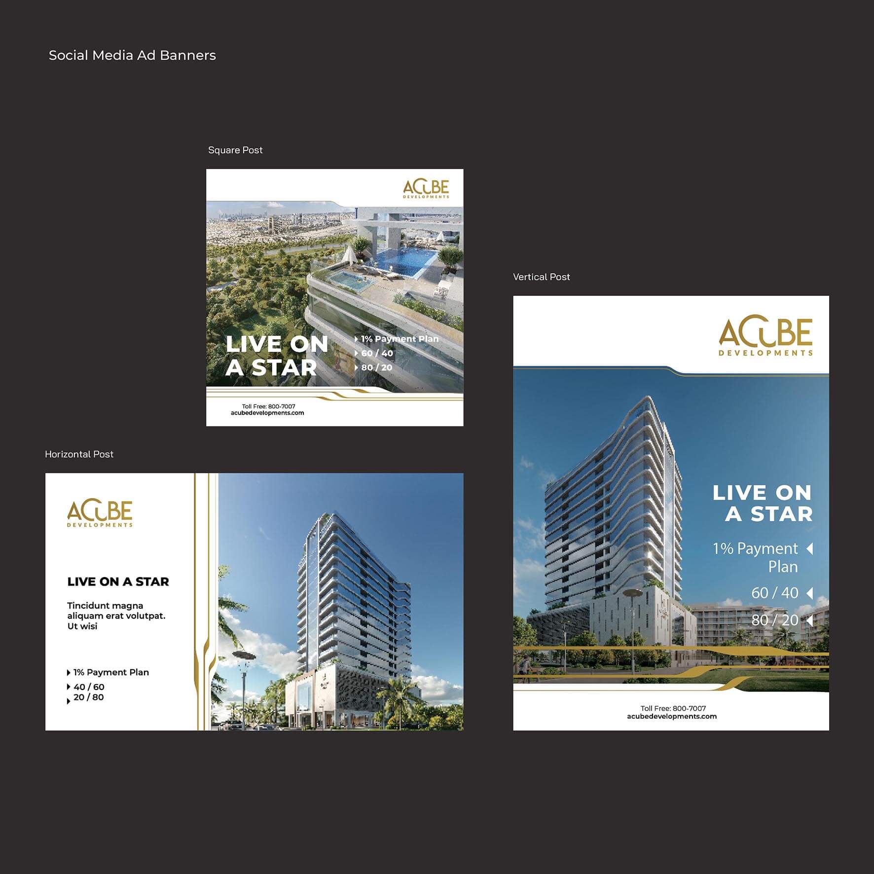
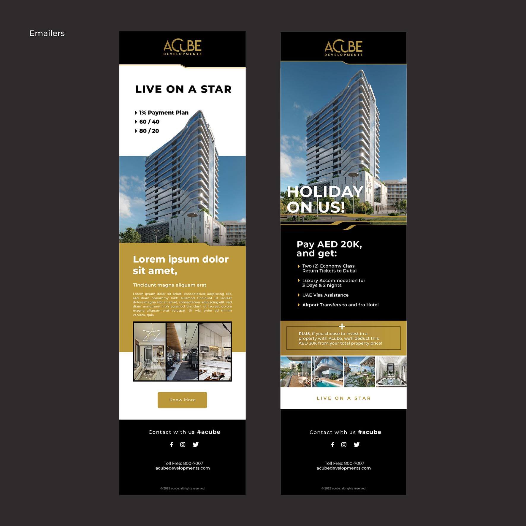
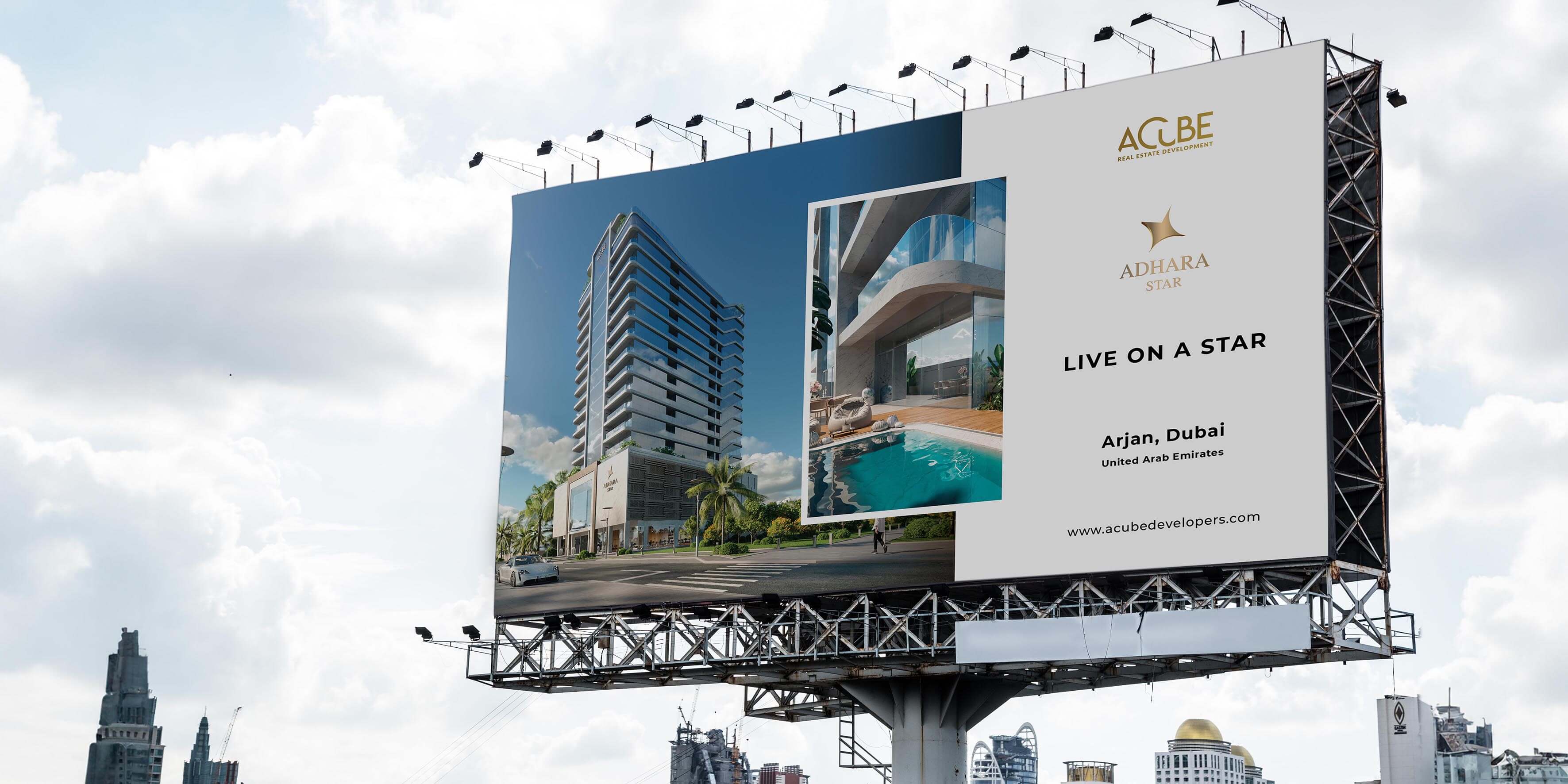
ACUBE's ad campaign combines print and digital mediums to showcase its innovative projects and commitment to excellence. Through targeted messaging and engaging content, the campaign positions ACUBE as a leader in the real estate industry, highlighting its unique advantages and superior offerings.
The successful completion of ACUBE's branding and visual identity development project marks a significant milestone in the company's journey towards establishing itself as a leading developer in Dubai. With a cohesive brand identity that reflects its values and aspirations, ACUBE is well-positioned to thrive in the competitive real estate landscape and set new benchmarks for excellence.